
Design is a way of communication. What your eyes perceive is what is communicated through the design. In art and design, space is significant. Space is the area surrounding the object and in between the subjects as well. And as a designer, a lot of you are aware of the terms, negative space or white space.
In digital designs, the vision is limited to the screen size. And one of the laws of Design, the Proximity principle says that it is the human tendency to create a synergy between the elements in front of their eyes and group. We are programmed to seek visual hierarchy. This is where negative space in design benefits.
Or should we say the White space? The terms negative and white space have been used interchangeably. And it confuses people that negative space is just as same as white space design. But here, nobody is wrong! Along with positive space, these three terms are significant in graphic design, web design, UI UX design, and photography as well.
The essence of Space in design is often neglected. Space design is responsible for highlighting the subject in front of your eyes. And with this blog, we intend to bring some spotlight on the importance of negative, white, and positive space in the design.
Let’s dive into a detailed explanation of these spaces and how they are different from one another, and their significance in design.
Article content
- What does space mean in Design?
- Difference between small and big spaces in the design
- What is Negative Space?
- What is White Space?
- What is Positive Space?
- Importance of Negative Space in the Design
- Importance of White Space in Design
- Types of Negative Space in Design
- Core factors influenced by Negative Space
- Negative Space vs Positive Space: What are the differences?
- White Space vs Negative Space: Differences
- How to use spaces in Design?
- Example of Negative, White & Positive Space
- Challenges you may face using space in design
What does space mean in Design?
Space refers to the set of measurements of height, width, and depth within which the elements will move and exist. Well, that was a generic explanation. The real question is what does space mean in design? It is everything.
A balanced, visually pleasing, and users’ favorite design is one that makes the right use of spaces. Every time you see a design and it feels off you can say for sure, the use of space was not done correctly. By understanding negative space and positive space in a design you can draw users’ attention to the important interface elements.
However, there’s a difference between having empty space in design and strategically using spaces. The spaces in design help you in ensuring the design is balanced and communicates well to the user.
Difference between small and big spaces in the design
The use of negative space and white space in design goes beyond the UI elements. For the type of digital product you are designing, i.e., an app or a website; there are two types of spaces based on the area size-
- Smaller Spaces
- Larger Spaces
Smaller Spaces
The small space refers to the area surrounding the following design UI elements:
The use of negative space is not generic. It differs for the smaller spaces since the agenda differs. Importantly, the negative space in typography assists in making the test more readable. And bringing clarity to the overall app or web design layout.
For a smooth user experience, you need to make sure that the text should not require additional effort to be readable. For that, make use of enough negative space between the letters, line spacing & overall typography, and other UI elements.
Larger Spaces
The larger space in design refers to the overall layout and design of a web page or app. When using negative space in larger spaces, you need to think about all of the UI components. Since this will affect the user’s visual flow, here are some key points you need to consider:
- Is the negative space applicable to separate UI elements?
- Text alignment: Whether the text block should be divided into columns.
- Padding for each element and the size of their margins.
The user’s attention span is concise and to hold their attention to the specific details you must use the spaces in a design carefully.
What is Negative Space?
“Negative space in design is the space or area around the subject and between the subject.”
It can be easily identified in a design or art where you find a visual hierarchy and a pattern in the design. When the space around and inside the object creates an illusion, communicating a message to the audience is a negative space. It is like an optical illusion.
Negative space does not necessarily need to be white space; it’s the space around the focal point. It is the space between the texts, paragraphs, and various lines. That is known as the Micro Negative space. While the space between larger elements like the header, footers, and the elements of the layout is the Macro Negative Space.
What is White Space?
The term ‘White Space’ comes from the print media world. Where most of the print work was done with a white background. The primary purpose of white space was to give a cushion to the text to make it readable. White space refers to the area around the objects or the focal point but does not create any composition. Rather in the digital space, white space in design gives an area to breathe the positive space in the design.
However, the white space does not mean to be white. The space can be different or could be a texture that brings focus to the subject in front. There are two types of white space; Active white space is where you make a conscious effort to bring emphasis on the positive space and enrich the structure. The second is the Passive white space, which is the natural white space like the space between the words and lines or the space between and around a graphics element like a logo.
What is Positive Space?
Positive space refers to the area of interest i.e., the subject. Whatever subject you notice first in the design becomes the positive space. The elements in the foreground are referred to as the positive space. The positive space is dynamic, motivating, and active in the design. The visual composition of positive and negative space in the design alone completes the whole design.
The composition emphasizes the idea that the viewer visualizes his or her meaning out of the meaning. In space design, the users can easily navigate through the app when important elements like content, CTAs, and more are placed. In digital design, the positive space is the words, letters, i.e., the content, buttons, media, interactions, and such.
Importance of Negative Space in the Design
The very reason why negative space in design is important is compositional balance. It brings a larger meaning to the design. Without it, in design, the positive space becomes meaningless. It is well known for enriching the whole viewing experience.
Negative space acts as a significant design tool. It brings attention to the object in focus and enhances the experience. For website and app UI design, it helps in improving the usability and the navigation factor. It cushions the important content on your website and app. Making the text more readable and attractive to visitors. The right composition will make the elements distinct from one another and ensure they catch the user’s attention for completing their user journey. In design, it has become important for crafting a seamless user experience for your digital product.
Moreover, the balance of negative and positive space not only makes the design accessible but also makes it look elegant.
Importance of White Space in Design
Many consider that the white space is the same as the negative space, but white space in design is omnipresent and doesn’t grab attention. Instead, white space design helps focus on the important elements by leaving the space around it empty.
A major benefit of white space is it gives space for users to influence the reading. Without enough space between words, letters, and paragraphs it becomes difficult to read and the user will leave your page in no time.
White space ensures that each element you’ve added is distinctly identified by the users. It gives them space. Hence, it becomes easy for users to navigate through your product. The more white space around an element, the more users will interpret it as an important part of the design.
Ultimately, we all admire the minimalist aesthetic design. White space in design helps in creating a clutter-free and clean design. Emphasizing every element in the space design, white space helps build an elegant-looking website.
Types of Negative Space in Design
There are 4 types of negative space in design based on the size of negative space in the layout and its purpose in design.
Active vs Passive Negative Space
Active space refers to the space where the UI components are placed asymmetrically and off-center. They have a flow that leads the user through the design. While the passive negative space design is where the UI components are placed in a symmetry there’s no movement in the design. Passive negative space has a balanced look but doesn’t point to a flow in the design.
Micro vs Macro Negative Space
Micro Negative space is the space between the elements. For example, the space between lines in a text block. Appropriate use of space signifies the content’s legibility. If the lines are too close or the text is unaligned then it will be assumed by the user that the app or web page cannot be trusted.
While the Macro negative refers to the area surrounding the larger elements like a larger content block or an image. The negative surrounding the larger UI elements hold the design together. You can easily identify macro negative space in web design which is minimal.
Core factors influenced by Negative Space
Brand Communication
If you want to build a significant brand then the use of negative space across your app or the web design helps set the tone for your brand and communicates clearly. Using negative space in varied methods can result in different design aesthetics which resonate with your brand personality.
User’s Attention Ratio
Definitely, when you use negative space design strategically, you highlighted the key UI elements and content. As a result, this assists in grabbing users’ attention and they pause to look at whatever has caught their attention. In brief, it increases the attention ratio.
Readability
The spacing between lines and letters influences readability, the more clearly words can be identified and read by the user, the more readability will be. Micro negative space plays an important role in improving the text readability on the web page and apps.
Nature of the Resource
Every design you create has a tone to it, a vibe as you may call it. The use of negative space can make or break the sense of authenticity for your digital product. For example, if your website design is minimal and sophisticated with appropriate negative space then the user will assume the information available on your web page will be reliable.
Negative Space vs Positive Space: What are the differences?
Reflecting the yin-yang analogy, one cannot exist without the other. And the same goes for positive vs negative space. There’s no negative space in design without the existence of positive space. And to be precise the design is incomplete without the right composition of the two. Above all, without the correct use of positive space in design, the design becomes bland and pointless.
Positive space is the area of focus in a design. In design, the areas of focus are the icons, buttons, and content. While the negative space in design is the background area and the space around the main focus. For example, in an image of a cup, the space between the cup and its handle constitutes a negative space.
It may not be noticeable in a design but its absence is noticeable. Similarly, the positive space cannot exist without the negative. To summarize, positive space will have no meaning if there’s not enough negative space around the area of interest to bring emphasis to it.
White Space vs Negative Space: Differences
This is our favorite section of this article. We’ll tell you why!
You will always find people using the terms negative and white space interchangeably in design. White space is the space surrounding the elements and between the layouts in design. Like the space separating the sections, the space surrounding the body content is white space. White space gives space for the elements to breathe and puts emphasis on it.
While negative space in design refers to the area close to and surrounding the positive space. The blend of negative and positive space creates a balanced composition in design. It helps in building attractive UIs along with creating better navigation for users. Hence, the user experience of your design is elevated with the right use of negative space.
The term “white space” was picked from the print media, where most backgrounds are white. And in digital designs, White space isn’t always white. It is just the space emphasizing the positive space in view.
Similarly, negative space isn’t always white, it can be of any color, texture, or pattern. It is designed to deliver a message through a proportional composition for a seamless UX.
Oftentimes, you will find the negative and white space are the same areas in a design. And this is different from the design and components you include. Neither the differences can be denied nor be followed without considering the elements of design.
See below what elements you need to consider while using white, negative, and positive space in the design.
How to use spaces in Design?
There’s no right way to use each of the spaces mentioned in the article. They co-exist! You have to ensure a balance of composition between the positive space and the negative space. The ratio of these spaces in design influences the final outlook of the design. Here are some elements of design you need to consider while using the spaces in the design.
Balance
There’s no positive space in design without negative space. They gotta exist together! In a design composition, both spaces establish a balance. You need to plan the areas of negative space while planning it for the positive space. Not balancing the positive and negative spaces will overwhelm the users. Since they bring equilibrium to your design. For web design, the composition of both spaces in design makes the visuals interesting.
Rhythm
The balance of negative and positive space ensures a rhythm in design which helps users in navigating the flow around your product. Also, you can sense the rhythm and movements in the patterns and repetitions within the design.
Focus
Negative space in design very well demonstrates the idea of the shift of focus from one vision to another. Creating a composition may not always need to be complex. It allows the users and audience to interpret and catch the focal point easily. Moreover, balancing the composition of spaces should not affect the tone and the branding of the website or app.
Dimension
Whether it’s a 3D design work or two-dimensional, the use of negative space ensures a dimensional aspect in your design. Certainly, 2D and 3D designs are incomplete without the right composition of negative and white space.
Readability
While managing the spaces in the design, you must ensure that the space between the letters, words, paras, and all the content in your design has enough space to breathe. Not just the spacing, but the font size, color, styles, tracing, and kerning also becomes important. Moreover, while creating the design layout, make sure there’s enough white space to improve the reading performance.
Example of Negative, White & Positive Space
Examples of Negative Space:
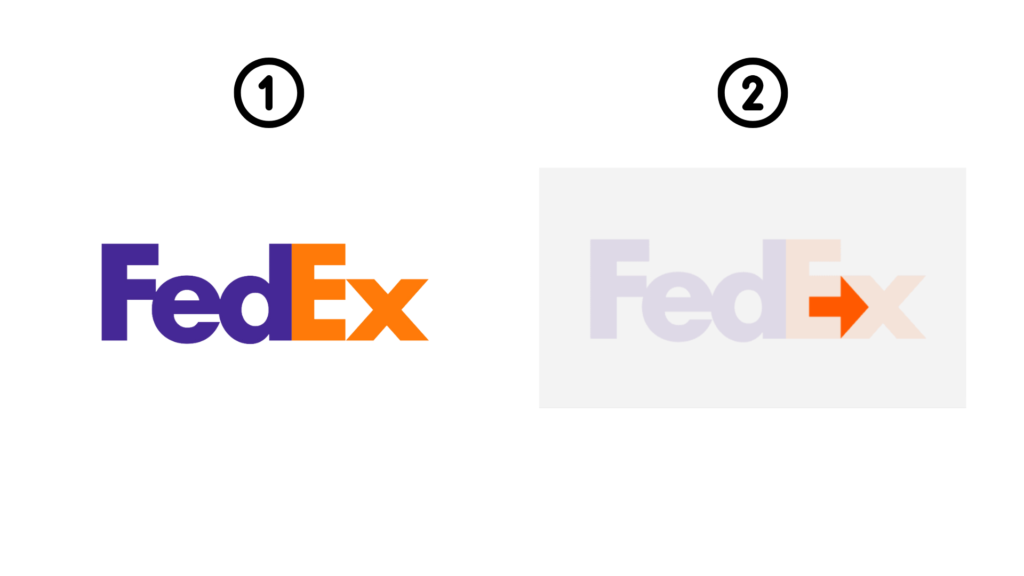
FedEx is one of the negative space examples that cleverly used negative space in its logo and has been very well-known for the same. Kerning the letters capital E and small x turned into an arrow representing the fast and reliable way to go from A to B.
Positive Space example: Van Gogh’s Oleanders

Since we know that any object that stands out in the design is a positive space. And in Van Gogh’s Oleander Painting, the positive space in the image is the vase full of flowers. The vase and the flowers is the primary subject while the book lying on the left is also an example of positive space but is the secondary subject.
White space example: Apple’s website

Apple’s website is the perfect example of using white space. It is elegant-looking and is pretty easy to navigate around. It is an excellent example of how to tell a story through white space and keep your users engaging.
Challenges you may face using space in design
Even if you are wondering what challenges you will be facing with space design. We wholeheartedly beg to differ! As much as space matters in design, it does come with certain design challenges.
In this case, two of the biggest challenges you will face with space design are: balance and message
Balance
Composing the right balance of positive space and negative space in design is important to deliver the right message. When either of the spaces, for instance; there’s too much positive space or negative in the design then it can be overwhelming for the users.
It distracts your audience and makes the design ineffective comprehensively. From a design perspective, you may think that the white space is too much and needs some text or media elements there. But bombarding your website or application with too many elements can result in fatal. Hence, the users will easily lose interest and won’t move forward in completing their intended tasks.
Here the key is to find a balance between both the space positive space and negative space in the design. There are no right numerical parameters for the perfect balance. What works for one design may not work for the other.
Message
The combination of positive and negative space in design holds the power to enrich or detract from the message. To communicate your message in a calm way you need to make use of enough white space, and go for more negative space. When you fail to do that, the users will lose focus from the focal point.
Often designers use too much white space design even though it can be overwhelming for users to interpret the positive space. This will make the actual message look distant and unimportant. The aim is to motivate the users to making action and to go for less negative space. But make sure, there’s enough space for users to comprehend the message and take action. Certainly, and to overboard your design with too many elements is not a good idea tho!
Conclusion
In the end, the spaces in design are important for crafting designs that turn out fruitful for the users and the business goals while being visually pleasing. However, The ultimate goal is to build a design where there’s no division of negative space or positive space rather it showcases a coherent and harmonious story in your design.