
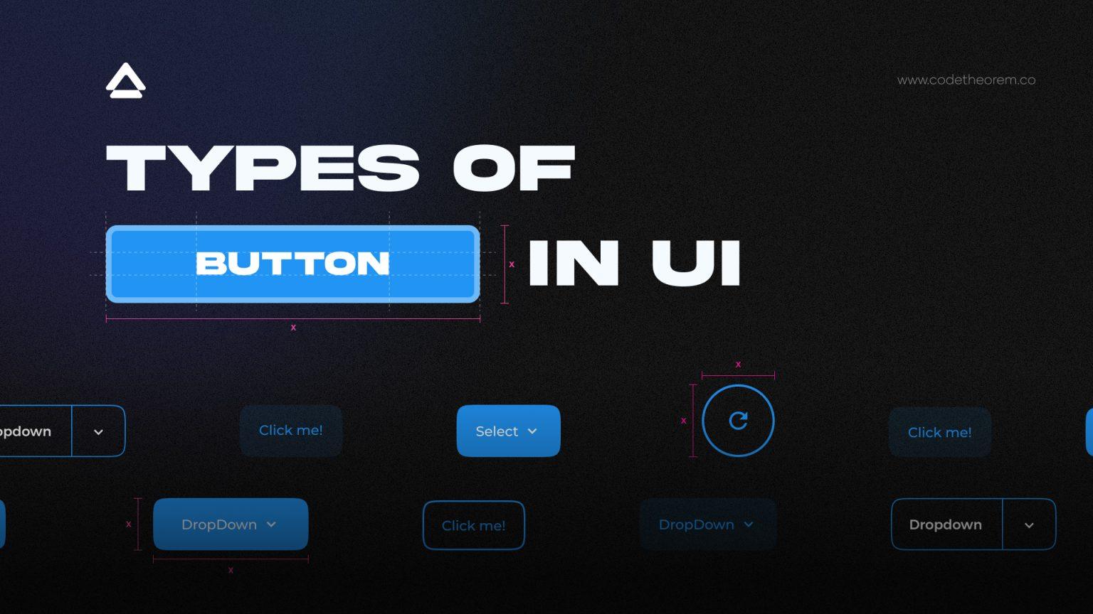
UI Buttons are one of the best UI materials that instinctively attract and convert visitors to buyers. Different types of UI Buttons that you can use; CTA button, Text button, Ghost button, Dropdown button, Floating Action Button (FAB), Hamburger button, Plus button, Expendable button, Share button, and Raised buttons.
Do you want solid interactions and a meaningful user experience from your website?
Wait, have you missed something from UI buttons and Color Theory while material designing? UI designers are always concerning aesthetics, visual hierarchy, and enhancing the user experience. But in the gist of creating a pretty UI, they often overlook the importance of UI Buttons or the types of buttons UI.
You can find out everything about UI buttons below-
What are UI buttons?
UI Buttons are one of the best UI material that instinctively attract and convert visitors to buyers. So, if you are building a landing page, you can’t miss on website button design because buttons reinforce the nature of the action.
These are ordinary and everyday elements that create a smooth conversational flow on the web and apps. So while placing UI buttons on your website, it is essential to finalize the touch target size and padding when designing a website layout.
According to the MIT Touch Lab study, the average finger pad lies between 10–14mm while fingertips are 8–10mm where 10mm x 10mm is considered to be a good minimum touch target size.
A few other things you need to consider while placing the UI button-
- You must place UI button design where one can spot easily
- Add a clear, crisp, and short label to the web button design
- Make creative and custom shapes to draw eyes to the center of the element
“The best way to indicate a button is to use visual cues.”
Different Types of Buttons in User Interface
The following are the different types of buttons UI that you can use:
CTA Button
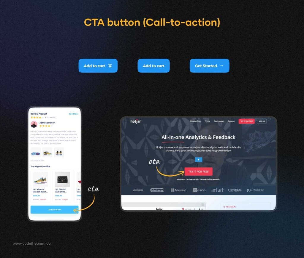
CTA (Call-to-action) button is an interactive element that prompts users to register, sign up, buy now, and more. It shall be placed where the user is most likely to see it. Here, you can go with buttons with rounded corners as they are striking and really eye-catching.
Text Button
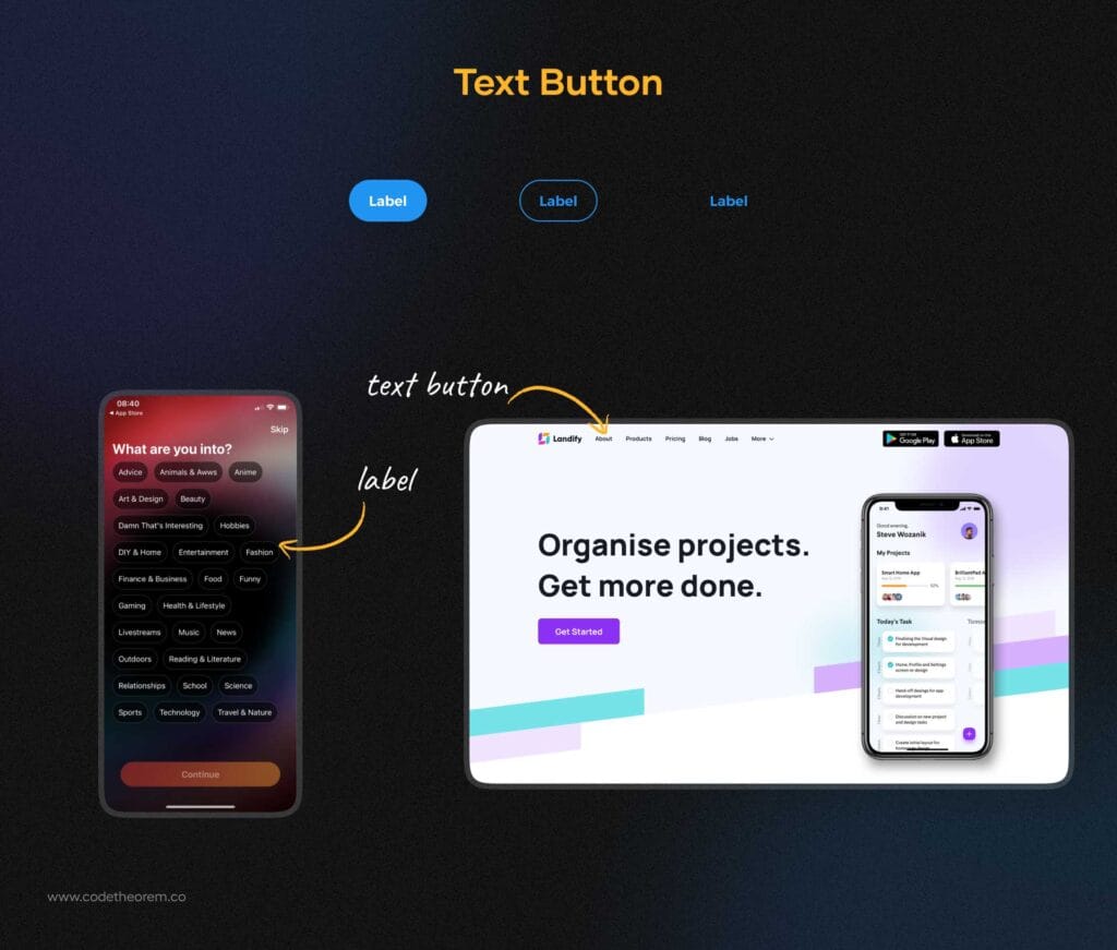
Text buttons in UI design are presented with a piece of text that can be integrated into any shape. This doesn’t look like a button but still, it has a live control that allows users to interact with an interface. These are mainly text labels that fall outside of a block of text. You can hire UX designers to get suggestions on where to place.
Ghost Button
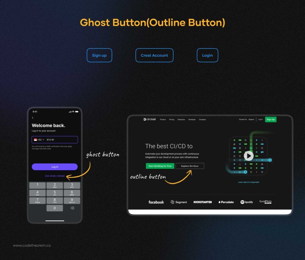
Ghost buttons are for the secondary options, important but not the primary action. When you are required to add an option that is less likely in favor of the app, you can opt for a ghost button design. The prime example of where the ghost buttons are used is when a user clicks on “Later”, “Not Now”, or “Skip the Sign-in”. This UX button design has become quite popular these days, particularly for landing pages.
They are also known as outline buttons, considering their appearance. if you ever wondered which is better – filled vs ghost buttons, note that it is a game of emphasis. If you want to emphasize your text, filled buttons should be your primary CTA. While, ghost buttons are for secondary actions and give an elegant, subtle feel to a design. This way the focus will be on the filled button and the ghost button will carry the secondary info.
Filled button
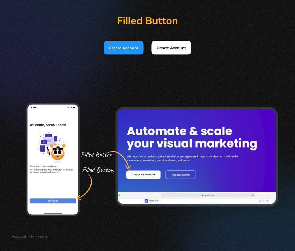
A contrast to the ghost buttons– filled buttons are the ones you use when you wish to grab the user’s attention towards the button and want them to take action– clicking the button. With the bold design, the filled buttons can help you to stand out from the rest. To make the best of the filled buttons, make use of highlighted UI button color.
At the same time, you must remember that this UI button type is an expert at drawing attention and should be used only for some of the key actions in your design. They are not your usual, expected CTA buttons. They are more appropriate for special or unique experiences.
Toggle Buttons
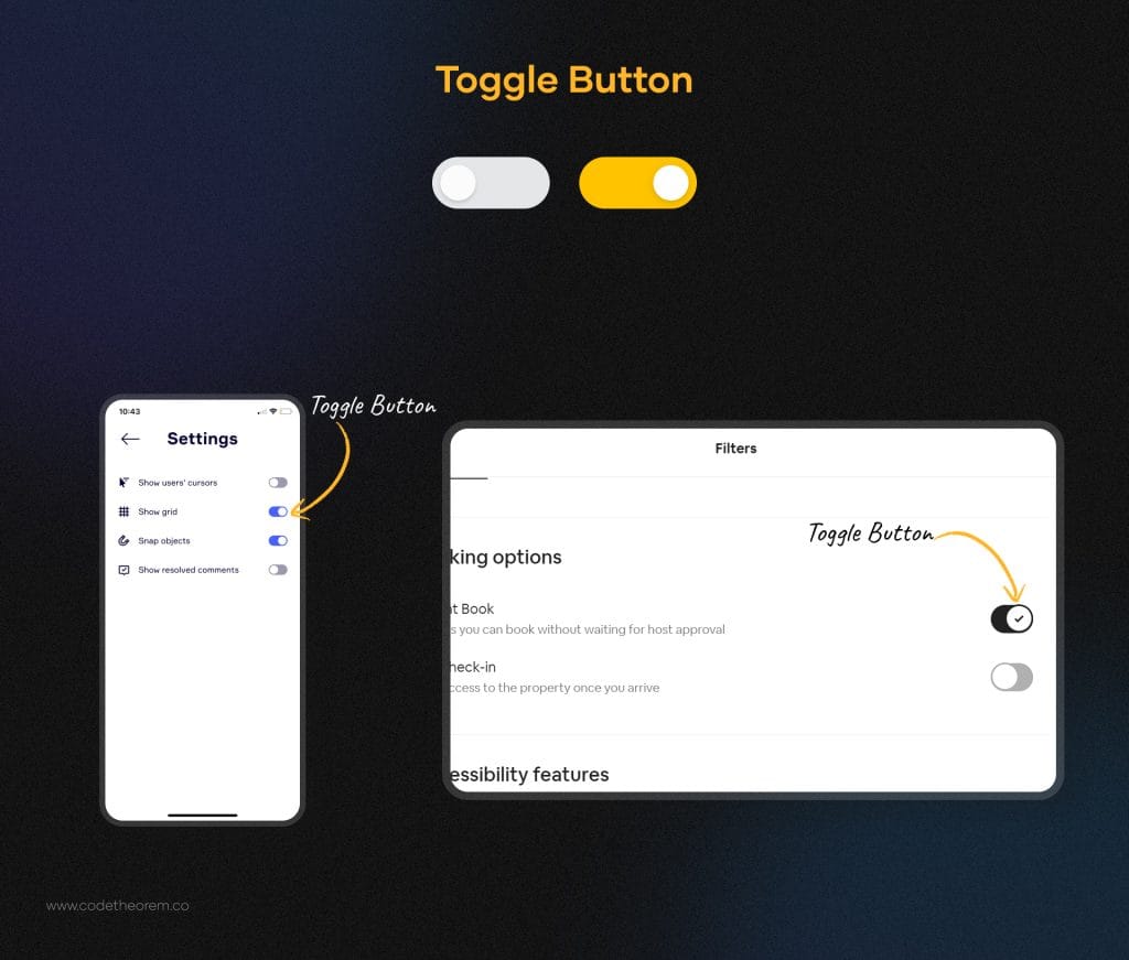
Toggle buttons allow a user to change the settings between two or more modes/states. One thing we love the most about toggle buttons is that they present the options upfront, the only left for the user to do is select one. This or that. Thus reducing decision-making time and leaving users in the action-taking stage rather than the thinking stage.
Some examples of toggle buttons are:
- On/Off UX buttons
- Dark mode/ Light mode
The toggle buttons need icons, texts, or both to help users identify what options they are choosing among the two provided. For a toggle button, it is essential to place them on the screen where they can be directly seen. They should be noticeable in the layout.
Dropdown Button
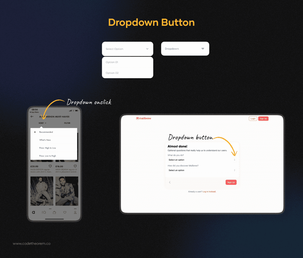
Dropdown buttons are commonly used as flat buttons. So when you click or hover, you will find a drop down list of mutually exclusive items. It gives an opening list to the user to add any particular item.
Here you can add a smooth animation with a customized drop down color and style the component with CSS selectors. Did we mention that you can add more and more items to the menu just by inputting a few pairs of anchors?
This is one of the most versatile components of UI. You can’t afford to miss this one.
Floating Action Button (FAB)
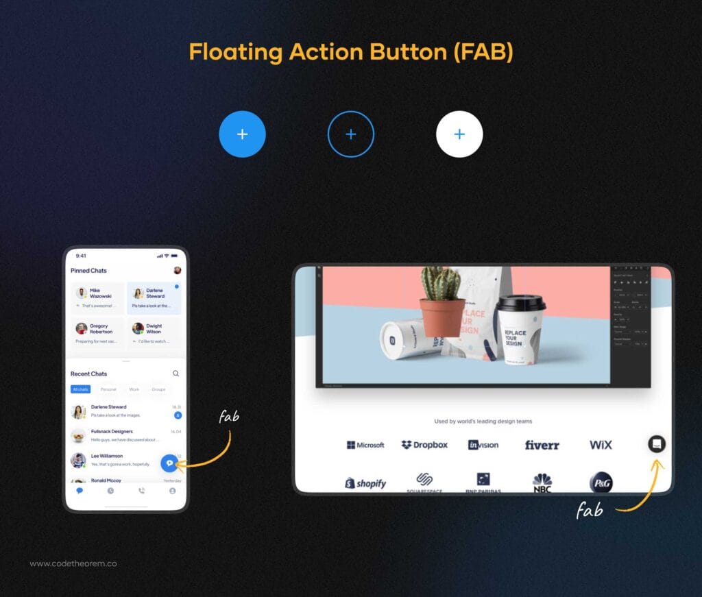
Floating Action Buttons assimilate with the primary button that appears in front of all screen content. You might have certainly seen this button but couldn’t be able to recognize it. Check the picture above and you will get an idea.
Generally, it is available in three different forms- regular, mini, and extended. You just have to select based on your requirements. Through this circular button, you can trigger the primary action in your app’s UI design. Want to give it a try? Hire a professional UI design Company now!
Hamburger Button
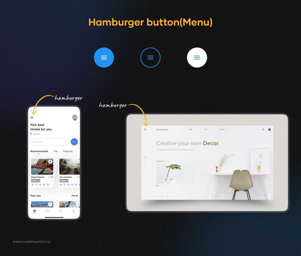
As the name suggests, Hamburger Button is derived from the hamburger theme. This is an unintentional resemblance. Wondering how? Check the picture above now.
The hamburger button is an essential part of any website design layout. You have seen this icon certainly in every website or application, popularly called a menu. One can find these three horizontal lines at the top of many screens, either on the far left or the far right.
A company website with several pages often goes with a hamburger button to let users have access to their pages. “Should I use these UX buttons?”
- It is ubiquitous and easy to recognize
- Makes your interface looks cleaner
- Serves great as a navigation button
Plus Button

Plus button is a really great UX button design ideas that let users create a new post, and add contact information, location details, and more items to the list. You must have seen this button in a blog posting that gives you complete freedom to choose from and make adding content more focused.
So when any user taps or clicks on the plus button, it will directly transfer to the modal window for creating content. Now that you know, notice it again when you download any app.
Expendable Button
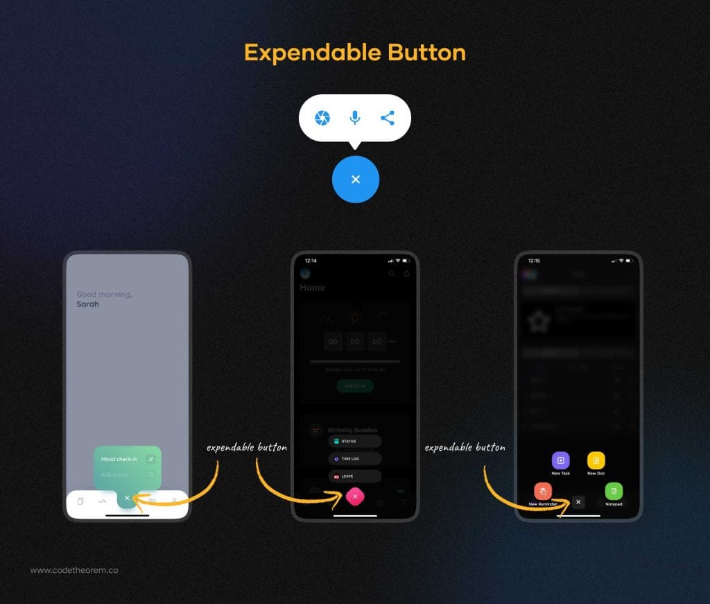
Expendable buttons are an extension of the plus button. When you click on it, it gives you a variety of options. So, this could be one of the best layouts for a web page that sets a seamless flow of interaction without overloading the screen.
Let’s say, if you have a travel website or application, your expendable button will allow a user to add a trip, date, new items, or any. Through these design buttons, you can definitely optimize the reach time. Give it a try once
Share Button
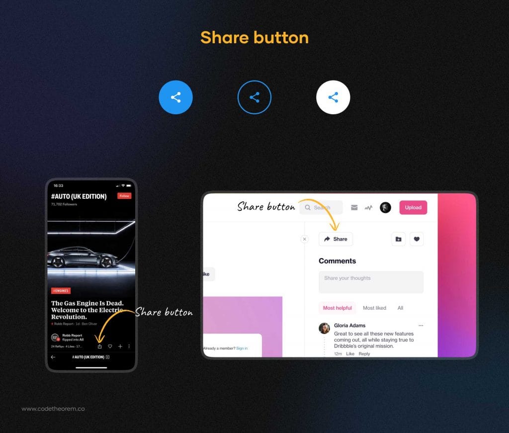
Share buttons have become extremely popular these days because of the growing social media channels and networks. People love to share the most creative, amazing, and informative things that can ultimately bring more users to your site.
Thus, it is a must to add a share button to your website UI design. Typically, it is presented with brand signs of icons like Facebook, Instagram, Twitter, or LinkedIn. No need to give shape or color to these icons as they must be kept original for better interaction.
Yes, these UX buttons are easily noticeable. You can place it either at the bottom of your website page or at the top corner.
Raised Buttons
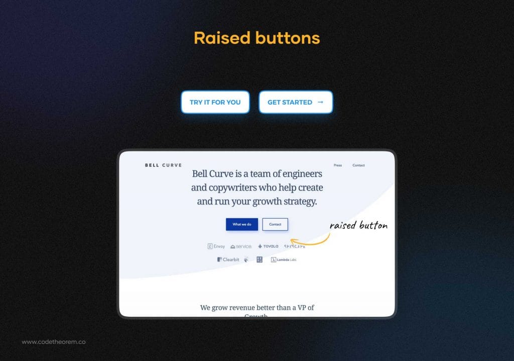
Raised buttons, also known as contained buttons are rectangular. It can add dimension to all the flat layouts. Its embossed effect attracts the users to click and press the button. Also, it can highlight functionality in wide, busy, or otherwise congested spaces.
Best Practices for Types of Buttons UI
The different types of buttons UI get the work done for you, without you realizing it. Every detail makes a difference in user interface design. Since it is about achieving a functional design that is a means to an end. Most important of all is focusing on the purpose of the button. Here are some key points you should consider while UI button design and making the buttons look like buttons.
UI Button sizes
UI button sizes are more important when you are designing a mobile app. The smaller touch screens have made it important to stick to a minimum button size. The app UI buttons should be clickable first. According to Android’s material design principles, it is recommended that the size size of touch targets should be at least 48 x 48dp to ensure a balanced info density on the screen.
UI Button Styles
Keeping everything at bay, the button UI should be identifiable, look interactable, and have a familiar design. Whether you opt for the round design button or a rectangular one with either sharp or rounded corners, consider your target audience first. Make use of shapes that are easily noticeable and the users are already familiar with. Some of the familiar button designs are:
- Square borders
- Rounded corners
- Filled button UI with shadows.
Padding
Padding refers to white space around the UI components. Each of the UI button types you design requires enough padding so that the user can easily find and interact with the button. The users should be able to understand that the button is an interactive element.
Color is your bestie
Play with colors. UI is all about visuals so make use of it and make it fun for users. This is a very simple approach where you can change the colors and look of the button UI every time there’s an interaction. Changing the UI button color is a subtle way of motivating the users that they are going in the right direction and silently appraises them to move forward to complete their desired actions. Color changing in buttons shows an appreciation towards the user that they’ve done it right.
Test the button UI
While conducting usability testing, it is crucial to check whether the UX button design performs the intended task. It starts with basic navigation testing. See how long a user takes to complete the user journey, whether it is logical or not, Check the importance of the features involved. And most important of all is the user able to find all of the key features in your design.
Secondly, every time you are confused between two options while designing a UI button, you can perform A/B testing and pick out the best among the two in no time. This is one of the commonly preferred methods for testing a button design.
Lastly, heatmaps are a great help in identifying where is the most interaction between the user and the product on the screen. You can understand the user’s POV and improve the location, shape, and size of the button accordingly.
Conclusion
Thus, try these interesting buttons for websites and applications to give them a sophisticated finish with an appealing call to action for users. And for the most professional result, don’t forget to hire Code Theorem, because we have a unique sight.
- All
- Development
- UI/UX Design


