Having a website and having a good website design are two ends of the same thread. How do you ensure a good website design when there are many web design trends around? We’ve got you. Last year, web design trends 2023 was dedicated to creating some of the most engaging web designs. However, the web design trends of 2024 are all about exploring and experimenting.
Did you know that 75% of users base their opinion of a company’s credibility on its website design, according to a study by the World Wide Web Consortium (W3C)? This indicates that being up-to-date with web design trends is important to sustain in the market.
This article aims to share the specially curated top 20 web design trends for 2024. Follow along to stay in tune with the trends.
Popular Web Design Trends for 2024
Web design is like fashion; it keeps evolving. What was trending last year won’t work this year. An effective web design does not only include aesthetic design and catchy colors but also Y2K effects, micro-animations, dark mode, visible grids, and animated cursors. User comfort is the key. The more comfortable they feel, the more likely they are to spread the word. Here are the top 20 popular web design trends for 2024:
Kinetic typography
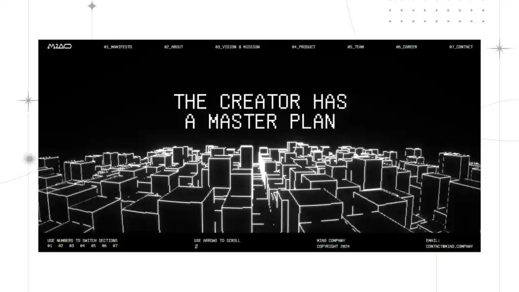
Imagine you are logging into a web page, and the heading moves as you scroll and texts dance as you put the cursor on them. Won’t it be visually pleasing? Giving life to boring texts is called kinetic typography. This trend is effective in conveying information effectively and interestingly.
Users are more likely to stay and go through the web page if it has visually pleasing elements. Kinetic typography does the job of getting attention effectively.
As a result, brands these days are employing kinetic typography on their websites to make them more interesting. Kinetic typography can be achieved with tools like CSS animations, Javascript, and the Greensock Animation Platform (GSAP). The beauty of the design lies in its versatility. With pleasing effects, kinetic typography can easily capture attention, inform CTAs, and highlight important messages.
However, it should be limited so as not to overwhelm the readers. Overly complex animations and too-flashy and jumpy texts can distract readers. It should be used in proper proportions to drive results.
3D
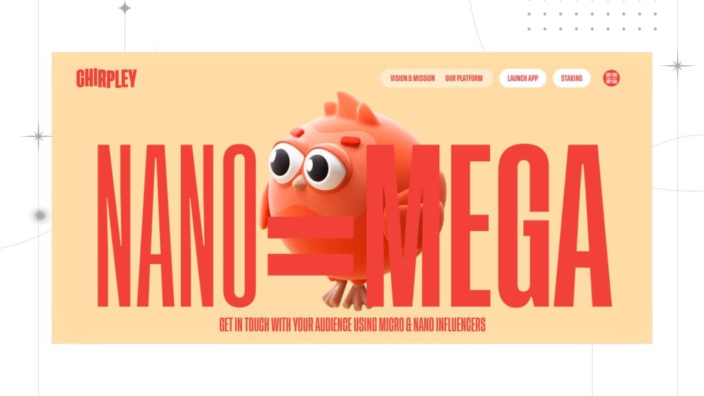
A 3D design is always a good idea to make your website unique and stand out from the rest. Despite the website design trend being around for years, creating a 3D visual experience for your website is a modern and stylish touch.
In this case, one of the stylish ways to implement this Web design trend is by creating centerpieces in 3D. The abstract 3D centerpieces in the hero section will create a powerful and impactful first impression. It will reflect the charisma and personality of the company.
Fortunately, creating 3D images and effects has become easier than ever. There are multiple platforms and tools available for it. Also, plenty of pre-built libraries are available to pick a 3D illustration.
AR and VR

In a digital-first world, one thing that is lacking is a touch of reality. But AR and VR technology have made it possible to deliver an almost real experience. Consequently, the latest web design trends are all about changing the way people interact with digital products.
Augmented reality and virtual reality are the best friends of an e-commerce website. They solve the biggest challenge for an e-commerce site: gaining users’ trust. Implementing VR allows users to check and see what the product looks like and whether it will fit their requirements. Therefore, it is a huge help in motivating buying decisions.
Glassmorphism

The frosted glass effect overlapped with rich content definitely makes a lasting impression. The frosted glass has been used profusely for the background, adding texture and depth to the web design. In addition, the blurred element of glassmorphism helps add a spice of color and make the content more readable. This website design trend has gained momentum since last year’s web design trends and will continue to make its mark this year too.
Microinteractions
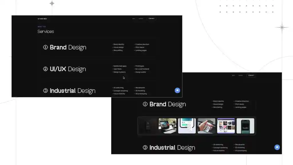
Microinteractions are subtle animations used in web design. User interactions are what set them off. Think of a cart icon that bounces when you hover the cursor on it, a progress bar that indicates progress as you scroll, or the small hearts that fly when the like button is clicked. These small animations were added to the web design to increase user interaction and showcase the craftsmanship.
Famous platforms like Facebook, Instagram, and others use micro-interactions to enhance the user experience. Micro-interactions make sure that the user is engaged and subtly guide them through important features.
Most importantly, the key to successful interaction is that it should be reasonable, purposeful, and concise. However, too many of them would drive the users away.
Custom Illustrations
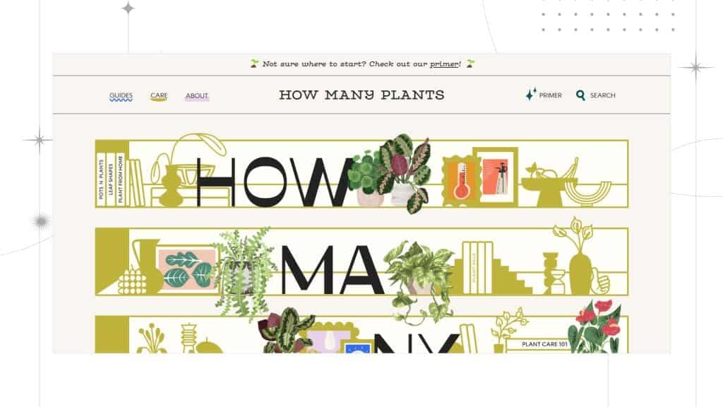
The trends in web design have been quite noticeable. We can legit see it growing and making its mark around. Illustrations are everybody’s favourite, but putting your niche into them makes them stand out. Custom illustrations bring originality and relatability to the table. They help users feel welcome and motivate them to explore more. For a brand, unique and custom illustrations help them connect and drive in more users. Custom illustrations are one of the best in web design.
Parallax scrolling
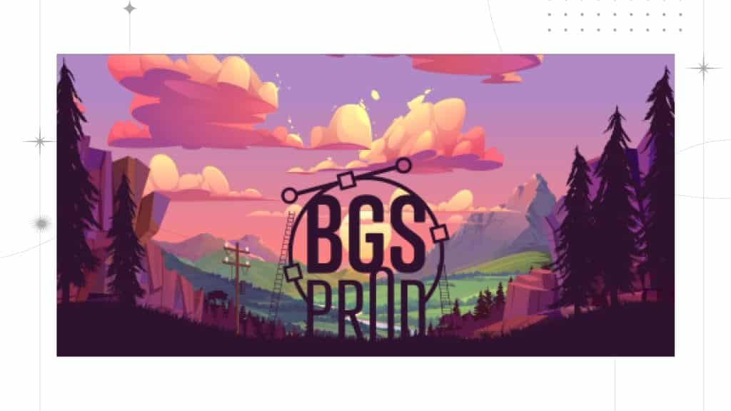
The designers have found a way around the task of scrolling and turned it into an engaging experience. The most common and primary user action is scrolling through the page. And this is a big opportunity to turn it in your favor with parallax scrolling. Parallax scrolling, or, as we say it, scrolly-telling, has always been a trend to follow. It gives you the space to experiment and innovate with design.
It’s time to make your web pages dazzling with this popular trend. It brings depth to the page when the user scrolls through the image. The video/content is placed in such a way that it will seem like the image/video is placed behind the other elements—an interesting twist to the design.
Gradients
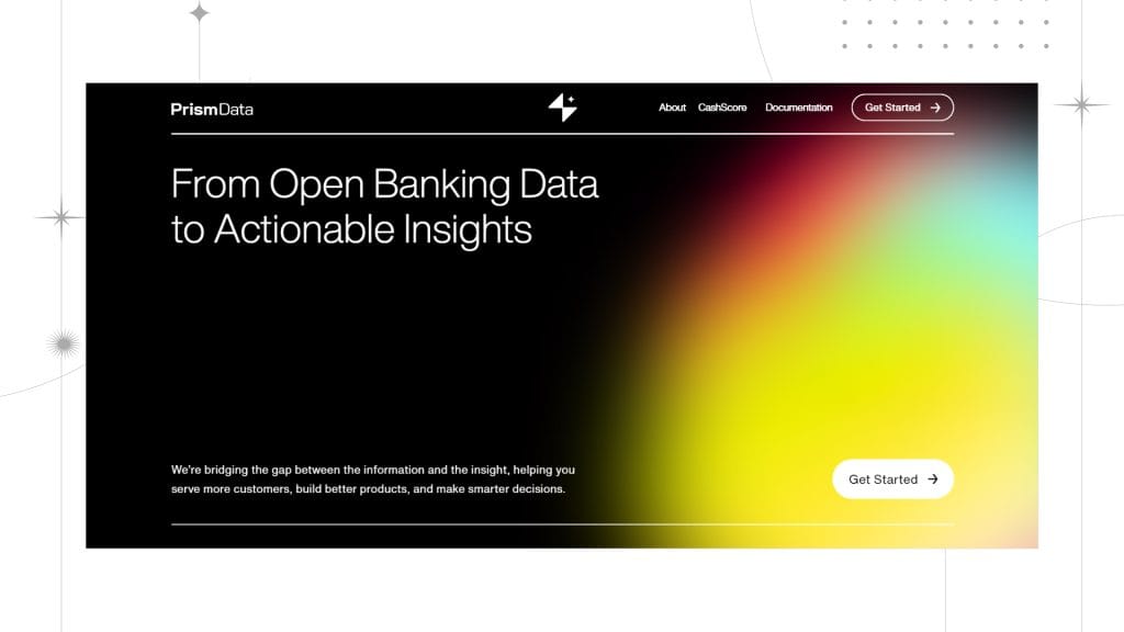
Who doesn’t love colors? Even though web design trends are always angled towards minimalism and have been like that for years, colors play a major role in web design. However, there isn’t a specific color that rules, but there are multiple ways for people to play around with color effects. And one of the popular styles is gradients.
Gradients are variedly used with another web design trend on the list, Claymorphism. Gradients light up a series of moods and aesthetics in the design. Besides, the mix of hues and tones goes a long way for web design. They bring up a positive vibe. You can spot multiple websites following this pretty web design trend.
The trend is limited to brighter and darker tones; the pastel tones have become a popular choice in gradients. In fact, they are just the right amount of subtle and bright for a modern web design. They can lift the settled and bland vibe of a simplistic design. All in all, gradients create an illusion of movement in a minimal design.
Claymorphism
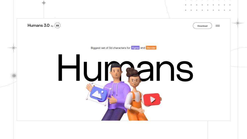
Like a bi-product of Neumorphism, Claymorphism is a popular trend among graphic and web designers. It is full of colors, bold typography, gradient effects, and, most important of all, 2D and 3D illustrations. It gives you a cartoonish vibe to the design. The floating effect and the soft finish can be seen all over Behance & Dribble.
Significantly, claymorphism is best suited when infused with animations and interactions. Might I remind you that this design trend is a little bit tricky, so you have to be careful of the color palette you choose and ensure that the clay morphism illustrations don’t end up being too childish? And for accessibility, you will need to perfect the visual hierarchy and contrast.
Memphis Design
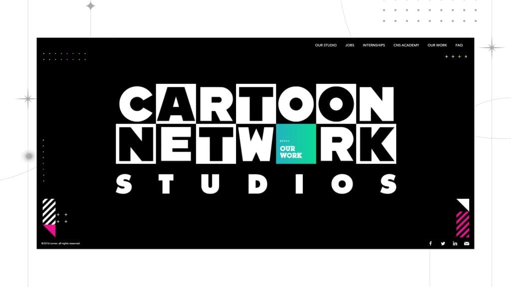
Nostalgia is the word I would use to describe this web design trend. Let’s take a trip back to the 80s. Memphis Design is an 80s-style web design aesthetic with a modern touch that is gaining popularity.
If you are a designer who is all about fun and loves the pop of colors and vibrant tones, then Memphis Design is gonna be your Fav. Undoubtedly, this is one of the new trends that is a fresh addition contradictory to the monochromatic & minimal designs. The contrasting color schemes can help you add a dramatic effect along with abstract and unique UI elements, which are big on the web design trends for 2024.
Micro-animations
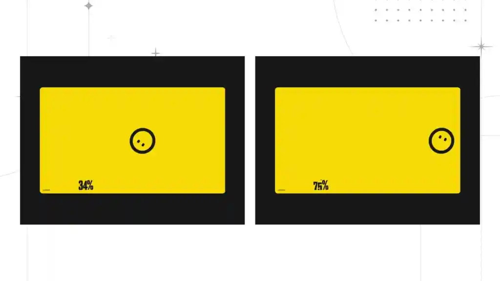
Micro-animations steal the show with their small and subtle elements that add depth to a web page. Think of a cute animation that replaces the typical loading screen. As the attention spans of people have shrunk, it is significant to integrate micro-animation into web pages to keep the users hooked.
Adding micro-animations to web pages, especially on the loading screen, makes the waiting time less boring and prevents them from abandoning the page. Micro-animations are meant for aesthetic purposes and to make a statement.
Similarly, micro-animations guide user attention and feedback, according to a study by Google’s Material Design Team. With intuitive designs, micro-animation enhances the overall browser experience.
Y2K effects
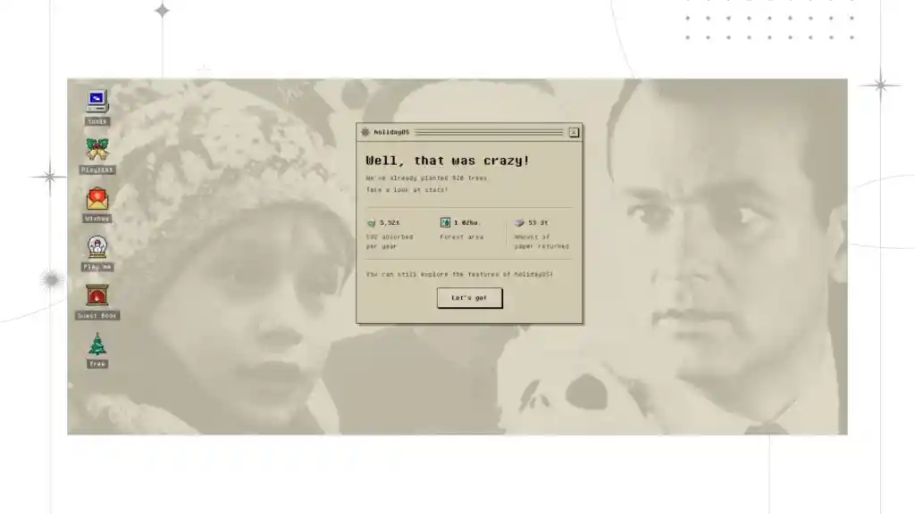
As the name suggests, Y2K effects comprise designs from the 1990s to the early 2000s. It includes a boomer pink color, nostalgic elements such as Windows XP’s UI, geometric spheres, and electric blue colors. The purpose of the design is to evoke nostalgia in the users. Psychologically, people are drawn to things that evoke memories.
Y2K designs are fun, nostalgic, and sophisticated. It will work efficiently on websites that target youngsters and middle-aged people. Moreover, it will stand out from the minimalistic designs and make a statement.
As a result, successful companies such as Microsoft and MTV use retro UI to resonate with people who love vintage aesthetics. Moderation is the key. Most importantly, keeping the usage in check is significant for the design to succeed.
Gigantic buttons
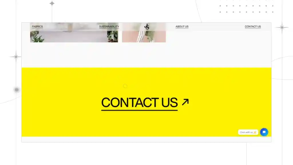
Gigantic buttons come out as an effective remedy where precision is challenging. Oversized buttons are clear and unavoidable and help users navigate through the screen. Gigantic size can easily capture attention.
Research shows that oversized or gigantic buttons reduce frustration since clickability is increased and errors are reduced. Moreover, gigantic buttons increase click-through rates, improve overall aesthetics and user experience, and emphasize action.
The best example would be famous websites like Airbnb and Boking.com. They use gigantic buttons to effectively streamline the booking process and increase conversion.
Interactive storytelling
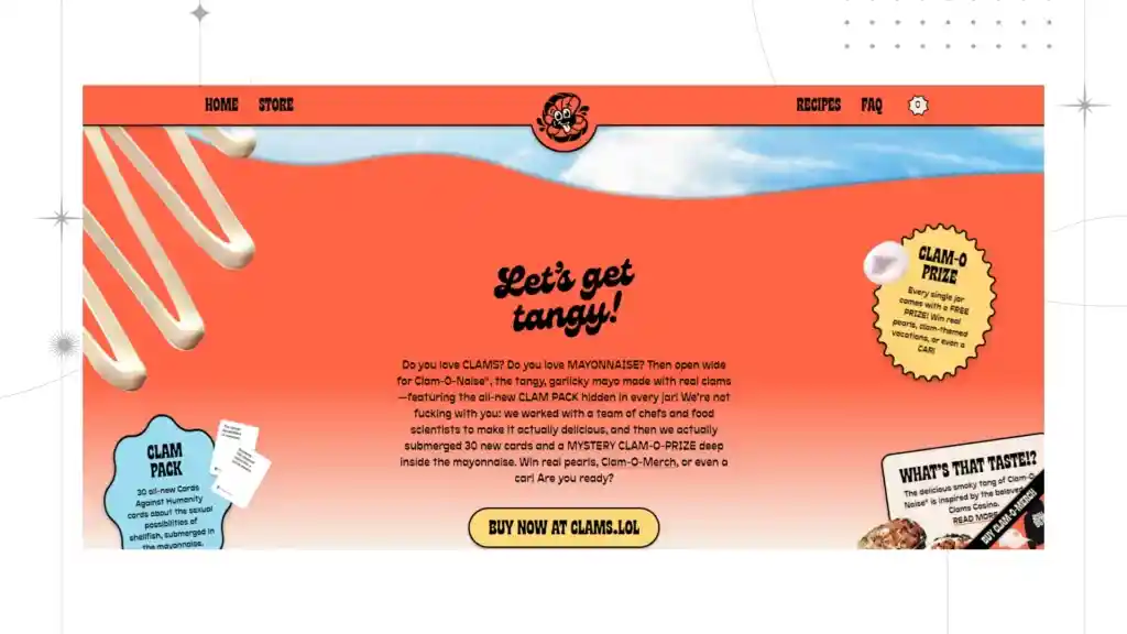
Interactive storytelling is emerging as the most efficient design in 2024. Storytelling as a design includes multimedia elements, user inputs, and branching narratives to connect with the users. People love stories. When the information and brand narratives are put forward as stories, they will have a permanent place in the users’ hearts.
Meanwhile, the design goes a step forward from conveying information and fosters a connection with the users. Be it promoting or selling a product or educating the audience, storytelling is the most efficient way to reach them. It will keep people hooked till the end, especially people with a shorter attention span. Websites like ‘The New York Times” and ‘National Geographic’ use interactive storytelling. That is to say, storytelling builds connections and leaves a lasting impression on the user.
Modern minimalism
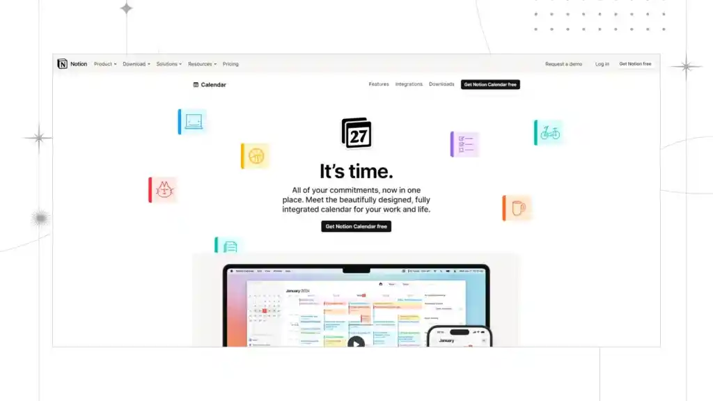
Clean lines, ample space, efficient use of elements, and restricting the overuse of elements make the web page prioritize clarity and functionality. Modern minimalism is an updated version of the typical minimalism of the past. It uses high-quality images and typeface to enhance the user experience.
Research by web designers shows that a minimalistic web design enhances the user experience by reducing the cognitive load. By removing unnecessary clutter, users are guided towards the purpose of the web page.
However, it takes a skilled hand to craft a modern minimalist design. If the design is sloppy, chances are high that users will abandon the website. In short, despite the ever-evolving landscape, minimalistic design continues to be a timeless option.
Text-only headers
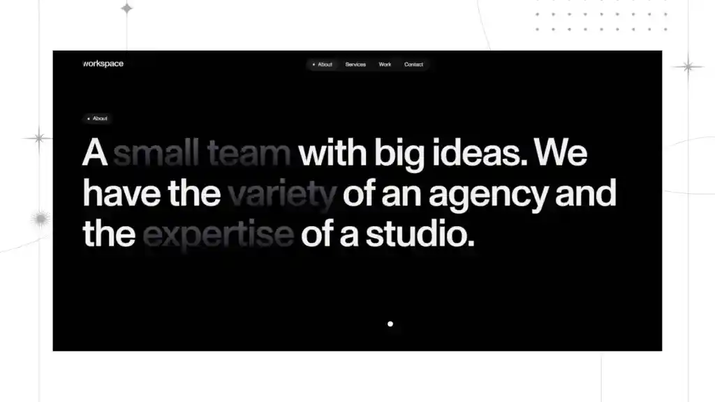
A text-only header is also known as a typographic hero. It is one of the most used designs in 2024. A text-only header aims to convey the information boldly since designs and gradient colors can distract the readers. Most designers prefer a text-only header because of its impactful, minimalistic, and straightforward design.
Secondly, text-only headers enhance the user experience by reducing the load time and letting users read the information quickly. They focus on the text, bold typography, concise message delivery, and minimalism.
In other words, by choosing the right colors and fonts, the information can be delivered effectively. However, using the right font and color is crucial since a mistake can ruin the appearance of a web page.
Dark mode
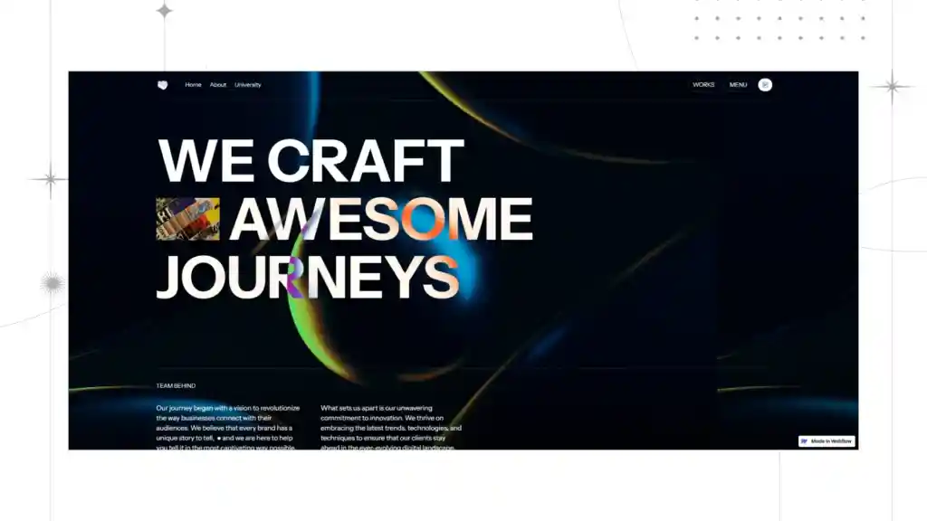
Dark mode will continue to be the most widely used web design in 2024. It offers a dark mode along with the traditional light mode for users to choose from. By providing this design, users can access the web page in low light and at night. Moreover, it helps people by avoiding eyesight problems, reducing eye irritation, increasing accessibility, increasing battery life, and creating an aesthetic appeal.
Moreover, it allows users to toggle between modes that suit them better. Imagine not having to strain your eyes while using the screen. Dark mode is not only an aesthetic element but also a battery saver.
Maximalism
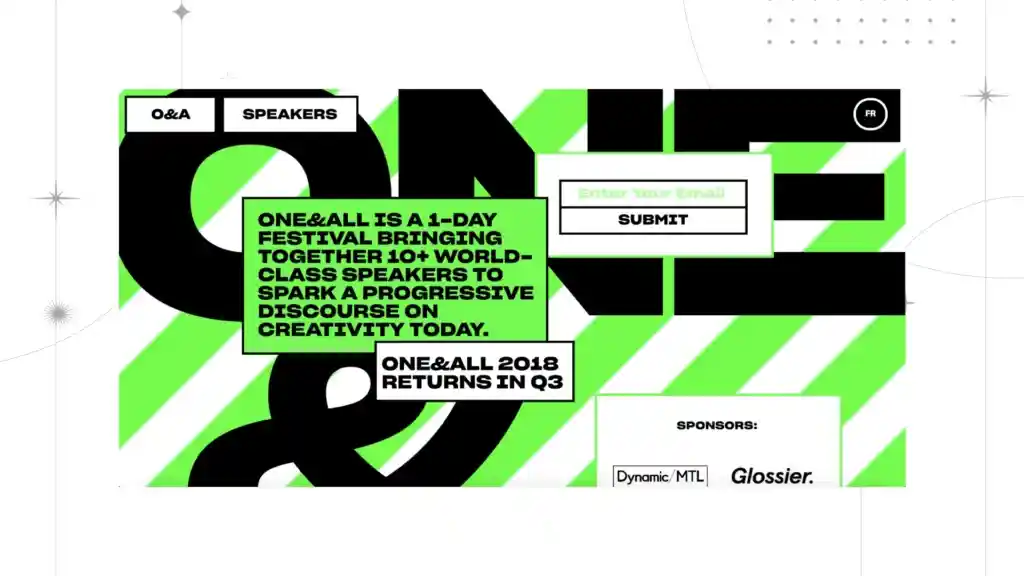
Contrary to minimalism, maximalism embraces vibrant gradients, rejects clean lines, and has a formal outlook. Maximalism is abundant and complex. It rejects everything minimalism follows. However, there are a lot of contradictions between minimalism and maximalism; both aim at enhancing the user experience.
Various designs can be adopted according to the target audience. A maximalist website contains extravagant elements, designs, rich textures, intricate patterns, and vibrant colors.
Most importantly, it takes a creative mind to successfully come up with a maximal design. Overdoing the designs may end up frustrating the users. A perfect maximal website is visually captivating, unique, and memorable.
Visible grids

Visible grids are a cutting-edge design in 2024. The design has grid lines visible on the web page to highlight the hierarchy and orderliness of a web page. Besides having an aesthetic appeal, grid lines help users navigate features with ease.
For example, platforms such as Pinterest and Behance use grid lines to showcase their wide collection of images and creative works.
That is to say that grid lines offer purposes such as emphasizing the hierarchy, adding a touch of playfulness, and acting as a meta-design. However, the usage of grid lines should be in check to maintain an aesthetic look.
Animated cursors
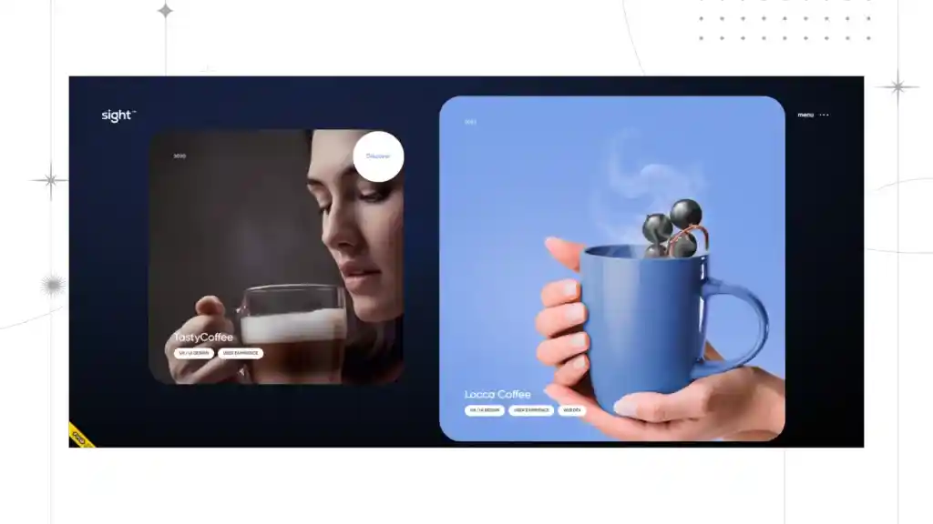
Cursors that were static and boring have been replaced by animated ones. Animated cursors add a sense of fun and playfulness to the web page. It can be the cursor that changes into a paintbrush while you are hovering over a painting or a fairy wand that sparks as you move the cursor.
They are both interesting and playful. The ultimate purpose of animated cursors is to increase engagement, provide clear feedback, and convey the brand personality. Such an aesthetic design will make the web page or a brand name memorable.
Looking for web design services?
Consider Code Theorem, a web design agency focusing on creating compelling and cutting-edge web designs to help reach a wider audience and boost the overall aesthetics of the web page.
We are a group of skilled web designers who will undertake your website and make it aesthetic and user-friendly with our website designs. We have helped hundreds of companies with web designs. Take a look at the service we provide.
Still have doubts? We’re just one call away.
Conclusion
Overall, the 2024 design trends are your cue to stop relying on just the simplistic and minimal web design styles, step out of your comfort zones, and experiment. The newest web design trends of 2024 are gonna help you achieve that.
Related Blogs
- All
- Blogs
- Development
- UI/UX Design


