The article will highlight the top 10 causes of User Frustration in UI/UX along with solutions. It will also teach you how to detect user frustrations.
Have you ever scrolled a website and gotten frustrated?
Maybe because of the long duration, poor interface, and unattractive, dull, and overly elaborate color background, you might have gotten frustrated. Sometimes, the website expresses too many elements that you get confused about what it offers.
Tiny, unnoticeable things sometimes matter the most for a user. They start judging your website based on those errors he has found, concluding it to be less professional. Have you ever faced that situation?
So, let’s understand more in detail about user frustration-
What is User Frustration in UI/UX?
User Frustration is visitors’ expression when they visit a website and find errors and mistakes in terms of navigation, user-friendliness, performance, and others.
It is often said that Bad Memories Stick Better Than Good ones. The same thing is applied to user frustration in UI UX, and we catch mistakes fast and dwell on them instead of accepting the positive expressions.
According to PWC’s Report, nearly 32% of customers or users are likely to leave the page or abandon the site if they ever experience a negative thing.
BUT, WAIT.
How to detect user frustration in the early stage: Direct and Indirect
If you are curious to detect user frustration early, congrats, you are now on the same plane. All you need to do is follow these easy-peasy processes for detecting user frustration.
Direct
Direct frustration detection is one of the best and most original ways to gauge customer sentiment and engage with them to know their view. You can go for
- Conduct surveys
- Prepare and circulate easily to fill out contact forms
- Hire experts to do social media monitoring
- Follow these things every six months
Indirect
Various companies use indirect user frustration detection processes to track the online experiences of customers. The methods used here are
- Check the bounce rate
- Track the average time customers spend on the page
- Note if any improvements in conversion rates
Whatever information you collect from this, make sure you implement it with the help of professionals for the best results. No matter what, Code Theorem is always by your side for anything, anywhere, anytime.
Okay. Now let’s understand what could be the reasons behind user frustration in UI/UX in detail-
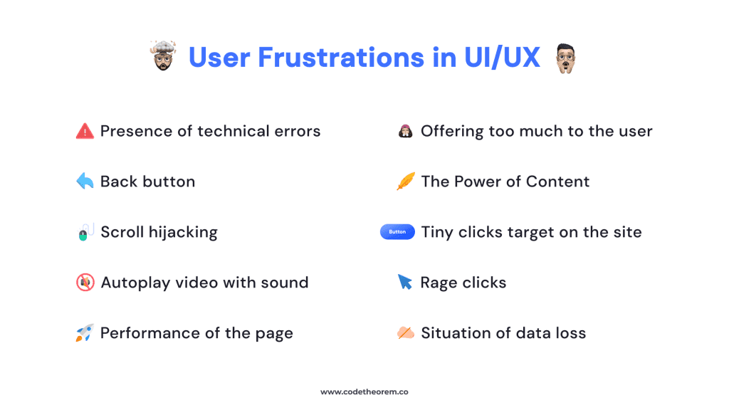
What causes user frustration in UI/UX, and how can you reduce user frustration in UI/UX?
Presence of technical errors
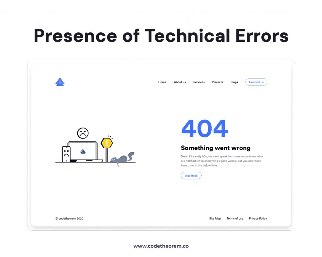
As per the UX survey, 63% of users will leave your site if they find it unreliable. By the term ‘unreliability’ in web design, we meant that
- 404 error
- Broken links
- Irrelevant CTAs
So make sure that your site doesn’t have any technical issues or broken links. Otherwise, users may consider it unauthentic, and that would be at your loss.
Solution:
Resolve this at an early stage before it becomes a burning issue to your visibility. Test it before making it live.
Agree?
Offering too much to the user
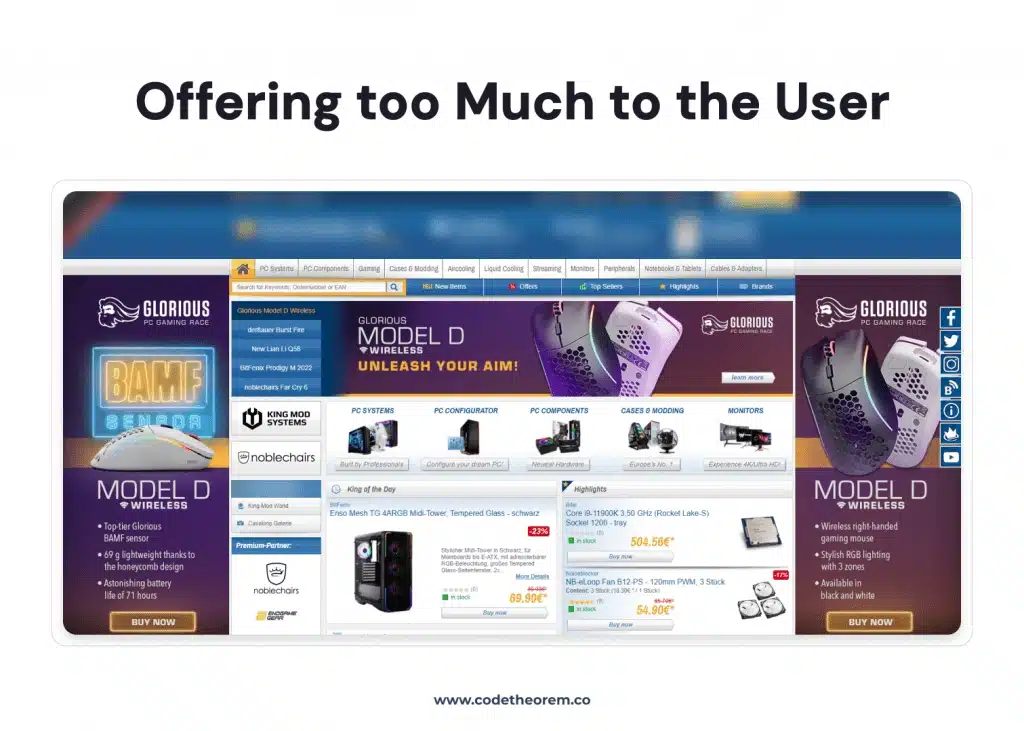
Less is more—this is the most followed principle for personal life to professional activities. You might think that offering more options to customers often makes them happier. But this is not always the case.
According to research conducted by American psychologist Barry Schwartz, offering too many choices may lead to anxiety and frustration. No matter how trivial the choice, it adds cognitive load to any user.
Solution:
So, in that case, you can insert a search filter or sort option so users do not have to browse thousands of items.
Performance of the page

Do you know the fact that 40% of users will abandon your site if it takes more than 3 seconds to load? And, as per Google, 53% will leave your site if it takes more than 3 seconds to load on mobile devices. You cannot simply ignore the issue of the slow loading of your website.
So the catch is the quicker the loading time, the faster you will have viewers. Did you know Amazon – the Ecommerce Giant, saw a 1% decrease in sales due to the page’s poor performance? And 1% equals a $1.3 billion annual loss.
Solution:
Optimize images, Minify CSS, JavaScript, and HTML, and improve server response time.
Don’t ever repeat this mistake. Check the speed of your page and start improving.
Tiny clicks target the site
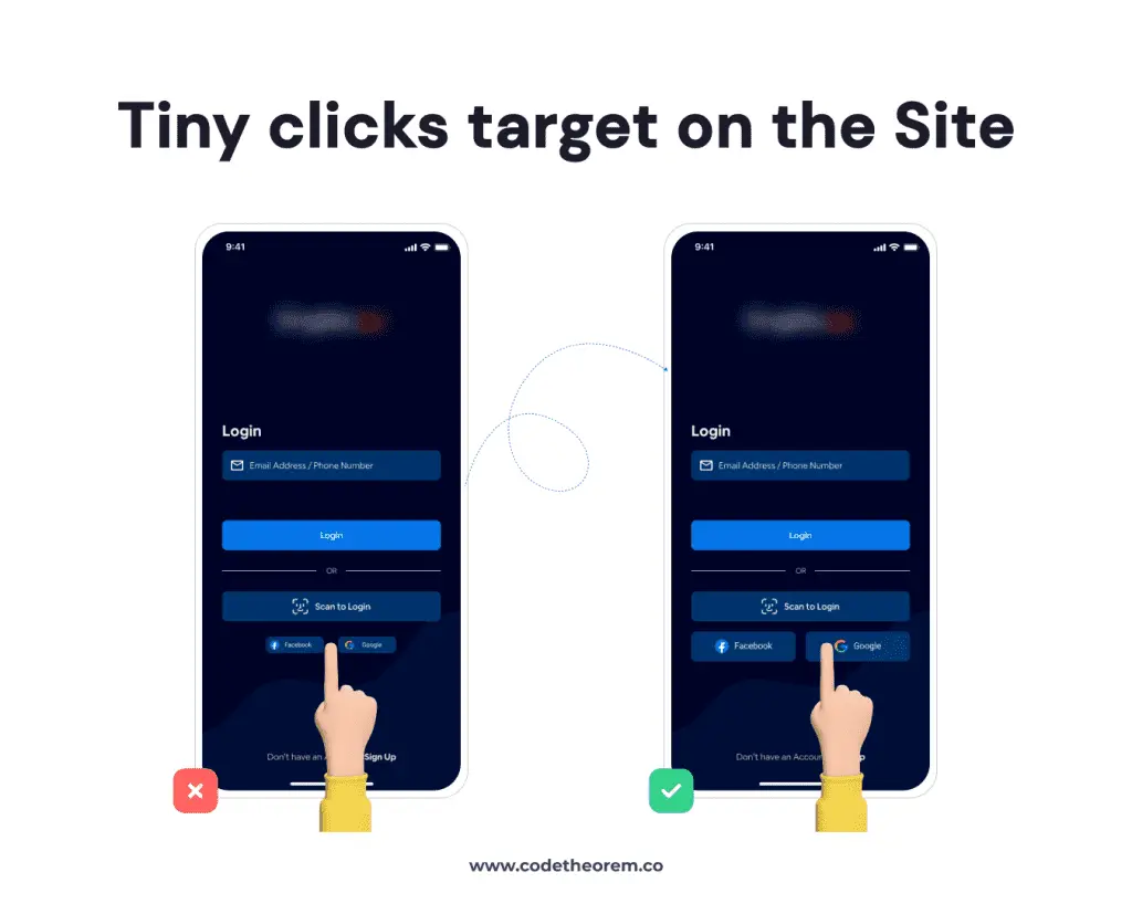
Users often get frustrated and annoyed by tiny clicks. The smaller the interactive elements, the larger the mistakes.
Solution:
Thus, this should be user-friendly. You must target 9mm x 9mm with a good paddling size.
Note that the color palette you have selected for your call-to-action button must be plain and appealing. Too much dark and gaudy can lead to user frustration in UI UX.
The situation of data loss
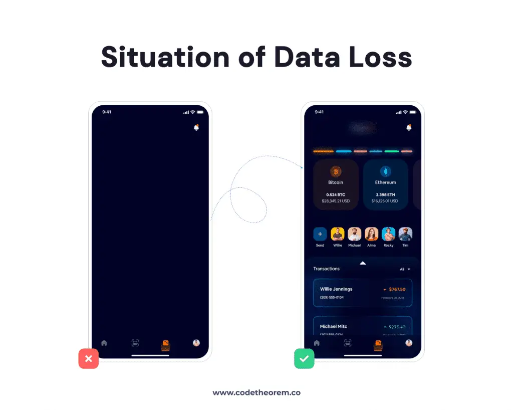
Have you ever filled out a form, spending 15 minutes of your time? And then, your page asks for reloading, where you have to fill in the data. That’s so frustrating. Now, certainly, you won’t fill out this form again and might avoid it shortly. Such a high level of user frustration in UI/UX can affect lead generation for your business.
Solution:
Therefore, you should prevent data loss by using localStorage and sessionStorage.
This will refill the data and save the information, so users cannot spend more time on it.
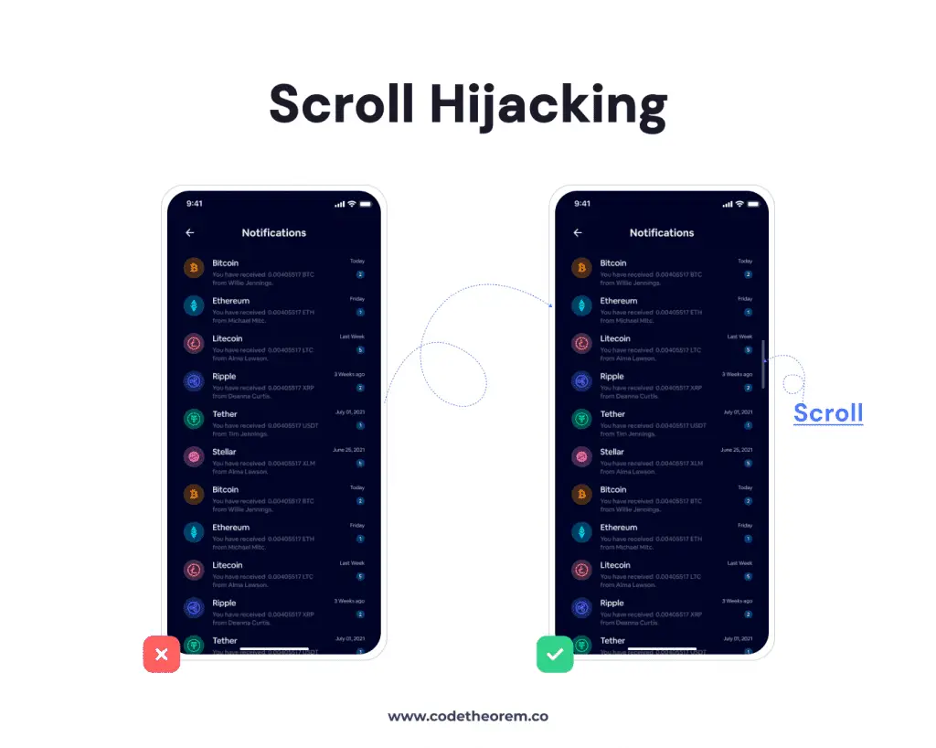
Scroll hijacking
Oh no! Did I click on Google ads?
What’s more frustrating than automatic scrolling? It is one of the most frustrating points from the user’s perspective. Scroll hijacking is an interface design that restricts the website from controlling your scrolling.
Solution:
Hire a professional UI/UX designer who can avoid pop-ups and ensure that your content doesn’t seem like a jumping jack.
Back button
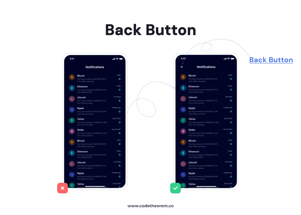
Have you ever experienced freezing back buttons?
According to design experts, there should be an emergency exit even when leaving unwanted pages, which could frustrate your users.
Solution:
Give a warning before going back. Ask permission to store cookies
Rage clicks
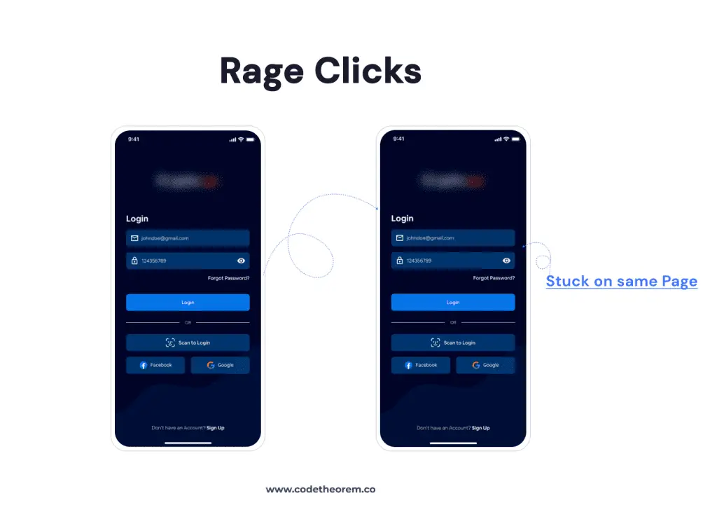
Rage clicks happen when a user clicks on the same feature very fast, too, multiple times. It shows that he is very frustrated because he is certainly not moving to the next place.
Such a situation worsens your bounce rate and may slow down the performance of a landing page. Do you agree?
Solution:
Hire a technical person who can get you out of rage clicks, dead clicks, and sessions.
Autoplay video with sound
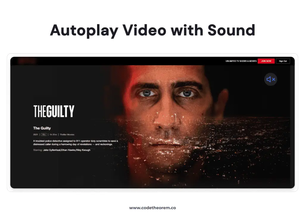
Imagine you are in a meeting, and suddenly, as you open the site, a video autoplays with sound. Now, that’s too frustrating and embarrassing.
So users may get boggled about pausing and stopping the autoplay video rather than focusing on their meeting.
Solution:
Therefore, your site must have a muted video by default. With these small things, you can win your users.
The Power of Content
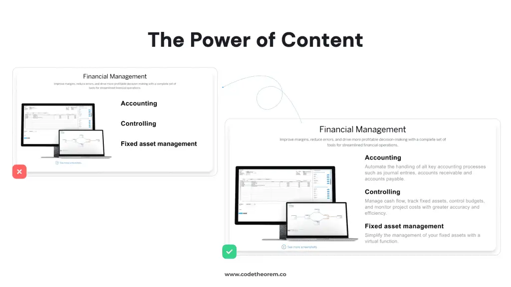
It is important to know to whom you are writing. If your content is super lengthy, but your audience is native, you may face a setback at the beginner stage.
It shouldn’t be full of jargon and buzzwords. Try to make it engaging. At least a user must be able to understand your concept in a layman’s language.
Solution:
Ask a non-technical user to read the content and provide their views. Accordingly, follow the selection of words and structure to get more reach. You can also do a content audit to avoid such user frustration in UI/UX.
The Final Words
Thus, the real money comes from finding and fixing these issues at an early stage. All you need to do is focus on creating the perfect user experience (UX) to keep your clients engaged at all times.
And, if it may seem challenging for you, then hire the most recognized UI/UX Designing Company to handle your site and maintain it for sustainable growth.
Call Code Theorem now for UI/UX Design Services because you can’t compromise on user experience.
Related Blogs
- All
- Blogs
- Development
- UI/UX Design


