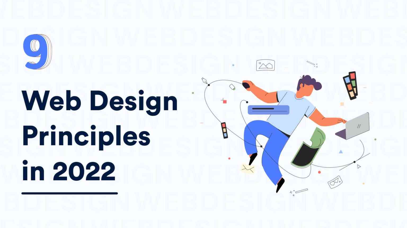
Web Design Principles are Purpose, Simplicity, Color, Typography, Visual Appearance, White Space, Grid Layout, Visual Hierarchy, Responsive

January 13, 2026 · 16 min read

Today, creating a website has become easier than ever. With so many tools available, such as Webflow which allows you to build a no-code website, the drag-and-drop way of creating a website has made a cup of tea for all. But the big question is, is your website effective in terms of usability and user experience? If the answer is NO, then you need to check whether you have been following the web design principles right or not.
No doubt, It is easy to build an attractive-looking website, but a website that is functional and attractive is more important. Not every website needs to be good-looking only, It doesn’t end there. A well-designed website is one that is user-friendly in terms of design, aesthetics, and functionality.
“Why is your website not gaining conversion?”
“Why is your bounce rate so high?”
Well, these questions are always gonna bug you if you don’t find the right solution to them. And the solution is right here. First of all, the source of your questions is that the website was not designed according to the web design principles.
You can take our word for it, these web design principles are everything you’ve always known but didn’t use before. And we are here to tell you just that it is high time to implement these impactful web design principles. Right from creative visuals to user-friendly designs and interactive content, there should be a perfect blend of all these components to strike the perfect web design.
And before jumping to web design principles, let’s take a brief look at what is a web designing
Website design is the process of planning and arranging the content, design elements, and structure of the website. Basically, it defines the look and feels of your website. Web design is the art of arranging the content, taking care of ergonomics, placing buttons, and simultaneously taking care of the user interface; this includes colors, fonts, spacing, graphics, and icons.
Web design has become more dynamic with the growing need to amplify the digital presence of all businesses and individuals as well. Web design will play a major role in attracting users to your website. Especially when you are looking for increasing conversions and decreasing the high bounce rates.

First of all, you need to clearly define the purpose of website design.
The purpose here is the type of industry the website is being made for; whether it is entertainment-based, food & travel, eCommerce, or a Magazine. This helps the designer to choose the theme for the website design.
Besides that, broadly discuss the intentions of websites and marketing. Your purpose will help designers in developing a clear plan and guide the flow of content creation. Because that’s how we will work to beat the competition. So focus on-
These points are the web design basics that contribute crucially in developing the best web page design for your online business.

Simplicity is a web design element you must follow when you are creating an effective web design.
Let’s be honest Have you ever ended up being disappointed after creating a spectacular, full-of-elements website design, just because it didn’t work effectively for user engagements and conversions? This happened because your website lacked the most important design element: simplicity.
Well, your website was overloaded with design elements, hence, creating a distraction for the users. It confuses your users, making it difficult for them to complete their user journey.
The simpler the design, the easier will be for the users to navigate through your website. Simplicity helps in making a seamless user experience for your users.
All the CTAs and actionable elements should be easy to locate, hence bringing the user focus on the important things you have to offer to them. Don’t go extra with web design, seek for less is more, and let simpler designs work their charm.

Colors have the power to elevate your web design. It is crucial to choose the right color palette and make the right color combinations for your website. They play a vital role in evoking emotions hence affecting how a user sees your website.
The colors you choose should be reflecting the message and ideas of the type of person or brand you want to represent. Website design is more like storytelling. And here, colors help in highlighting the key content in your story.
As a result, you can hire professional web designers who keep abreast of the market and latest trends and can keep your website simple with the right colors. Meanwhile, if you want to learn more about colors then check out our blog on the Color Theory

Typography is definitely our favorite element of the website. Typography helps gather the attention of your users and gives a voice to your brand. Be it bold highlighted texts on the home page or the small readable fonts, make sure there’s always a balance of font size.
Make sure you keep the font style the same throughout your website to maintain brand consistency. The font style should be reflecting the brand message. Go according to the theme and web design, and choose font styles that are minimal, and easy to read. For instance, a home cover page with uppercase typography resonates with how bold your brand is.
Don’t fall for the attractive and eye-catching fonts, they can often take the attention of users from completing their intended tasks. Not to target, align the typography with the color palette you choose, because you cannot blend a minimal and subtle color palette with a bold and sharp font style.
Above all, note that the typeface should be legible and use only three unique fonts on your website.

Visuals are the easiest and quickest way to enhance the user experience of your website. It includes illustration, still photography, video and animation, abstract images, and more. Visuals can be used for a variety of purposes in web design whether it’s telling a story, demonstrating how a product works, evoking emotion, or creating an atmosphere. They add energy to your design instead of taking up your space.
Therefore the Visual content on your website must be expressive, and clear, and should be sharing the right message. It embodies what your brand is and reveals your professionalism to a greater extent. This in turn increases the credibility of your business.
Find Free images and icons here-
Tips to include audio/ Video on the website

White space which is also known as the negative space has become a hot topic in web design. The space between graphics, margins, columns, copy, and other visuals is known as white space. You can make your website look more professional and sleek with tonnes of white space. White spacing
So, white spacing not only takes off the cognitive load but also contributes crucially to displaying the information clearly and neatly. White space makes it easier for users to navigate through your website. It greatly helps in drawing attention to CTAs, headlines, value propositions, and other key content.
Whenever you have any complex hierarchy, make sure you rightly choose white spacing to simplify the process of information sharing. This is one of the best web design tips that you must follow.

The grid layout is an intersection of vertical and horizontal lines that serves as a guide to aligning and placing elements in your web design. It is a great help for creating consistency across your website.
It helps you in dividing the content into boxes, columns, rows, and different sections. A grid-based layout helps keep your web design more organized and elements more aligned. Anyways who likes a cluttered design? We don’t!
It also helps in adding a lot of white space to your web design. Your web design needs to be consistent in terms of the alignment of elements. When your website is heavy on content then grid-based layouts are your best bet. Moreover, It becomes easier to find and navigate for users.

While we always talk about creating aesthetically pleasing web designs, one thing we missed out on was the visual hierarchy. Visual hierarchy is arranging the elements and content of your website according to their importance. It can be defined by size, graphics, font, color, contrasts, white space, texture, and style. Moreover, When you clutter up too much content it can be overwhelming for the users.
No doubt visual hierarchy is a key web design principle to make the navigation of your site easy and clear for the users. Above all, the content structure and web design will make more sense to the users with visual hierarchy done right.

In today’s date, there’s a high chance that the visitors to your website will be accessing through their mobile phones. Now, this makes it obvious that a responsive design of your web design is now a necessity. So whatever you decide for your web design also consider the fact that you have to make it responsive to the mobile screens as well.
Now here comes the important part, you have to ensure that the website looks and works on mobile screens as well as on the desktop. The reason is when the same quality of user experience is delivered on both screens, it helps in building brand consistency. Optimize your website and make it accessible to multiple screen sizes
Here are some tips from us to build an impactful responsive design:
Altogether, this will help your website be more useful, engaging, and memorable for visitors.
Design is all about inspiration. Inspiration can help you bring out new ideas for your next web design project. Explore these platforms to find your next design inspiration
Web Design Principles don’t imply a limitation to your work but ensure decent opportunities to experiment with your design. These principles demonstrate how your design can be visually attractive and at the same time functional delivering a pleasant user experience. Using these web design concepts wisely in your designs can help you enhance your website and make it more lucrative for both the business and the users.


