Hey, do you know there’s a color theory behind every design? This theory has a positive relationship with the audience’s interest and purchase intent. The blog will be covering:-
- What is Color Theory?
- Introduction to Color Wheel
- Color temperature in color theory
- Additive and subtractive color models in Color Theory
- Major 6 color scheme
- Tools for Choosing Color Palette
Let’s first understand the color theory:
Article content
What is Color Theory?
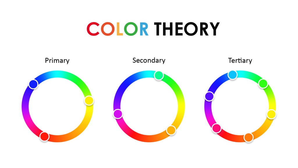
Color Theory is a body of practical guidance that mixes colors to provide a visual impression of your product. A Color palette is widely used for communicating the message to the audience. Professional designers often use a coloring wheel to collect the sample of information pertaining to-
- Signal actions and influence physiological reactions
- Guides the curation of color palette
- Help you understand the psychology of users
Introduction to Color Wheel
Color Wheel is an effective tool to obtain the best color combinations. A color wheel or color circle is a combination of primary, secondary, and tertiary colors organized in the form of a wheel or circle.
Do you know the psychology of color was coined by Sir Isaac Newton in 1666? But, what was the basic thought behind this? He understood colors as human perceptions by categorizing them into three different groups-
- Primary – Red, Yellow, and Blue
- Secondary – Shades of Primary Colors
- Intermediate or Tertiary – Mixes of Primary and Secondary Colors
After classifying the color schemes and palette of colors, it focused on advanced colors covering two main forms- Print and Screen. These two forms include hues, shades, brightness, contrast, saturation, and others.
Let’s discuss this in detail-
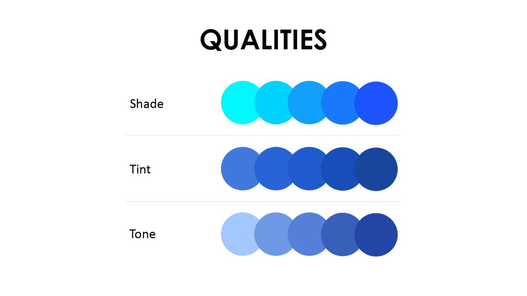
Hue
Hue is said to be the origin of color. It gives you a pure pigment and does not reflect shades or tint. For instance, if you mix primary and secondary colors, you get a hue. The wavelength of light determines it.
Example: Green, Orange, Red, or Violet
Shade
Shade refers to the proportion of color added to the hue because that’s what darkens a color. So, for instance, if you add black color to any color design, the darker version will be called a shade.
Tint
A tint is completely the opposite of shade. Adding black makes the color palettes darker while adding white makes it a little bit light. For instance, pink is a tint of red and light blue is a tint of blue.
Tone
When you combine both black and white colors, what you get is tone. So it is more of modifying the hue and combining shade and tint to get the perfect tone you want. Tone can make a colorless image intense, bringing out vivid color combinations. For instance, yellow is bright, and orange is dark.
Color temperature in color theory
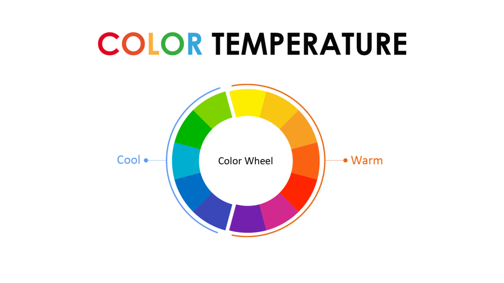
Have you ever realized that even color has a temperature? Well, this is one of the most important things in color theory. So, the colors of the wheel are generally divided into two forms-
1. Warm Colors
Warm colors are the color of fire that includes- Red, Yellow, and Orange, radiating warmth and heat. These colors are quite bright and symbolize passion, enthusiasm, impulsiveness, energy, vibrant behavior, and a loud tone.
These colors are confident enough to attract the audience with their lustrous and bright shade.
Okay, so have you ever noticed the logo of Ola?
Well, it has yellow and black colors where the main intention is to let users recognize Ola far from a distance. The logo looks like a tire with bright yellow for attention gathering.
Did you know a fact about the Red color?
Almost all fast-food chains have red, orange, and yellow colors in their logo. Did you observe that? Wondering why? Because yellow and orange are colors that make people feel hungry, and red brings out the energy to have some food.
2. Cool Colors
Cool Colors are like flowing water that symbolizes peace, harmony, and calmness. It includes blue, green, and violet that radiates tranquillity and mental stability. These shades mostly remind us of the sky, nature, space, and water.
Green – Nature-Friendly Brands like Nature’s Basket
So, that’s the case when any company launches an environmentally friendly product; it chooses cool colors like shades of green over warm colors. Here, the personality of products plays an integral role in selecting between cool and warm colors.
Blue – Medical Institutions
Do you know drinking water companies, governmental organizations, technology-based businesses, and medical institutions use the blue color in their logo? Wondering why? Because blue is the color of confidence, faithfulness, and depth.
The importance of color in design
- Color sets facilitate visual search that speeds up the search process
- Improves the usability with right-colored button selection
- Colors evoke emotions and create a mood for users while shopping online
Additive and subtractive color models in Color Theory
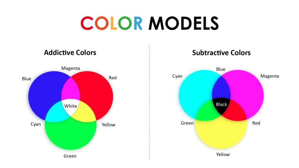
Do you know the power of mixing color charts ?. Okay, so let’s discuss the two basic ways of mixing colors-
1. Additive Colors in Color Theory
But where can I find additive colors? Computer monitors, Television, mobile phones, and Cameras, are using additive colors.
The RGB (Red, Green, and Blue) model is primarily used for screen display. So these three colors are activated by an electrical charge that brings out the glow. Now, when you combine all, you get ‘white light’ as a result.
It is like- the more you add colors, the lighter will it get.
2. Subtractive Colors in Color Theory
When you combine two pure additive colors, you get subtractive colors. It reflects more of the CMYK model (cyan, magenta, yellow and black) to produce color using reflected light. This model begins with white (paper) and ends with black.
So, the more color you add to it, the darker it will get. This CMYK model is used primarily for printing or other similar processes to alter the full-color appearance.
Compare the figures for Additive and Subtractive Colors for a better understanding.
But, which Color Model should I choose?
Before working on any project, selecting the right color model and defining the design process is very important to produce desirable results. Because if you want your final image to print, you need to convert it into a CMYK model from RGB.
Still, a bit confused between these two? Have a look here-
Choose Additive Color Model only when-
- You are looking for a digital presentation
- This will result in a duller image
- Ideal for Web graphics and video making
Choose Subtractive Color Model only when-
- You are looking for a print setting
- It will deliver unexpected results
- Ideal for poster making or printing newsletters
Major 6 color scheme
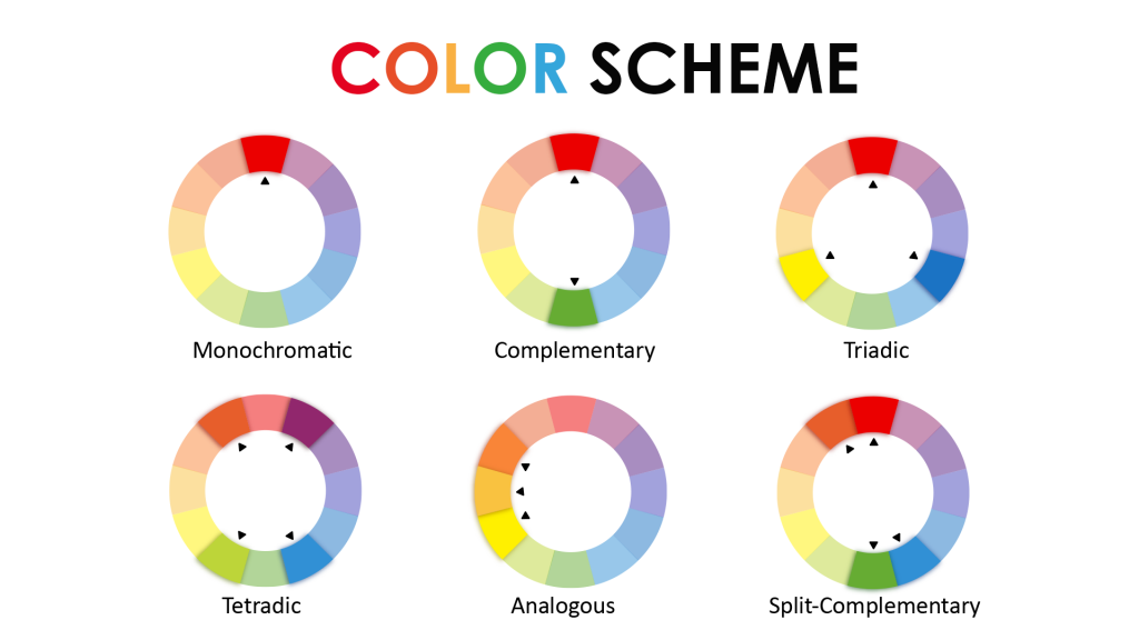
Color Palettes or Color Scheme is a group of colors selected by designers or professionals to deliver a classic impression to the user. A few of the different types of colors in the palette are-
1. Monochromatic
A monochromatic color scheme is derived out of one sole hue, tint, and shade. Since it uses only one color, it is quite easy to create monochromatic shades. Although it lacks contrasting effects, this palette makes your website look cleaner and more polished. Do you want to give it a try? Hire UI UX Designers now!
2. Analogous Palette
This palette uses toning colors, either in the cool or warm spectrum. For instance, are red-orange-yellow combinations or green-blue-violet more appealing than violet-green-orange? Often used to promote a sense of security and serenity by presenting comfortable shades. Ensure you go with a contrasting palette where one color will dominate and the other will support.
3. Complementary
As the name suggests, you have to choose two colors and then create shades, tints, and tones of those same colors. Congratulations! You just made your complementary color palette.
Wasn’t that too simple and quick?
Using these tints and shades, you can also create depth and character in your area. Do you know that in this complimentary palette, the tints are used as the focal points? As a result, it can produce anything right from a vibrant, splendid style to a gentle, sophisticated look.
4. Split Complementary
On the color wheel, these are exact opposites. It is more of a variation in the complementary color scheme. This is considered one of the ideal concepts for beginners because there’s hardly any chance to mess up. What you can do here is-
- Select a color (Let’s say I have selected a Blue color).
- Select a color that complements the first one (orange).
- Now, on the other side, select orange on the color wheel, turning out to be (yellow-orange and red-orange). This will display the nuances of color yet still maintain strong focal areas.
5. Triadic Complementary
Triadic Complementary offers a strong visual contrast evenly spaced around the color wheel. Here one color is dominant, and the other colors are for accents. These colors are unsaturated still, and it reflects vibrancy in every shot
6. Tetradic (Double Complementary)
Double Complementary takes four colors into consideration. (e.g., orange/yellow/blue/violet). Pay attention to the cool and warmer shades for a vibrant effect. Here you have to choose one color to dominate, and the rest will face into place supporting your selection.
The best online tools for choosing a color palette
Neon and Bright Blue? Pastel or Light Grey? Struggling with the color palette? Check out these commonly used online tools for selecting the ideal color palette for your project-
Adobe Color CC
Adobe Color has almost all the colors that you are looking for. In addition, it is much more comprehensive than other online tools that let you pull colors from the images uploaded. So you can give it a try.
ColorSpace
ColorSpace is the best tool for you that generates various color combinations to match your choice.
Designspiration
Designspiration lets you select and browse color palettes to design content as one of its kind for Infographics, social media posts, or any other.
Adobe Illustrator color guide
When you choose one color, it will generate a five-color palette for you. Besides that, it will also provide you with a range of shades, and tints, for each color selected.
Contact us now for any queries. We can help you create flawless designs for your business with the best color palette.


