Choosing the right or best fonts for an ecommerce website helps you to build a strong brand image for your audience

January 13, 2026 · 16 min read

Contact Us
Choosing the right or best fonts for an ecommerce website helps you to build a strong brand image for your audience
Do fonts really matter for an eCommerce website?
At first glance, it’s tempting to say no. Products sell products, right? But that assumption quietly ignores how people actually shop online.
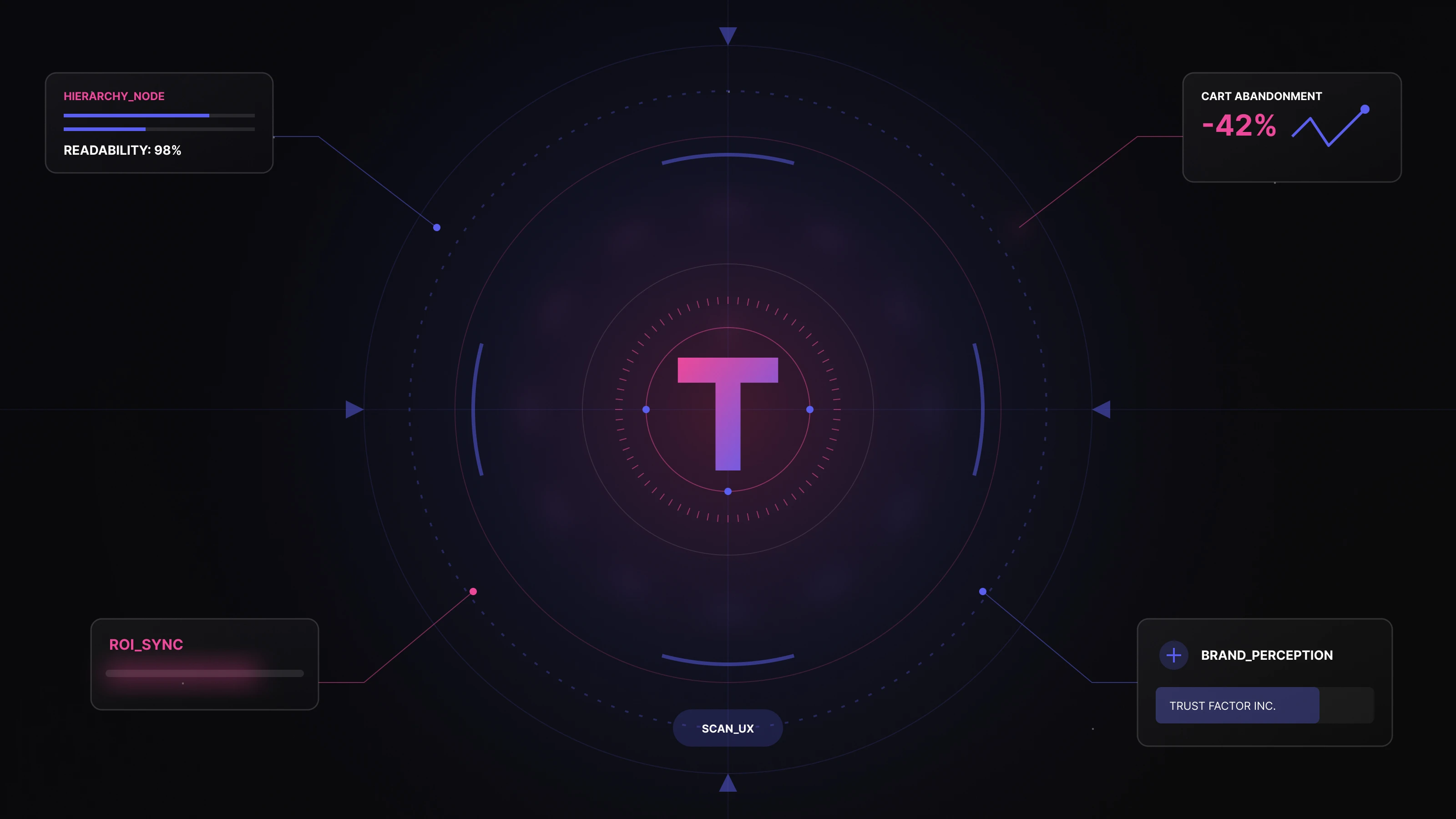
In eCommerce, design decisions are rarely neutral, and typography is no exception. Multiple UX studies consistently show that users form an opinion about a website in under 50 milliseconds, and typography plays a measurable role in that first impression. Before users read your product description or compare prices, they subconsciously judge clarity, trust, and usability based on how text feels to read.
From a UX psychology standpoint, fonts influence cognitive load, the mental effort required to process information. Poor font choices increase friction: users take longer to scan product details, misunderstand key information, or struggle during checkout. This directly affects conversion rates, bounce rates, and cart abandonment, especially on mobile devices where screen space is limited.
Research-backed UX patterns show that:
For an eCommerce website Development, typography isn’t just about aesthetics; it’s about guiding behavior. The right font choices subtly encourage users to scroll, compare, add to cart, and complete checkout without friction. The wrong ones introduce doubt, slow decision-making, and silently push users away.
That’s why choosing the best fonts for an eCommerce website in 2026 isn’t about trends or personal taste. It’s about aligning UX design principles, conversion psychology, and brand positioning so every word works harder toward revenue.
This guide explores the importance of brand fonts in modern eCommerce and walks you through how to choose the best fonts for your website in 2026.
Fonts play a critical role in shaping a smooth and intuitive user experience. In UX terms, the goal is to keep the interaction cost—the effort required to read, scan, and understand content—as low as possible. When typography is readable, well-spaced, and visually balanced, users process information faster and with less friction.
For eCommerce websites, this matters at every step from browsing categories to reading product descriptions and completing checkout. Fonts must remain clear and legible across devices, screen sizes, and lighting conditions. If users have to strain to read, trust erodes quickly. This is why choosing the right fonts for your eCommerce website isn’t a cosmetic decision it’s a usability requirement.
What you say and how it’s presented are two separate but equally important parts of communication. Fonts act as a visual voice for your brand. They signal tone, intent, and credibility before a single word is consciously read.
For example, a soft, expressive typeface might work well for a fashion or lifestyle eCommerce brand, while the same font could feel inappropriate or untrustworthy in a healthcare ecommerce or financial context. The right typography aligns with your brand personality and reinforces what your business stands for subtly but powerfully.
Typography directly influences how long users stay on your website and how confidently they move toward a purchase. This is a core principle of conversion-focused UX design, where visual clarity and readability reduce friction and increase trust.
Well-chosen fonts help build trust, reduce hesitation, and create a sense of professionalism. Over time, this becomes a competitive advantage. Fonts also influence emotional response. Clean, consistent typography can make users feel reassured, while poor font choices can introduce doubt. In eCommerce Design, trust and clarity often decide whether a user converts or leaves.
Moreover, fonts create a sense of trust in the users. It works as a competitive advantage for your business. Fonts help evoke positive emotions among visitors, encouraging them to explore more on your website.
No matter how strong your design is, overusing fonts can quickly make an eCommerce website feel cluttered and confusing. As a best practice, websites should use no more than three font styles. This maintains visual clarity and ensures content remains easy to scan.
Primary fonts are the most prominent typefaces on your website. They appear in high-visibility areas such as headings, banners, product titles, and key messages. These fonts define your brand’s visual identity and set the overall tone of the experience.
Primary fonts should be bold enough to command attention while remaining legible across devices and screen sizes.
Secondary fonts are used for body text, descriptions, and longer content blocks. Their main purpose is readability. Since users spend the most time reading this text, secondary fonts must be comfortable on the eyes, well-spaced, and easy to scan, especially on mobile devices.
A strong secondary font reduces reading fatigue and keeps users engaged longer with product details and supporting information.
Accent fonts are used sparingly to highlight buttons, labels, badges, navigation elements, or short emphasis text. These fonts add personality and visual interest without overwhelming the layout.
Before choosing the best fonts for your eCommerce website, it’s important to understand the core font categories. Each typeface carries its own personality, usability strengths, and best-use scenarios. Most eCommerce typography systems are built using one or more of the following three font categories.
Serif fonts are typefaces with small strokes or “feet” at the ends of letters. They’ve been around for centuries and are deeply rooted in traditional print typography. This long history gives serif fonts a sense of heritage, authority, and sophistication.
Despite being considered classic, many serif fonts remain highly readable—especially for longer text—when used correctly on the web. Modern screen-optimized serif fonts work well across devices and resolutions.
Where to use:
Serif fonts can be used effectively for headings, editorial-style sections, and even body text on content-heavy eCommerce websites.
The following are the brands using serif fonts:
The following are the Serif font styles:
Sans serif fonts remove the decorative strokes found in serif typefaces, resulting in a clean, modern, and highly versatile look. Their simplicity makes them one of the most widely used font categories in digital products and eCommerce UX.
Sans serif fonts are easy to scan, perform well on mobile screens, and adapt effortlessly across layouts. If your website has a bold layout, strong visuals, or unconventional design elements, sans serif fonts help maintain visual balance and clarity.
Where to use:
Sans serif fonts work well as primary, secondary, or accent fonts, making them ideal for full-site typography systems.
Brands using sans-serif fonts:
Popular sans-serif font styles:
Script fonts—often referred to as cursive fonts—are inspired by handwritten letterforms. Originally designed to make writing faster and more expressive, script fonts today are used to convey creativity, elegance, or personality.
While visually appealing, script fonts are not suitable for long-form content due to readability constraints. When used sparingly, however, they can add strong character to an eCommerce brand.
Where to use:
Script fonts are best reserved for logos, short phrases, badges, or accent text—not body copy or long descriptions.
Brands using script fonts:
Berkshire is a semi-sweet typeface with a feminine and bold touch flair. It would work wonders for a beauty & cosmetics brand and a jewelry e-store.
Lato gives the users a warm and welcoming vibe with a tinge of seriousness. It is the perfect brand font for a business that wants to be perceived as Bold, trustworthy, and approachable. It is from the sans-serif typeface family.
Merriweather is quite popular and one of the widely used brand fonts for websites. Especially for the e-commerce ones. Indeed, it is pleasant to look at because of its condensed letterforms. Also, it is ideal for font pairings. If you wish to have a high-end brand image, then Merriweather is the best font style for it!
Montserrat is one of the brand fonts with a vintage touch in its geometric style. It is a great fit for all text cases, capitals, lowercase, or paragraphs, perfectly. No doubt, it is one of the most versatile font styles.
Neue Helvetica is a font used by many well-known brands like Facebook, eBay, and Yahoo. The font style is simple, readable, and works well in the header and body text fonts.
The perfect option for the headlines! Oswald brand fonts know how to grab users’ attention, be it the titles or the paragraphs.
Pro tip: Oswald’s fonts look the best in all caps.
Open Sans is one of the best fonts and the most popular free fonts. The reason is that it is readable on screen, especially for small screen sizes. According to Wikipedia, it was the second most used Google font in July 2018.
Playfair Display is a beautiful serif font with rounded corners and curves. It is a versatile brand font that fits well with most website design aesthetics. It is excellent with a title and short content, but not advisable for the lengthy paragraph, as it becomes less readable.
Raleway is an elegant, ultra-light sans-serif font type. It is ideal to use with headlines and large-size text, but is short in length. Raleway would be the perfect brand font for a food and beverage business.
Roboto does have a slightly mechanical feel to its letters, and yet it is comfortable to read. It was initially designed by Google to become the Android system font. And now YouTube and Flipkart.
Fonts should enhance your design, not compete with it. A common rule of thumb is to limit your website to two fonts, one for headings and one for body text. In rare cases, a third accent font can be added for emphasis.
Using too many fonts creates visual clutter and weakens hierarchy. Overly unique or decorative fonts may look interesting in isolation, but they often hurt clarity and distract users from the actual goal: browsing products and making decisions.
For most eCommerce websites, two well-paired fonts are more than enough to create a clean, high-converting interface.
Your eCommerce website will be accessed across desktops, tablets, and mobile devices—often in less-than-ideal viewing conditions. That means your fonts must remain legible at different sizes, resolutions, and lighting environments.
Before finalizing any font:
Decorative fonts may look attractive, but they often fail in real-world usage. If a font slows users down or makes scanning difficult, it’s not doing its job—no matter how stylish it looks.
In eCommerce, readability directly affects conversions. If users struggle to read product descriptions, policies, or pricing details, they lose confidence and leave.
Readability isn’t just about writing quality; it’s also about letter spacing, line height, contrast, and font structure. The right fonts make content feel effortless to consume, while poor font choices introduce friction.
Choose brand fonts that:
Work inquiries
Career
Address
Quick Links
Solutions
Industries
Address


Talk to the Founder. Build with Clarity.
Talk to the Founder.
Backed by 20+ years of Design & Engineering experience.
30 minutes. Founder-led. Clear direction.

