Check out the best-proven Ecommerce checkout UX practices to convert cart abandoners to checkout champions!

January 13, 2026 · 16 min read

Contact Us
Check out the best-proven Ecommerce checkout UX practices to convert cart abandoners to checkout champions!

In today’s fiercely competitive online marketplace, mastering the art of the eCommerce checkout experience is essential for success. Imagine searching for the best pair of shoes, comparing prices, features, and delivery options, and after days of thinking over it, you decide to buy the one that suits you. You have read the description, checked all the features, applied the promotion code, and availed of the discount. When you are all set to pay, you click on Place Order. It takes you to another page and asks you to create an account and set a password. You fill in all the information, and finally they come up with an extra delivery charge, and the website design is kind of sloppy.
Would you still proceed to place the order? It will be a turn-off, won’t it? The reason for this is sloppy UX design. The eCommerce checkout design should be user-friendly to boost conversion. It is quite common in the e-commerce world. Studies show that 70% of customers abandon the cart during the checkout stage.
This article aims to share proven eCommerce checkout practices. Whether you are a business owner worried about the deteriorating sales rate or someone who seeks inspiration for your design, hop on to check out the best eCommerce checkout practices that convert.
Single-page checkout and multi-step checkout are the two predominant checkout types. Depending on the audience and goals, you can choose one. Let us discuss the, in detail:
According to studies, 11% of customers give up during the checkout process!
The e-commerce checkout process consists of six steps:
This is the first step of the checkout process. This is where the customer checks their chosen product and quantity. It should be transparent. The subtotal and estimated delivery time should be mentioned properly. If possible, promo codes can be shown to build trust.
A flexible entry point should be made for customers. Recurring customers will find it easy to access the site since they already have an account. New customers may need help to register while checking out.
The shipping address should be mentioned clearly, along with the estimated delivery time and date. Other flexibility options, like specific pickup points, locations, work, and houses, can be added to satisfy the customer.
Filling out information can be overwhelming and makes room for them to have a second thought. To eliminate this, auto-fill options, and secure data handling can be introduced.
Quickly reviewing the payment details and delivery address can help reassure the customers. This will eliminate last-minute jitters and build trust.
The penultimate and the most important step. Various trustworthy payment options such as debit cards, credit cards, EMI options, and UPI should be added to make it easier for the customer. Sending off the customer without any friction or doubt is of paramount importance.
Send off the customer with a brief detail of their purchase, an estimated delivery time, and easy access to customer support.
It’s all about the customers’ sophistication on the eCommerce checkout page. The eCommerce checkout steps should be given utmost care to boost conversions.
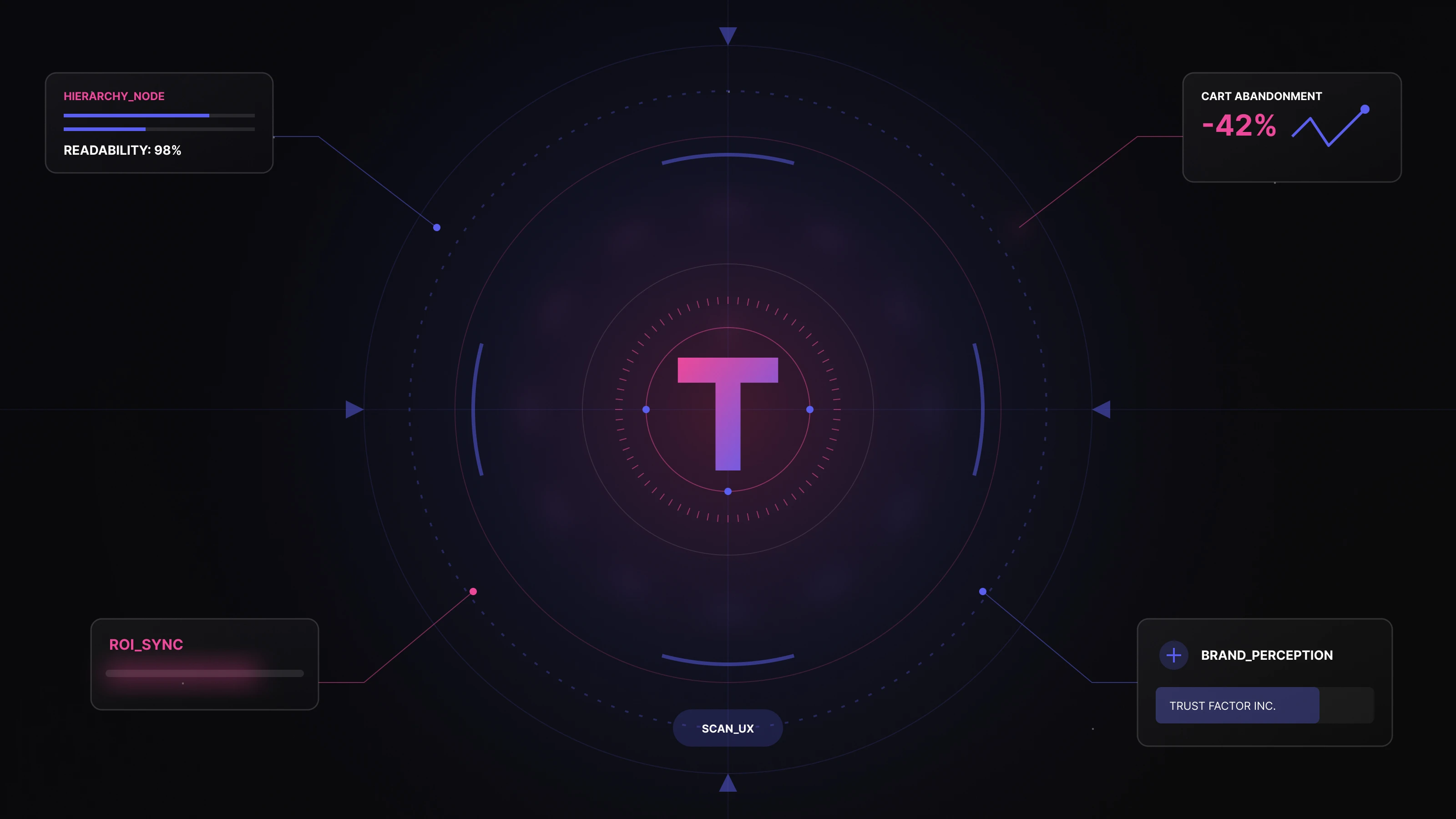
The thin line between the customers abandoning you or proceeding to buy lies, checkout UX design. Here are some pointers on why seamless checkout UX is crucial:
One of the reasons customers are on the checkout page is that they trust you so far. It takes a lot of cognitive load to make a purchase. It is in the hands of the UX designer to make it easier for the customers to navigate through the eCommerce checkout process.
A familiar, calm, and intuitive UX design will eliminate last-minute checkout anxiety and boost conversion. Transparency in the process will bolster confidence.
Every click, every detail asked, and every page shown adds a mental hurdle. UX streamlines the process with eCommerce guest checkout and auto-fill options to help customers navigate the process. This will gain confidence and reduce anxiety.
Engaging the customers with a progress bar, aesthetic designs, and subtle animations will increase the chances of conversion by building confidence.
One of the main reasons for cart abandonment during the checkout stage is a sloppy UX design. The absence of a user-friendly design is a major deterrent. Complicated forms and unclear calls to action can turn away the customers.
One of the main causes is the hidden costs, when the customer has made up their mind to spend a particular amount on the product and they see an additional charge in the checkout section, it causes friction and increases the chances for the customers to abandon the cart.
The checkout process in eCommerce is the most important step. Utmost importance should be given here. All your efforts would go in vain if the customer jilts you at the checkout process. Follow the eCommerce checkout optimizations to step up the conversion game:
Unnecessary questions are pet peeves. Just stick with only the necessary information. No one would be interested in sharing their shoe size unless they are buying a shoe. This being straightforward with the customers makes it easy for them to complete the purchase. Remember, user experience is the key to conversion.
Don’t keep the customers guessing. In the checkout area, give strong and compelling calls to action, seamless designs, and contract colors to entice them to move forward. Some strong calls to action like “Order now” and “Checkout now” can be used.
Show your customers the light at the end of the tunnel. Using progress bars can give them a satisfying feel and help them navigate themselves in the process. This will enhance user experience and boost conversion.
Imagine having to fill in all your details to create an account at the end of the process. Frustrating right? The utmost priority of eCommerce development is to enhance user experience, not to make it otherwise. Using eCommerce guest checkout saves your customers valuable time and creates a good impression.
In the era of increasing scams, give your customers some trust signals such as adding customer reviews, testimonials, and security badges. This will reassure them and bolster trust so that they will leave the page satisfied.
Introduce the auto-fill option and real-time validation to save your customers some of their valuable time. This will reduce typos and anxiety paving the way for a smooth eCommerce checkout experience.
Remember, a picture speaks a thousand words. E-commerce designs have a huge take on conversion. Save your customer from having to read the step-by-step tutorial to make the purchase. Use clear logos and signs to enhance user experience. This will smoothly guide them towards the checkout process and avoid cart abandonment.
Studies show that most eCommerce transactions are done via mobile. It is paramount to make the eCommerce checkout flow mobile-friendly. Make sure your mobile customers do not strain their eyes when reading the text.
Provide multiple payment options like debit cards, credit cards, UPI, and wallet purchases. You never know what your customer prefers. It is safe to keep them all. Ensure all payment options are available on the payment gateway with their respective logos to build trust.
Don’t abandon your customers once they make the payment. Everyone would prefer reassurance. Provide them with a summary of their purchase with the estimated delivery time, and date and thank them. This will instill confidence and promote trust.
Here’s a quick summary:
The eCommerce checkout UX is a make-or-break thing. The business owner or the UX designer should be careful with the designs. One mistake and the whole thing will be ruined. To satisfy the customers, mastering UX design is the key.
A clear and to-the-point UX design equals Conversion. A lousy UX design can mar the customer’s mood and will lead to cart abandonment. Investing in enhancing the user experience is paramount to the success of an online retail business.
According to studies, a seamless UX design has a higher rate of conversion compared to a business with a sloppy UX design. One should equip a seamless UX design and invest in user experience to win the race.
Meet Code Theorem, we are a UX and UI Design agency, committed to helping retail businesses with seamless user experience design.
We enhance theeCommerce user experience with our cutting-edge designs to give your online retail business a leg up. Schedule a call with our expert team. Our design geeks will take you from there.
Let’s make it happen!
Work inquiries
Career
Address
Quick Links
Solutions
Industries
Address


Talk to the Founder. Build with Clarity.
Talk to the Founder.
Backed by 20+ years of Design & Engineering experience.
30 minutes. Founder-led. Clear direction.

