The business landscape has shifted dramatically over the last decade, driven by cloud computing, automation, and AI-led decision-making. At the center of this transformation is Software as a Service (SaaS). Today, SaaS platforms enable businesses to access powerful tools without heavy infrastructure costs, long implementation cycles, or complex maintenance. In fact, industry reports estimate that over 85% of business applications will be SaaS-based by 2025, making SaaS the default delivery model for modern software.
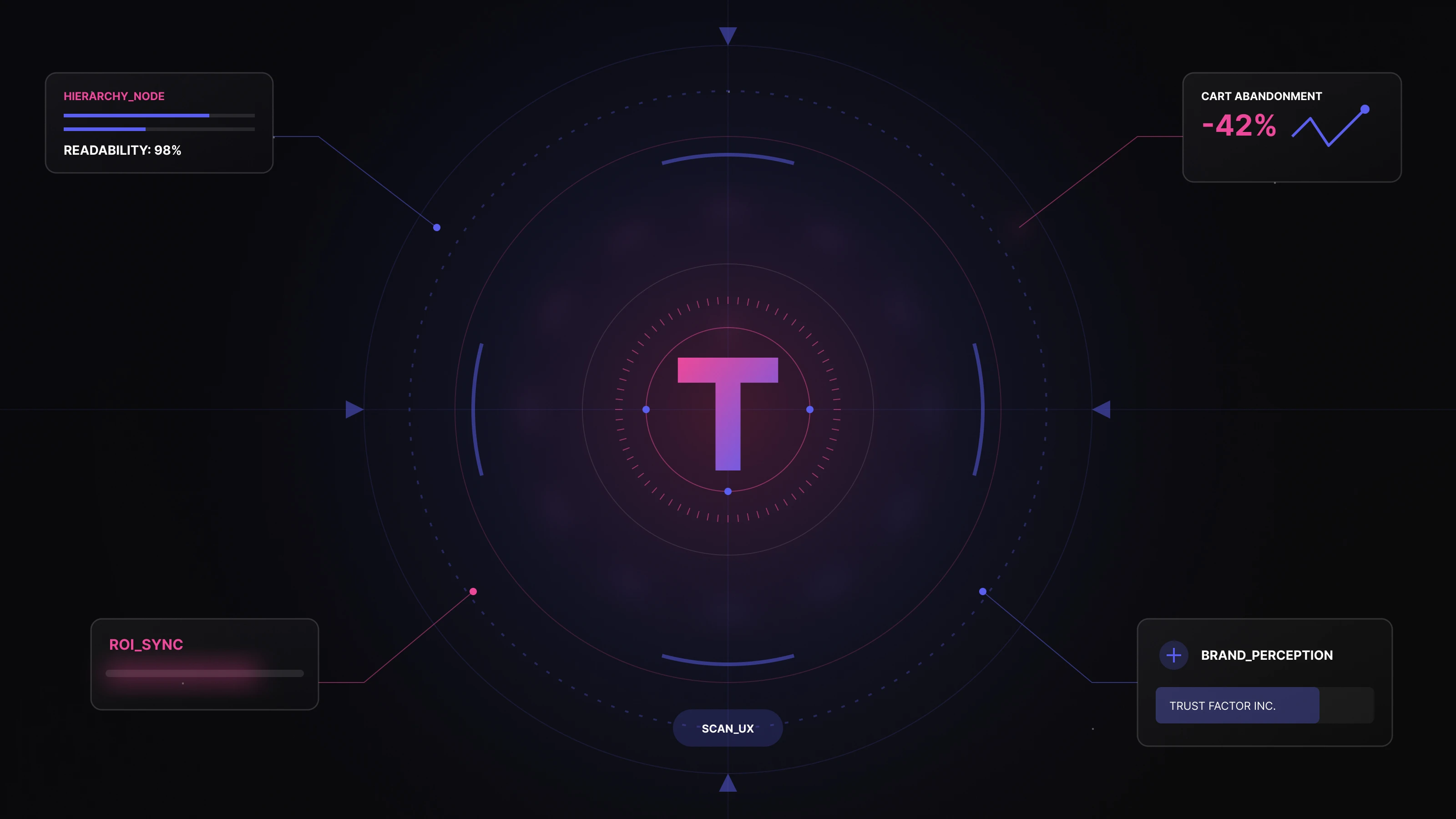
As SaaS adoption grows, so does the importance of dashboards, the primary interface where users interact with data, insights, and workflows. SaaS dashboards are no longer static reporting screens. They now act as real-time command centers, combining metrics such as revenue, growth, customer behavior, and operational performance into a single, actionable view.
With the rise of AI and machine learning, dashboards have evolved even further. Modern SaaS dashboards don’t just display data, they interpret it. AI-powered dashboards can surface trends, predict outcomes, highlight anomalies, and recommend next actions, helping teams move from reactive decisions to proactive strategies.
In this blog, we’ll explore what makes an effective SaaS dashboard design, the UX best practices that drive adoption and clarity, and the latest AI-driven trends shaping how users consume and act on data inside SaaS products.
What is SaaS dashboard design?
The dashboard is the first screen users interact with when they log into a SaaS product. It acts as a centralized in-app interface that surfaces the most important data, activities, and performance indicators at a glance. A well-designed SaaS dashboard helps users quickly understand what’s happening in their account—without digging through multiple screens.
Unlike generic reporting tools, SaaS dashboard design is highly contextual. Every SaaS product serves a different purpose: CRM, analytics, finance, HR, marketing, or operations, so the dashboard must be tailored to reflect the product’s core value and user goals. The metrics shown, the hierarchy of information, and even the visual components vary based on what matters most to the end user.
Modern SaaS dashboards go beyond static data. With AI-driven insights, dashboards can now highlight trends, flag anomalies, predict outcomes, and guide users toward the next best action. This shift from “data display” to decision support makes dashboard UX a critical success factor for SaaS products.
To truly engage users, strong SaaS UX design is essential. An effective dashboard combines clarity with visual intelligence—using elements like charts, tables, progress indicators, and real-time graphs to make complex data easy to consume. When done right, it reduces cognitive load, improves adoption, and increases long-term product stickiness.
Importance Of Dashboard For SaaS Business
Dashboards play a critical role in helping SaaS businesses track performance, spot issues early, and make data-driven decisions. They bring together vital metrics from finance, sales, marketing, and customer support into a single, unified view. Instead of jumping between tools, teams can quickly understand what’s working and what isn’t.
By having clear, real-time visibility into key data, SaaS companies can set smarter goals, define priorities faster, and resolve problems before they scale. This clarity is especially important in fast-growing SaaS environments where decisions need to be made quickly and confidently.
Monitor Multiple Metrics At Once
A well-designed SaaS dashboard helps define and track Key Performance Indicators (KPIs) across the organization. Using analytics dashboards, teams can continuously monitor whether targets are being met and where corrective action is needed.
Because SaaS platforms are cloud-based, dashboards ensure shared visibility across teams. Everyone—from leadership to individual contributors—has access to the same source of truth. At the same time, dashboards can be customized by department. For example:
- Sales teams track pipeline, revenue, and conversion rates
- HR teams focus on hiring, retention, and productivity
- Support teams monitor tickets, response times, and CSAT
This balance of shared data and role-specific views improves alignment without overwhelming users.
User Engagement And Insights
For any SaaS business, user engagement is one of the most important indicators of product success. It reflects how frequently customers use the product, which features they rely on, and how much value they’re getting from it.
A user engagement SaaS dashboard turns raw usage data into actionable insights. With the help of AI and behavioral analytics, modern dashboards can highlight drop-offs, predict churn risks, and surface patterns in user behavior. These insights allow teams to improve onboarding, refine features, and proactively address user concerns ultimately increasing retention and lifetime value.
Customization And Personalization
One of the biggest strengths of SaaS dashboards is customization. Users can tailor dashboards to match their goals, preferences, and workflows, choosing which widgets, charts, or reports matter most to them.
From selecting color themes to rearranging components or enabling AI-powered insights, personalization improves usability and relevance. A well-thought-out SaaS dashboard UI Design ensures that every user sees the data that matters most to them, reducing noise and improving productivity.
Key Performance Indicators( KPIs)
KPIs measure how effectively a SaaS business is achieving its objectives. A SaaS KPI dashboard is essential for tracking growth, profitability, and operational health over time.
Common SaaS KPIs include:
- Customer Acquisition Cost (CAC)
- Sales Revenue
- Customer Lifetime Value (CLV)
- New Contact Rate
- Lead-to-Customer Conversion Ratio
- Organic Traffic
- Social Media Engagement
By visualizing these KPIs in one place, teams can understand performance at a glance and make informed strategic decisions.
KPI-Focused Dashboards Drive Growth
SaaS dashboards are more than reporting tools—they are growth enablers. By continuously tracking SaaS metrics across sales, marketing, finance, and operations, businesses can identify risks early, adapt faster, and allocate resources more effectively.
AI-powered dashboards further accelerate growth by forecasting trends, identifying anomalies, and recommending actions based on real-time data. This enables SaaS leaders to move from reactive problem-solving to proactive, strategic decision-making, driving sustainable and scalable growth.
SaaS Dashboard Design Best Practices
SaaS dashboards in 2026 are no longer just about displaying data—they are about guiding decisions, reducing cognitive load, and proactively driving outcomes. With AI becoming native to SaaS products and users expecting faster insights, dashboard design must evolve accordingly.
User-Centered Design
A great SaaS dashboard always starts with the user. Effective SaaS dashboard design is built by deeply understanding user goals, pain points, and decision-making patterns. This means going beyond assumptions and relying on user research, behavioral data, and continuous feedback loops.
In 2026, many SaaS products also leverage AI-driven usage analytics to understand how users interact with dashboards—what they ignore, where they struggle, and which metrics drive action. Designing from this insight ensures the dashboard delivers real value, not just visual appeal.
Keep It Simple and Focused
Simplicity is non-negotiable in modern SaaS dashboards. Poor dashboard design often fails because it tries to show everything at once, leading to clutter and cognitive overload.
A well-designed SaaS dashboard:
- Shows only essential metrics upfront
- Hides advanced data behind filters or drill-downs
- Reduces noise and visual distractions
When dashboards are simple, they feel organized, intuitive, and easy to operate—encouraging daily usage instead of overwhelming users.
Prioritize Data Visualization
Dashboards exist to make complex data easy to understand. That’s why strong data visualization is at the core of effective dashboard UI design.
Best practices include:
- Choosing the right chart for the right metric
- Avoiding over-decorated or misleading visuals
- Using AI-powered visual insights (trend highlights, anomaly markers, forecasts)
In 2026, visualization isn’t just about charts—it’s about telling a clear story with data.
Clear Information Hierarchy
A SaaS dashboard must communicate information within 5 seconds or less. This is only possible with a strong information hierarchy.
Key principles:
- Most important metrics get the most visual weight
- Secondary data is accessible, not dominant
- Details are revealed progressively, not all at once
By unfolding information gradually, dashboards remain powerful without overwhelming users—supporting both quick scans and deeper analysis.
Responsive and Device-Adaptive Design
In 2026, dashboards are accessed across laptops, tablets, and mobile devices. A responsive SaaS dashboard ensures a consistent and usable experience on every screen size.
Modern responsive design goes beyond layout:
- Touch-friendly interactions
- Mobile-first KPI summaries
- Adaptive components that adjust based on device and context
This flexibility gives users control over how and when they consume data.
Intuitive Navigation
Navigation should feel invisible. Users shouldn’t have to think about how to find data—they should just find it.
An intuitive dashboard:
- Keeps core actions easily accessible
- Avoids deep, confusing menu structures
- Uses familiar interaction patterns
In AI-enabled dashboards, navigation is increasingly assisted through smart search, contextual shortcuts, and conversational UI, reducing friction even further.
Consistency is key
Consistency builds trust and reduces learning effort. Effective SaaS dashboard design uses:
- The same visual language across screens
- Consistent components, icons, and behaviors
- Predictable interactions
A strong design system ensures dashboards feel like a natural extension of the product not a disconnected analytics layer.
Personalization Without Chaos
Personalization improves relevance but only when done thoughtfully.
Modern SaaS dashboards allow users to:
- Customize widgets and layouts
- Choose preferred themes or views
- Enable AI-driven recommendations based on usage
Even small personalization features, like theme selection or widget prioritization, can significantly improve focus and engagement without breaking overall consistency.
Real-Time and Intelligent Updates
Dashboards must reflect reality as it changes. Real-time or near-real-time updates help users respond quickly to shifting metrics and market conditions.
In 2026, dashboards will increasingly combine:
- Live data streams
- Predictive insights
- AI alerts for unusual patterns or risks
This turns dashboards into decision-support systems, not passive reporting tools.
Performance Optimization
Performance is UX. No matter how good a dashboard looks, slow load times break trust.
Best practices include:
- Optimized assets and API calls
- Lazy loading for heavy data sets
- Efficient caching and data refresh strategies
Fast, responsive dashboards encourage frequent use and improve overall product perception.
SaaS Dashboard Design Trends Shaping 2026 and Beyond
As SaaS products mature and AI becomes deeply embedded in digital workflows, dashboards are evolving from static reporting screens into intelligent, adaptive decision layers. User expectations have shifted—teams now want clarity, speed, and guidance, not just data.
Here are the most influential SaaS dashboard design trends defining how modern products are built in 2026.
Minimalist, Outcome-Driven Design
Minimalism continues to dominate SaaS dashboard design, but in 2026, it’s no longer just a visual preference. It’s a performance and usability strategy.
Modern minimalist dashboards:
- Remove non-essential metrics from the default view
- Prioritize clarity over decoration
- Focus attention on the few metrics that actually drive decisions
Whitespace, restrained color palettes, and clean layouts reduce cognitive load and help users act faster. The goal is not to show less data but to show only what matters, when it matters.
Minimalist dashboards consistently outperform cluttered ones in adoption, engagement, and daily usage.
Data Storytelling Over Raw Reporting
Dashboards are shifting from “what happened” to “what does this mean?”
Data storytelling connects:
- Past performance (historical trends)
- Present state (real-time metrics)
- Future direction (forecasts and predictions)
Instead of dumping charts, modern SaaS dashboards guide users through insights using:
- Contextual explanations
- Progressive drill-downs
- AI-assisted summaries and trend highlights
The result is a dashboard that feels like a narrative, not a spreadsheet—making complex data easier to understand and act upon.
Gamification for Engagement (Used Selectively)
Gamification is no longer about novelty; it’s about behavior reinforcement.
In 2026, successful SaaS dashboards use subtle gamification elements such as:
- Progress indicators and milestones
- Achievement states (completion, consistency, growth)
- Light rewards for engagement or best practices
When applied thoughtfully, gamification taps into motivation, progress, and achievement—encouraging users to return, explore features, and complete workflows. Overuse, however, can reduce trust, especially in enterprise SaaS.
The trend is purposeful gamification, not gimmicks.
Accessibility and Inclusive Design as a Standard
Accessibility is no longer optional—it’s a baseline requirement.
Modern SaaS dashboards are designed to be:
- Readable and usable across abilities
- Keyboard and screen-reader friendly
- High-contrast and color-safe
Dashboards now follow inclusive design principles by default, ensuring usability across age groups, devices, and physical conditions. This not only improves compliance but also broadens adoption and retention.
Accessibility improvements consistently benefit all users—not just those with specific needs.
Micro-Interactions That Guide, Not Distract
Micro-interactions are small but powerful UX elements that make dashboards feel responsive and intuitive.
Examples include:
- Hover states that explain metrics
- Inline filters and toggles
- Subtle animations that confirm actions
In 2026, the goal of micro-interactions is feedback and guidance, not visual flair. They help users understand cause and effect, reduce uncertainty, and feel in control of the interface.
Well-designed micro-interactions make dashboards feel alive—without slowing them down.
Voice and Conversational Interfaces (Emerging)
Voice-enabled and conversational dashboards are gaining traction—especially in analytics-heavy or executive use cases.
Instead of navigating menus, users can:
- Ask questions in natural language
- Request summaries or comparisons
- Trigger actions conversationally
This trend is closely tied to AI and large language models. While voice dashboards aren’t yet mainstream, they are increasingly used in hands-free environments, mobile contexts, and quick executive check-ins.
The future points toward dashboards that can be spoken to, not just clicked.
AI-Native Dashboards (The Biggest Shift)
The most transformative trend in SaaS dashboard design is the native integration of AI and machine learning.
In 2026, leading dashboards:
- Automatically highlight anomalies and risks
- Predict future outcomes based on behavior
- Personalize views based on user role and usage patterns
- Recommend next actions instead of just showing metrics
AI turns dashboards into decision-support systems, reducing manual analysis and helping teams act faster with confidence.
Personalization powered by AI ensures users see:
- What they care about most
- When they need it
- In the format they prefer
This shift from static dashboards to adaptive, intelligent interfaces is redefining what “good UX” means in SaaS.
How Much Does UI/UX Design Cost for a SaaS Dashboard?
The cost of SaaS UI/UX design has a direct impact on product adoption, retention, and long-term revenue. While great design requires investment, poorly designed dashboards often cost far more in churn, rework, and lost opportunities.
There’s no fixed price for designing a SaaS dashboard. The overall cost depends on multiple factors, including:
- Dashboard complexity (single-view vs multi-role dashboards)
- Number of screens, sub-menus, and workflows
- Level of data visualization and interactivity
- Customization, personalization, and AI-driven features
- Depth of UX research and usability testing involved
For example, a dashboard with multiple user roles, advanced filters, real-time analytics, and AI-powered insights will naturally cost more than a basic reporting dashboard with static views. On the other hand, a lean MVP dashboard focused on a few core metrics can be designed more cost-effectively.
Budget also influences how much time is spent on each design stage, from user research and wireframing to usability testing and iteration. Higher budgets typically allow for deeper exploration, more validation cycles, and better long-term outcomes.
That said, a good SaaS UI/UX partner doesn’t push unnecessary features. Instead, they help you prioritize what delivers the highest value within your budget, ensuring design decisions are both user-centric and business-aligned.
How Code Theorem Helps You Design Better SaaS Dashboards
As subscription-based products continue to dominate the software market, dashboard design has become a critical success factor for SaaS businesses. A well-designed dashboard isn’t just a visual layer; it’s where users understand value, make decisions, and form habits.
At Code Theorem, we approach SaaS dashboard design as a strategic product exercise, not just a UI task. We focus on building dashboards that are:
- Aligned with real user goals and workflows
- Clear, intuitive, and easy to act on
- Scalable across roles, data complexity, and future features
- Ready for AI-driven insights and personalization
Our team combines UX research, product thinking, data visualization, and AI-aware design practices to craft dashboards that feel effortless to use yet powerful under the hood. We work closely with SaaS founders and product teams to ensure every dashboard decision supports adoption, engagement, and retention.
With Code Theorem, you’re not just designing screens.
You’re building a decision engine that helps users see value faster and keeps them coming back.
👉 Check out all of our UX design services for SaaS dashboards and product design and see how our team partners with founders and product teams to design scalable, user-centric SaaS experiences.
We combine UX strategy, data-driven design, and AI-ready thinking to ensure your dashboards and products don’t just look good but perform where it matters most.