UI/UX Design For a Next-Gen Smart Home Automation App
About Pifi
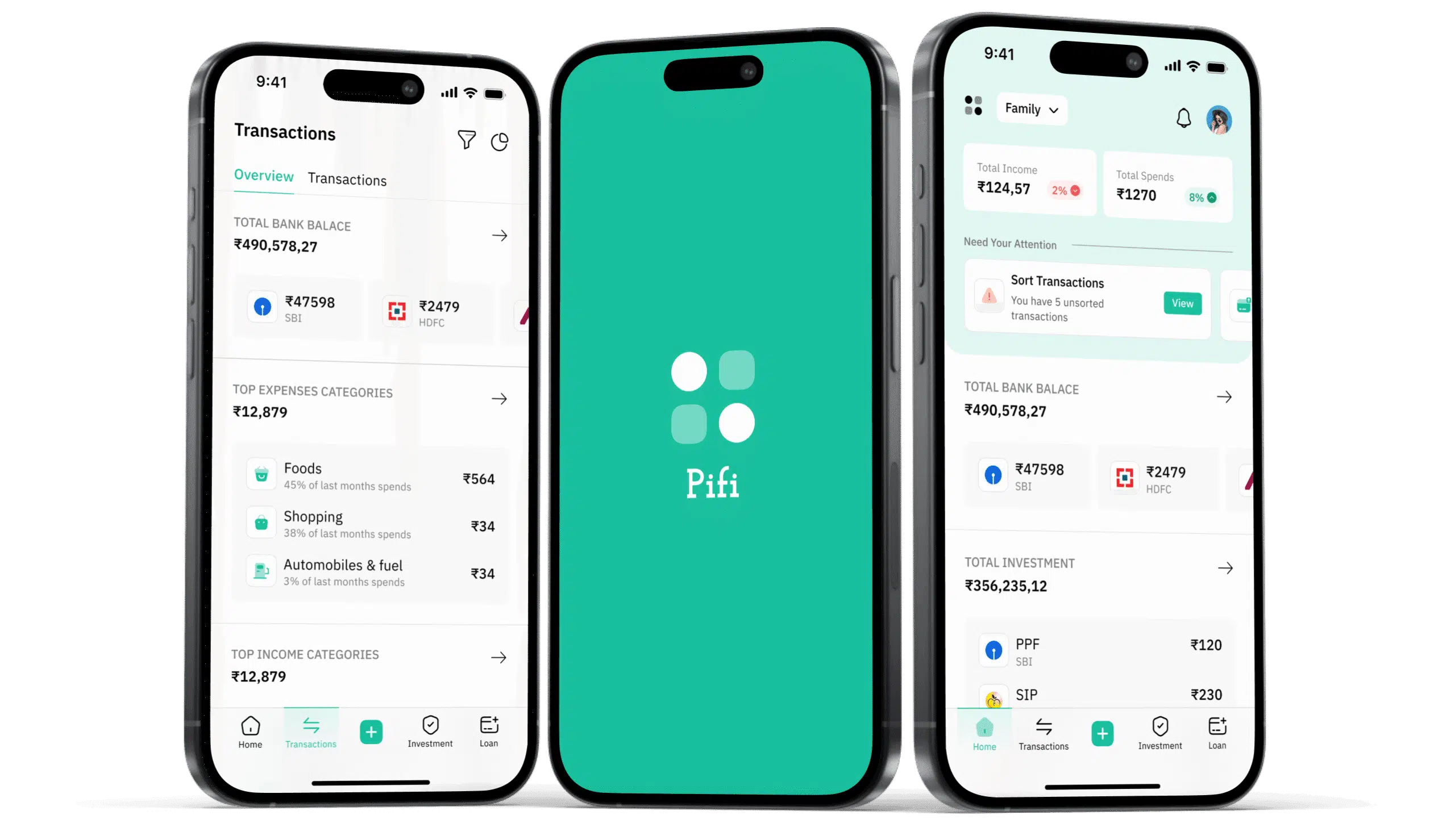
The client sought to develop a user-friendly finance mobile and web application that integrates multiple bank accounts, tracks income and expenses, and provides AI-driven financial insights. The goal was to simplify financial management for families who are not accustomed to complex accounting software and jargon.
Industry
Fintech
Product Type
Mobile App
Our Role
Design, Mob Development
Geography
India
Problem Statement
- Families often struggle to maintain a clear understanding of their financial status due to the complexity of traditional accounting software. Many individuals are not well-versed in accounting terms, making it difficult for them to track income, expenses, investments, and overall financial health efficiently. The client required a seamless and intuitive application to:
- Integrate all family members’ bank accounts in one place
- Display real-time bank balances and categorized expenses
- Provide AI-driven financial insights and projections
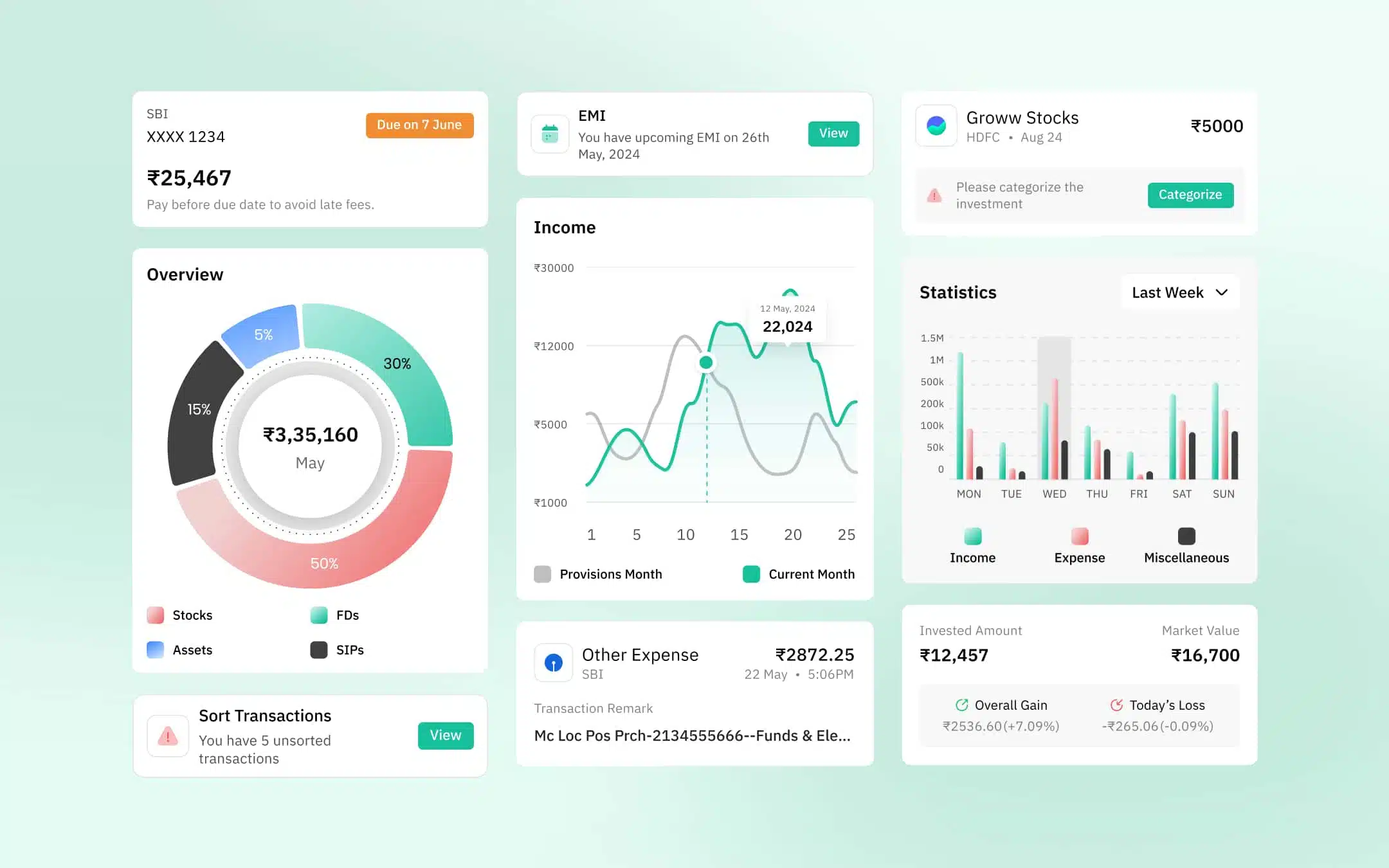
- Visualize income, expenses, and investments through charts
- Predict upcoming expenses and suggest savings strategies
Research & Discovery
User Interviews & Surveys
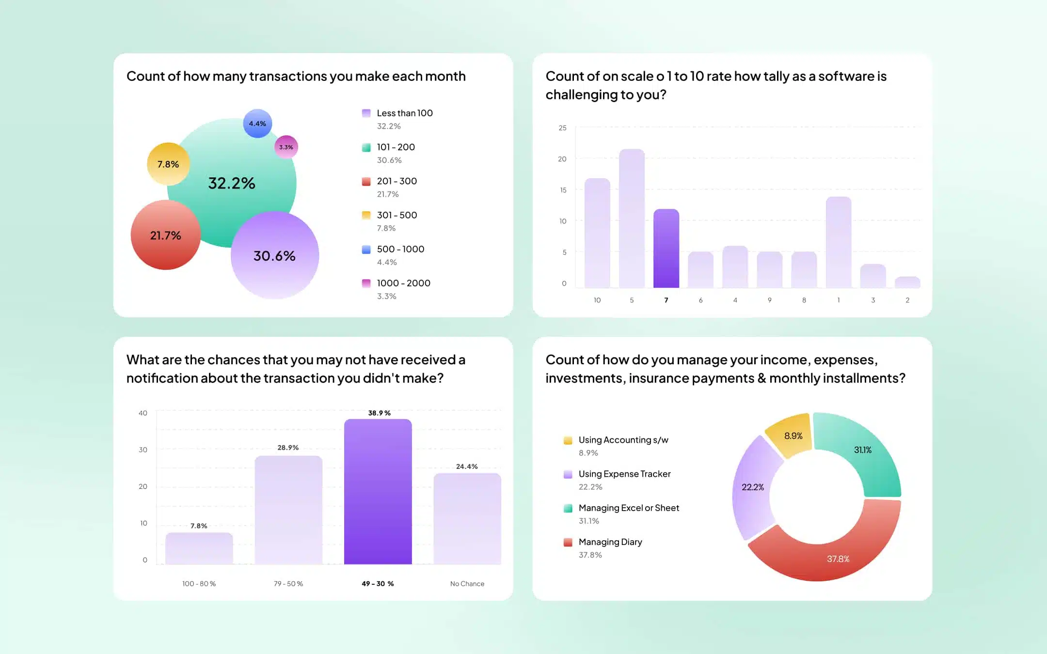
- To understand the target users’ pain points, we conducted:
- Interviews with families to assess their financial management habits
- Surveys to gauge their familiarity with accounting applications and terminology.
- Competitor analysis of existing finance management tools.
Key Findings
- Users preferred a simplified, intuitive interface with minimal financial jargon
- They needed a dashboard displaying all critical financial information at a glance
- Users valued AI-driven insights for budgeting and investment tracking
- Security and privacy of financial data were top concerns.
Design Approach
Information Architecture
- We structured the application with:
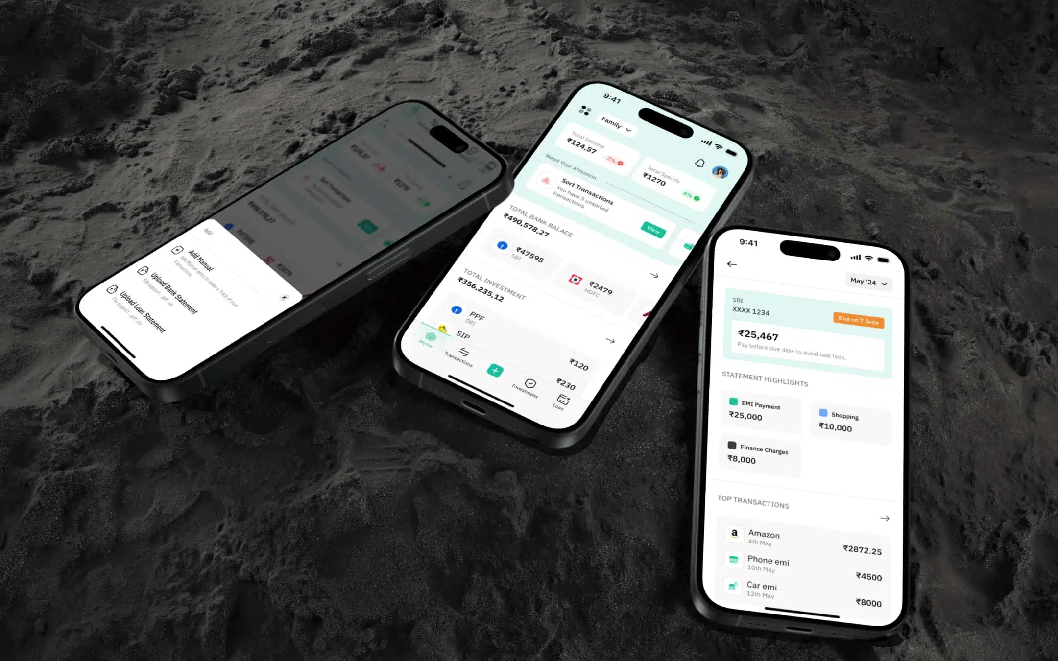
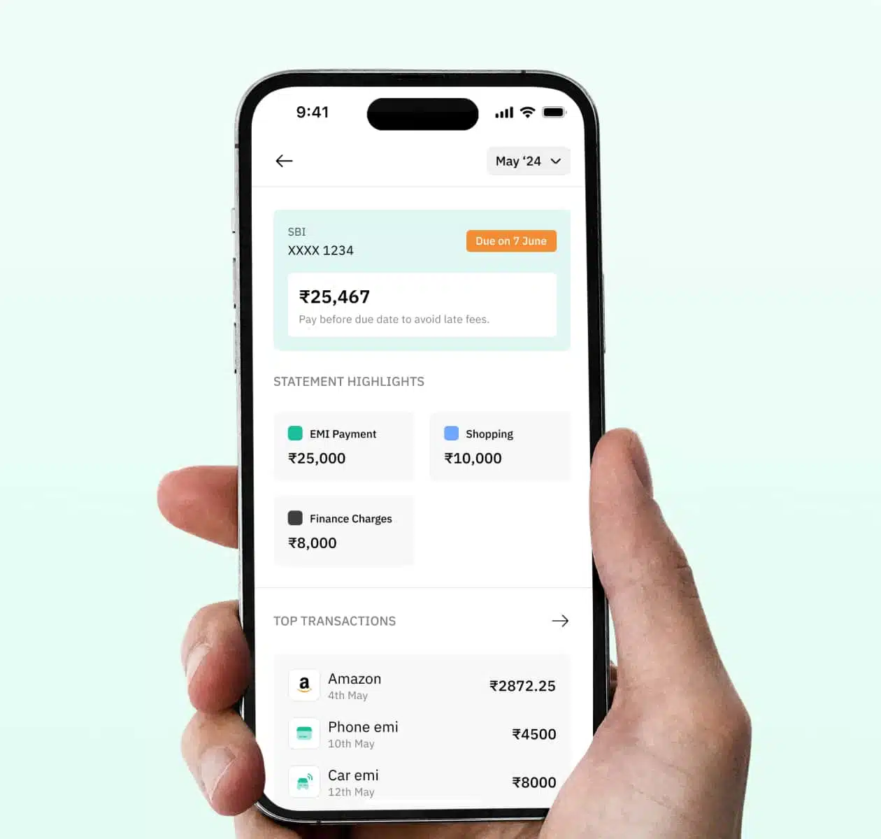
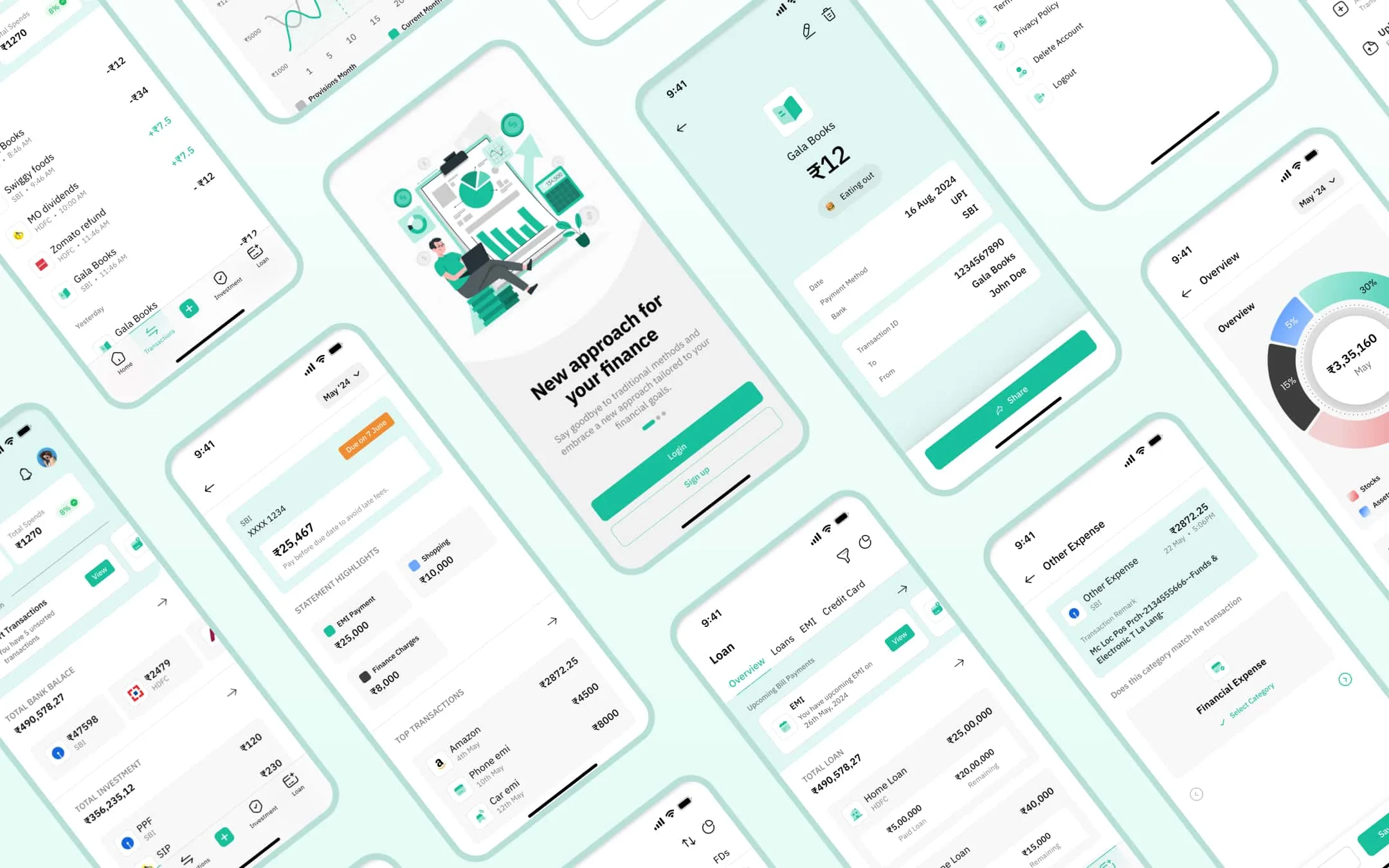
- Dashboard: A consolidated view of bank balances, monthly expenses, income, and investment summaries
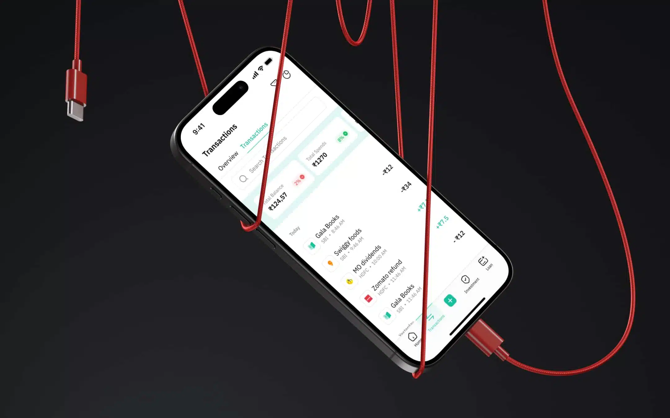
- Transactions: Categorized income and expenses with automated tagging
- AI Insights: Predictive analytics for upcoming expenses and saving suggestions
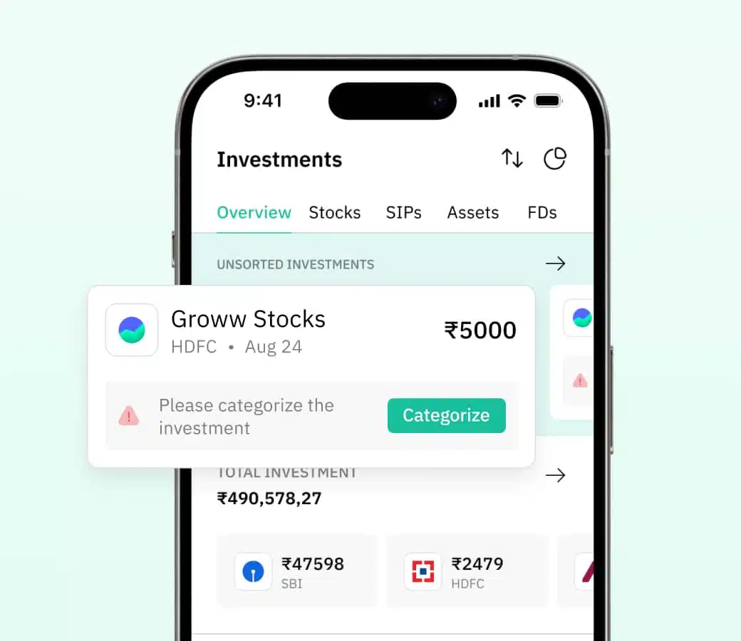
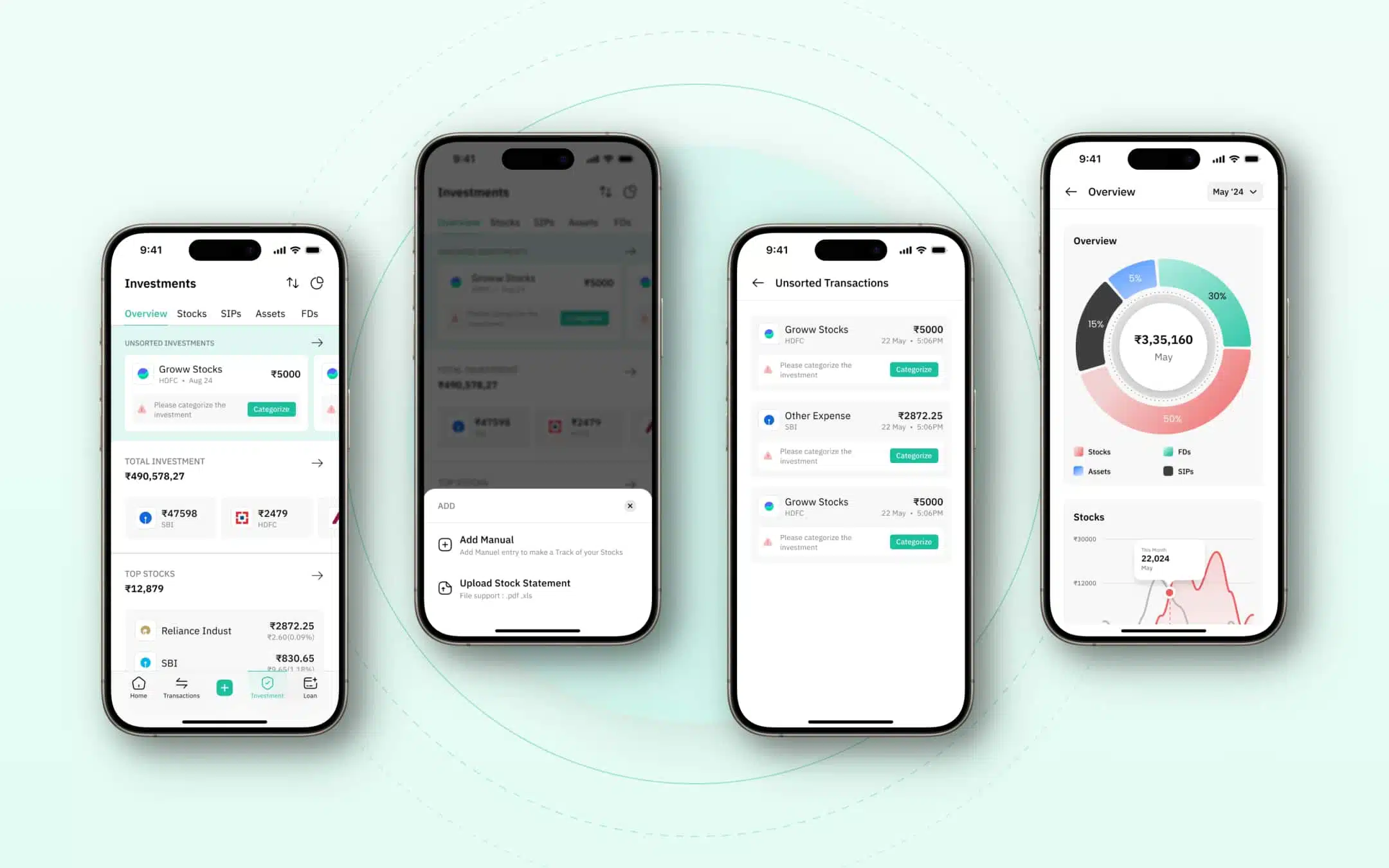
- Investments: Tracking of family investments, returns, and portfolio insights
- Reports & Charts: Visual representation of financial health trends
- Settings & Security: Customizable preferences and strong encryption protocols
UX/UI Design Considerations
- Minimalist UI: Clean layout with easy navigation
- Color Coding: Red for expenses, green for income, blue for investments
- Visual Charts: Intuitive graphs to represent financial trends
- Natural Language Inputs: Users could describe transactions in plain language
- Dark & Light Mode: Customizable themes for accessibility
Prototype & Testing
- We created interactive prototypes and conducted usability tests to refine:
- Navigation flow
- Readability of financial insights
- AI-driven recommendations’ clarity
- Integration and security of bank accounts

Outcome & Impact
- Simplified Financial Management: Users could easily track income, expenses, and investments without financial expertise
- Enhanced Decision-Making: AI-driven insights helped families plan their savings and investments better
- Improved Engagement: A 40% increase in user retention due to the intuitive interface and valuable insights
- Secure Transactions: End-to-end encryption ensured users' financial data remained protected
Conclusion
The finance application successfully transformed the way families manage their money, making financial health tracking effortless. With its intuitive design, real-time insights, and AI-driven decision-making, it empowered users to make informed financial choices without the need for extensive financial knowledge.


Struggling with low conversions?
Get your UX audit done for free!
What Our Clients
Say About Us
Verified by clutch


We work across the US, Europe, and Asia, and this team adapted to each market without losing quality. That global fluency made a real difference as we expanded.
Every deadline was hit, and nothing drifted from what we originally asked for. Regular updates meant no surprises just steady, high-quality progress from start to finish.
Our numbers moved engagement, performance, all of it not long after we started working together. Feedback was never brushed off; it actually shaped the next round of work.
Fewer revisions, faster execution, better numbers across usability and engagement. Communication stayed tight throughout a quick check-in was usually all it took to keep things moving.
Users noticed the difference immediately, and the feedback has been overwhelmingly positive. What stood out most was how well the team understood what we were building before they even started designing.
No templates, no shortcuts just a custom-built experience that actually felt like ours. Users picked up on it right away, and the team stayed responsive any time we needed a tweak.
They delivered exactly what we asked for and stayed responsive the whole way through. Ad-hoc requests never slowed things down turnaround stayed fast even.
On time, on brief, and genuinely invested in getting it right. When our scope shifted partway through, the team adjusted without missing a beat.
Stay Informed, Stay Inspired