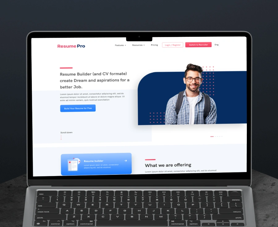
Building a Fintech Mobile App with OCR For Cheque Mgmt
$100k+
Revenue Growth
3x
Growth in Higher conversion rate
30%
Higher lead generation
20%
Growth in customer accusation
Industry
Startup
Product Type
Web App
Our Role
Research, UX, UI
Geography
India
About EzyCheck
Scope of Project
Creating a seamless user flow and easy navigation
Minimal interface design from scratch
A seamless user experience design
Challenges
EzyCheck needed to enhance their platform with a mobile app capable of OCR functionality for checking documents. The challenge included designing and developing an intuitive app in English, Hebrew, and Arabic, while ensuring user trust through seamless UI/UX. Additionally, both Android and iOS versions were required for a broad reach.
Solutions
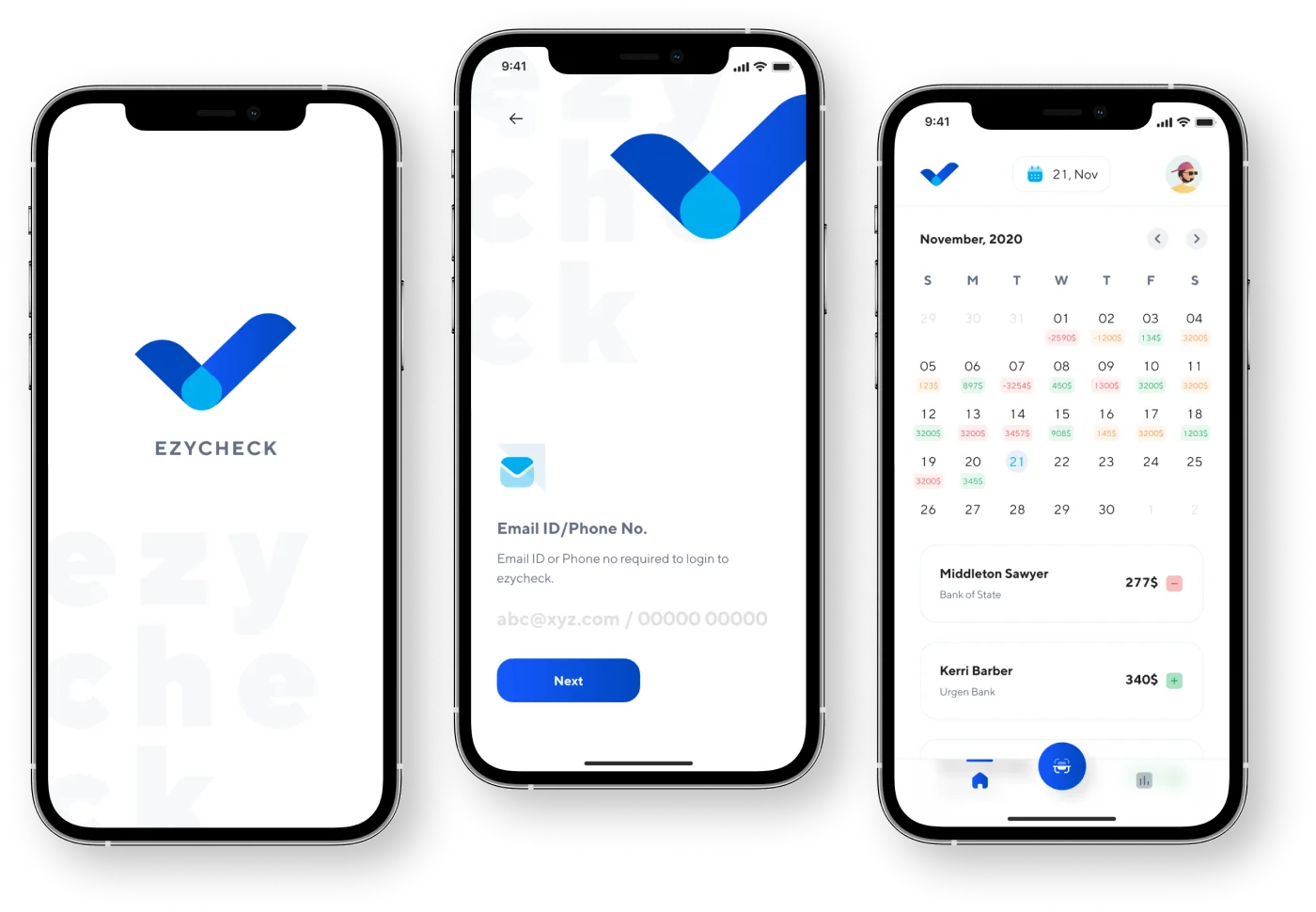
CodeTheorem designed and developed an intuitive mobile app for EzyCheck, integrating OCR technology for document verification. We built versions for both Android and iOS in English, Hebrew, and Arabic. The app’s sleek, user-friendly interface ensured a seamless experience, boosting customer trust and improving accessibility across diverse language markets.
Dive into Our Success Stories
Process/Approach
Brainstorming session
The concept of EzyCheck was a fresh brew to us. With an intrigued mind, we understood the client’s requirements and what were the expected deliverables to get on the same page as the client. This step brought a broader sense for proceeding with the research and forming design solutions.
UX Research
To understand the target audience better and create an app UI UX design that aligns with the needs of the users, we conducted extensive user research. We performed a detailed user and competitive analysis to define the user flow and determine how the product’s design can deliver a valuable experience to the users.

Wireframing & Prototyping
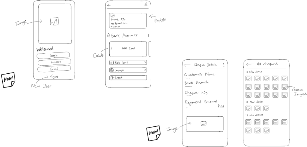
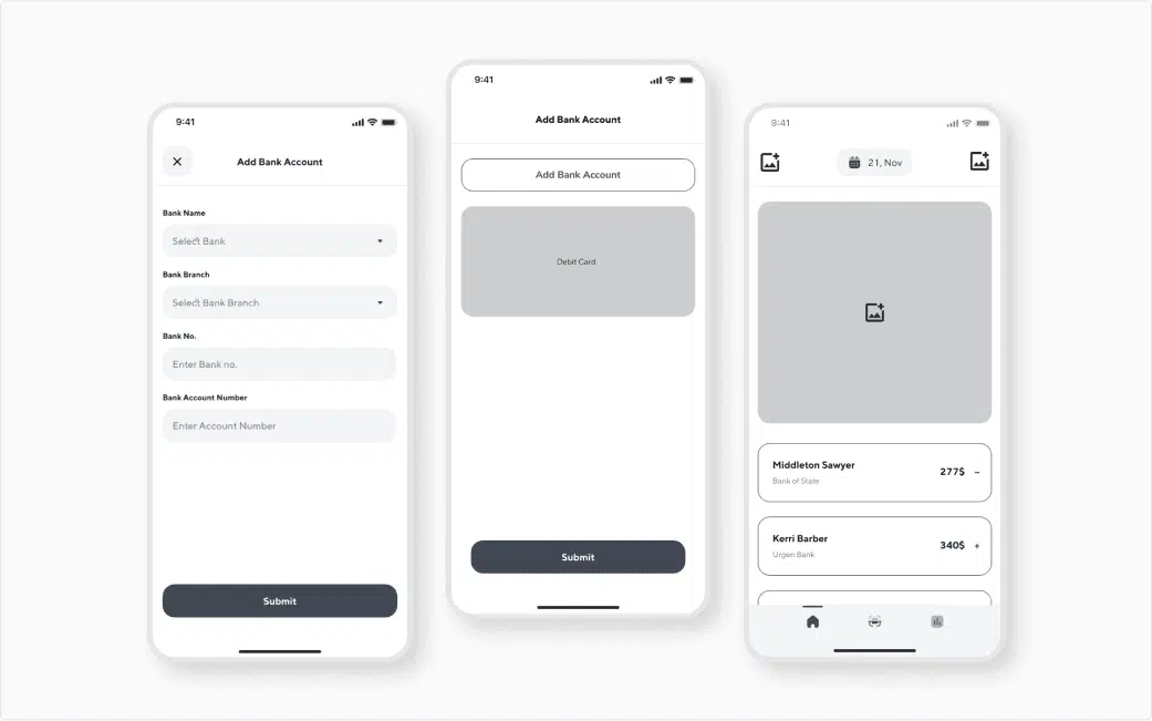
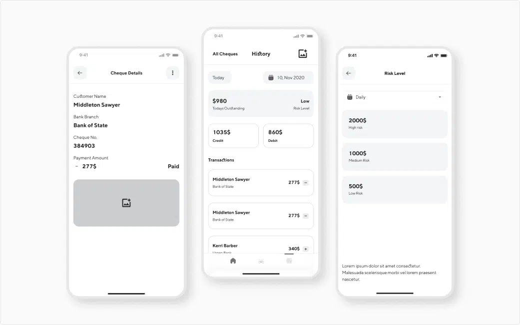
We created wireframes to test the UX concepts and see how they can be viable by testing with a group of individuals representing the target audience. We formed high-fidelity mockups from the basic wireframes which helped in refining the user flow without the need of making significant changes in the final design.


Mobile App Visual Design
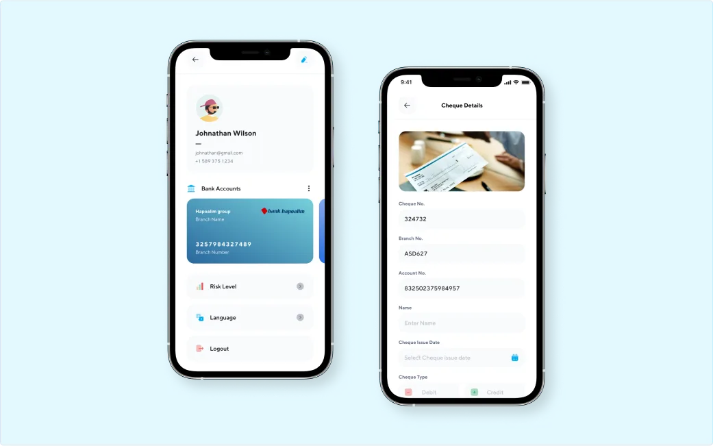
After testing and validating UX concepts with high-fidelity prototypes, we created the visual design for the mobile application with a set of coherent interface elements. The UI components worked together to offer a hassle-free user experience. The seamless UX design allows users to effortlessly enter data, manage, and sort their cheque details in a simplified manner.


Design Style

Outcome
We designed an intuitive and seamless UX design for the EzyCheck application. Creating a UX design that users could easily navigate through—the design assists in scanning and managing the cheques. The client received positive feedback for the ease of use and reliability.
The design focused on the key audiences and delivered a solution that met the user needs i.e., to add and manage the cheque details in a fast and secure way. We ensured design consistency throughout the app which assisted in creating credibility for the client.
Struggling with low conversions?
Get your UX audit done for free!
What Our Clients
Say About Us
Verified by clutch


We work across the US, Europe, and Asia, and this team adapted to each market without losing quality. That global fluency made a real difference as we expanded.
Every deadline was hit, and nothing drifted from what we originally asked for. Regular updates meant no surprises just steady, high-quality progress from start to finish.
Our numbers moved engagement, performance, all of it not long after we started working together. Feedback was never brushed off; it actually shaped the next round of work.
Fewer revisions, faster execution, better numbers across usability and engagement. Communication stayed tight throughout a quick check-in was usually all it took to keep things moving.
Users noticed the difference immediately, and the feedback has been overwhelmingly positive. What stood out most was how well the team understood what we were building before they even started designing.
No templates, no shortcuts just a custom-built experience that actually felt like ours. Users picked up on it right away, and the team stayed responsive any time we needed a tweak.
They delivered exactly what we asked for and stayed responsive the whole way through. Ad-hoc requests never slowed things down turnaround stayed fast even.
On time, on brief, and genuinely invested in getting it right. When our scope shifted partway through, the team adjusted without missing a beat.
Stay Informed, Stay Inspired