Redesigning an HRMS Platform to Reduce Employee Churn
$100k+
Revenue Growth
3x
Growth in higher conversion rate
27%
Higher lead generation
20%
Growth in customer accusation

Overview
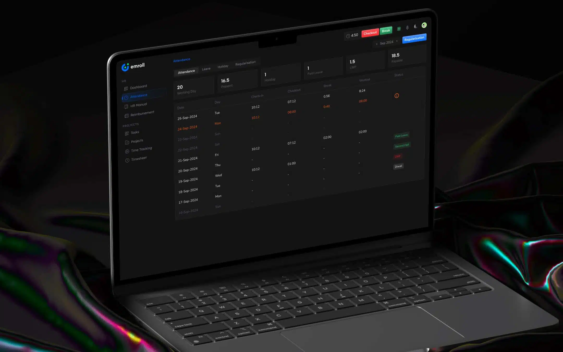
Emroll is all-in-One Software for streamlining internal business functions like Onboarding, Leave Management, Attendance Management, Payroll, Expense, Timesheet, and Time Tracking.
Industry
Enterprise
Product Type
Web App
Our Role
Research, UX, UI
Geography
India
Challenges
Emroll HRMS was initially developed based on the founder's vision but lacked a user-centric approach to UX/UI. This oversight led to negative user feedback and a drop in client retention, as customers shifted to competitors with better usability. As the company planned to expand into international markets, it became evident that a minimal yet enterprise-level UX/UI was essential for improving user satisfaction. Despite being feature-rich, the product's outdated design hindered its appeal. Moreover, the company needed a capable frontend development team to ensure the new designs were implemented precisely, restoring trust and strengthening the product's market position.

Solutions
CodeTheorem partnered with Emroll HRMS to enhance its UX/UI, focusing on a minimal and enterprise-grade design that catered to both existing users and international audiences. By analyzing user feedback and market demands, we redefined the platform’s identity, creating an intuitive and engaging interface to improve usability and retention. Our approach emphasized aligning the user experience with the product's rich functionality. Additionally, our expert frontend development team meticulously translated the designs into a responsive and scalable solution. The result was a fully revamped platform that not only addressed usability issues but also reestablished Emroll HRMS as a competitive global solution.
Design Approach
Brainstorming ideas & Understanding the requirement
The initial stage of our engagement with the Emroll team involved getting a deep understanding of various business functions and workflow. At this stage, we identified the Key challenges, and current products they are using.
Auditing the current business workflow & making app usage intuitive
As the management wants to have everything in one place and wants to ease their business workflows. We interviewed potential consumers, domain experts, and other stakeholders to learn about their concerns and solicit suggestions. Armed with process improvement concepts, we performed an audit of the existing workflow. We prioritized and rectified the design flaws.
Wireframing & idea validation
Based on the interviews, we’ve tested the list of requirements to check their feasibility by forming user flows & then we generate the wireframes. After numerous iterations, we achieved the deliverable that passes the usability testing.
Visual Design
Proceeding with an agile design approach, we transformed the iterated design into the final visual design that is handed over to the development team.
Outcome
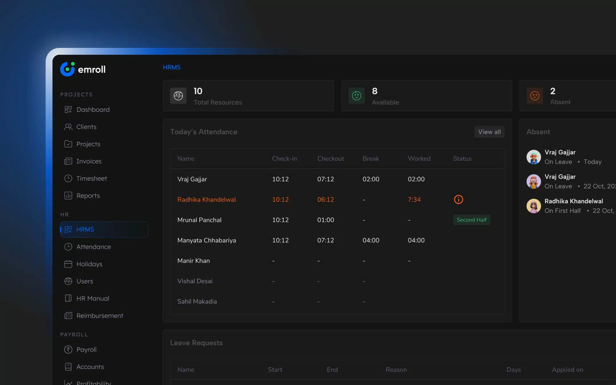
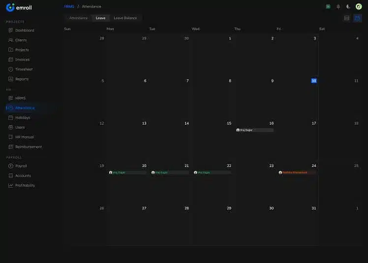
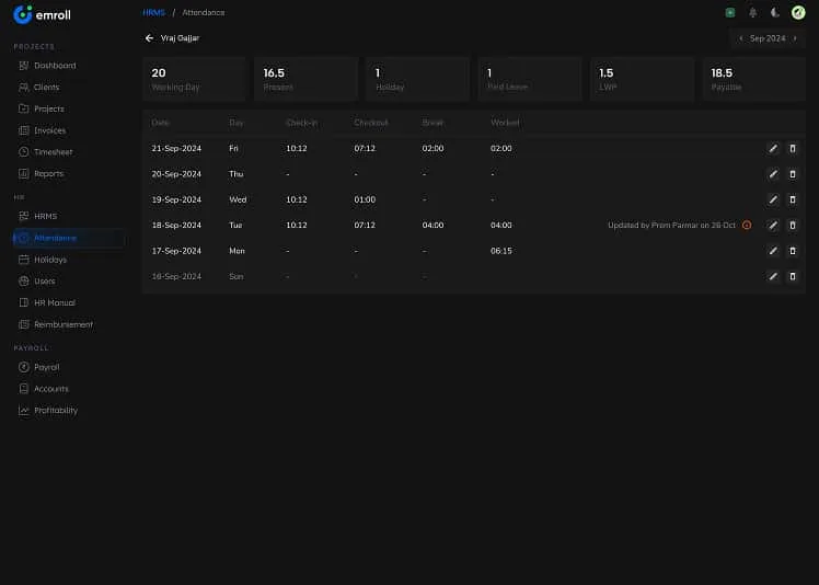
An idea brought to life and tested with potential users through clickable prototypes using Figma design. Following a user research-based approach to enhance the product with ongoing real-time user testing and feedback making EmRoll a user-first all-in-one software.
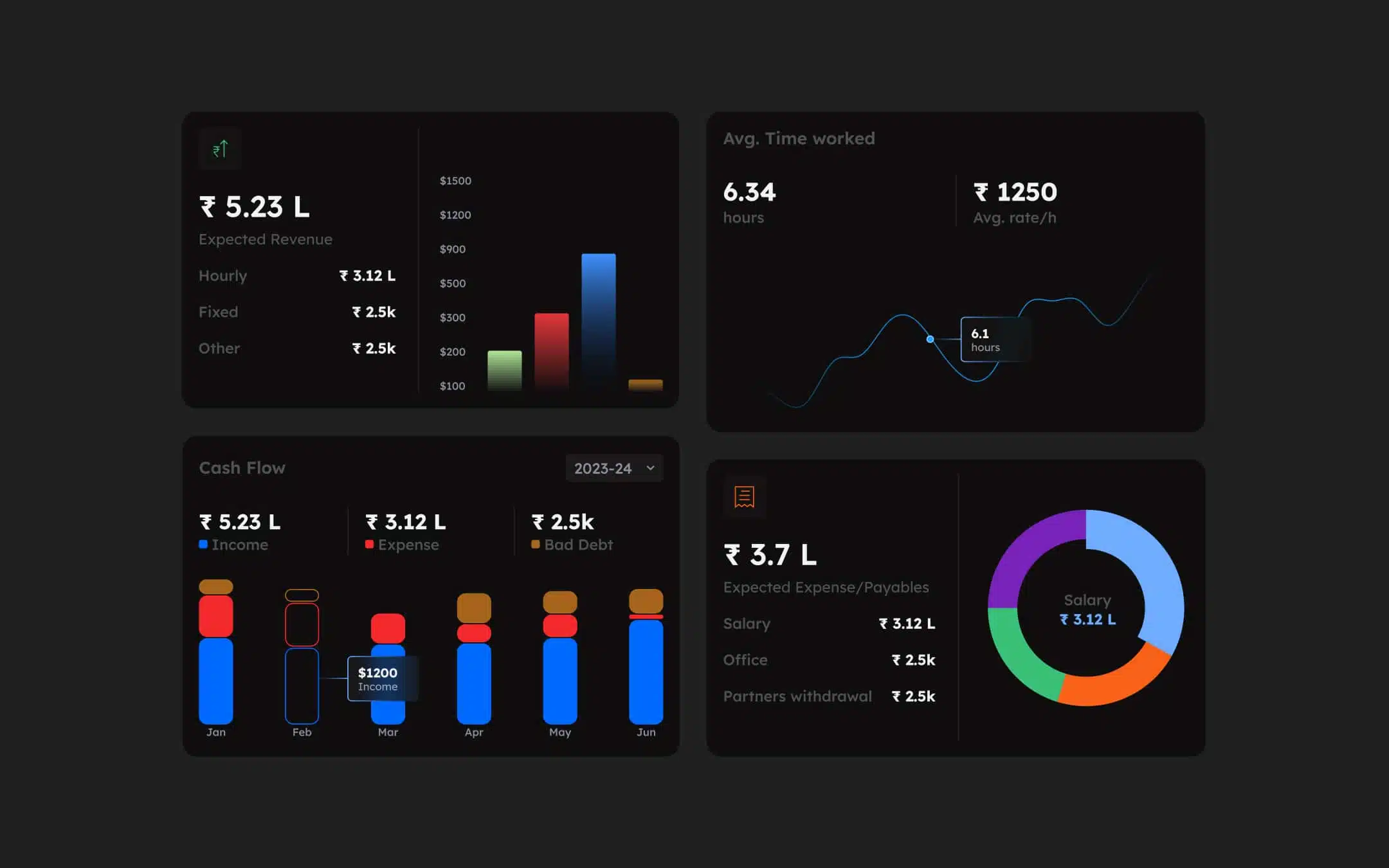
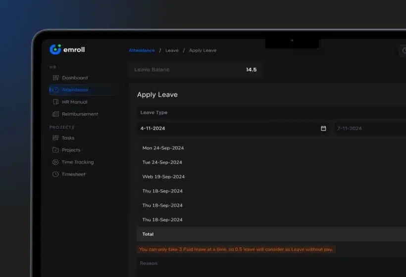
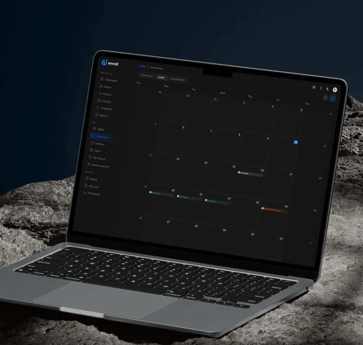
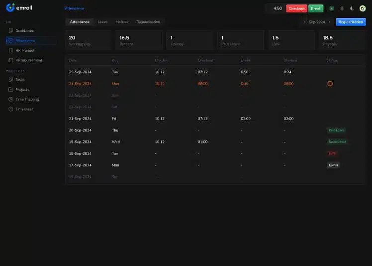
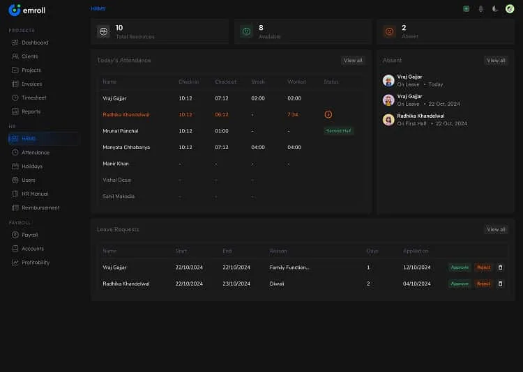
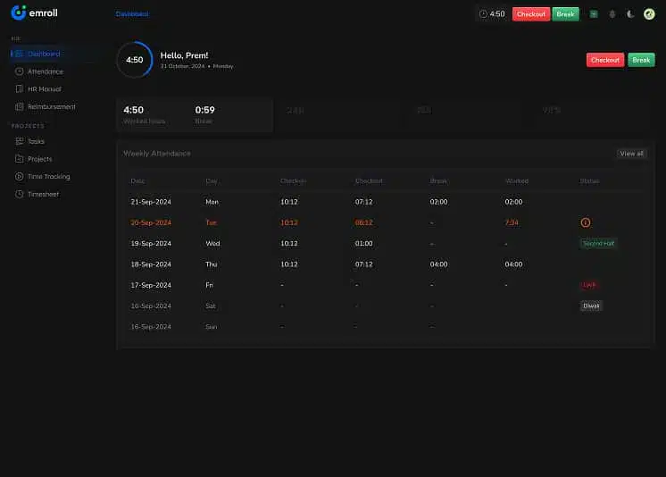
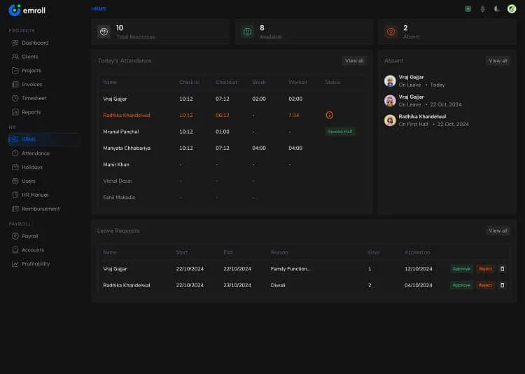
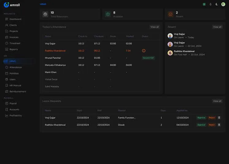
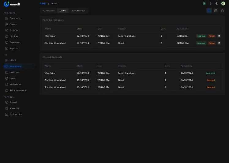
Moreover, the intuitive and customizable dashboard design helps keep track of employee activities i.e, attendance, time-tracking, and automated payroll.
40%
Increase in Software Speed



Struggling with low conversions?
Get your UX audit done for free!
What Our Clients
Say About Us
Verified by clutch


We work across the US, Europe, and Asia, and this team adapted to each market without losing quality. That global fluency made a real difference as we expanded.
Every deadline was hit, and nothing drifted from what we originally asked for. Regular updates meant no surprises just steady, high-quality progress from start to finish.
Our numbers moved engagement, performance, all of it not long after we started working together. Feedback was never brushed off; it actually shaped the next round of work.
Fewer revisions, faster execution, better numbers across usability and engagement. Communication stayed tight throughout a quick check-in was usually all it took to keep things moving.
Users noticed the difference immediately, and the feedback has been overwhelmingly positive. What stood out most was how well the team understood what we were building before they even started designing.
No templates, no shortcuts just a custom-built experience that actually felt like ours. Users picked up on it right away, and the team stayed responsive any time we needed a tweak.
They delivered exactly what we asked for and stayed responsive the whole way through. Ad-hoc requests never slowed things down turnaround stayed fast even.
On time, on brief, and genuinely invested in getting it right. When our scope shifted partway through, the team adjusted without missing a beat.
Stay Informed, Stay Inspired