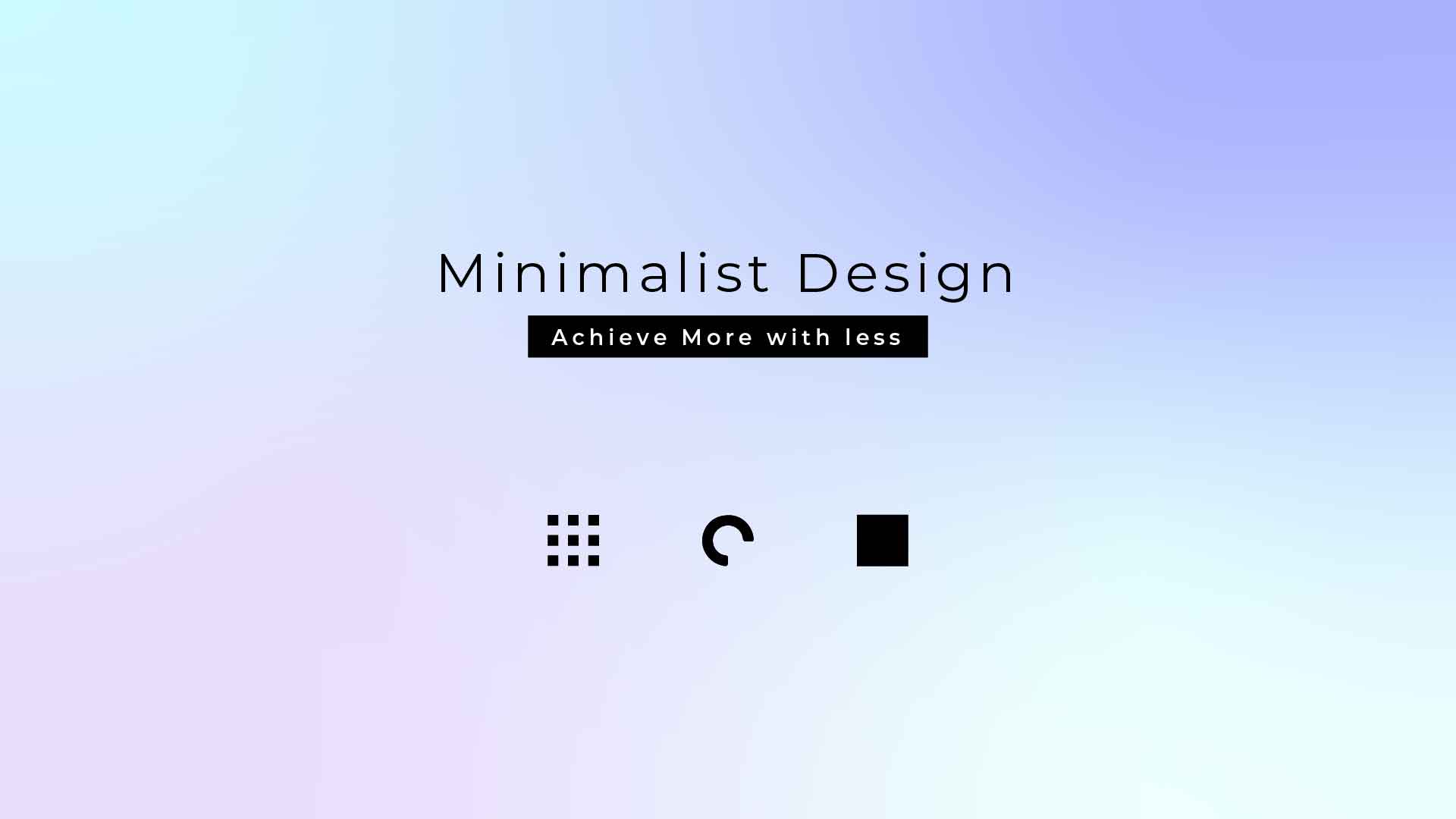
“Less is more” You must have heard this catchy phrase, and you know how it is associated with minimalist design. That’s the exact metaphor for minimalist meaning. In the last few years, minimalistic design trends have topped the charts. Moreover, it is the primary choice in digital design. You must have noticed the simplistic designs in the applications and websites you use. We are never bored with a minimal design.
One thing you will find in common among all minimalist web designs is the excellent blend of usability and aesthetics. When the unnecessary elements are gone from your website’s UI design, the user journey is easily simplified. Ultimately, you can be sure that minimalist design will always work in your favor. Some designs never go out of style, and minimal design is one of them.
Article content
History of Minimalism in Design
Minimalism in UX design or Minimalism in design is often mistaken for a modern revolution, but that’s not the complete truth. The Minimalism movement became popular in the late 1950s in the world of music, art, and design.
Blessing the home decor and architecture with minimalist design. People started noticing the visual appeal of minimalist designs after implementing them in home decor and architecture. It came to a smooth spread from architecture to the fields like design, art, and more. Especially for digital design, it has become a thumb rule for applying it to web designs nowadays.
In minimal design, the central idea, object, or element takes center stage while only the necessary components accompany it. It focuses on the idea of simplicity and harmony in design. It is connected to conceptual art that became popular around the same time. The things chosen and presented serve a purpose, an idea. Minimalist UI Design embraces the element of experience more than attachment to things and consumerism.
When Google went live, it had a more simplistic design approach instead of being a cluttered website design that is full of elements regardless of their necessity. It worked wonderfully for them, as we can see today. Another great live example of a sleek and minimal web design is Apple’s official website.
Even today, where the early 90s and 00s versions of the internet are considered aesthetic. You can find plenty of websites that are inspired by retro and 90s-style web designs. Here we have something for you to think about;
“Is it a great example of UI or just nostalgia that makes it visually pleasing to our modern eyes?”
And now that minimal design has become a brand image and a popular design trend, let’s understand what Minimal design is in web design.
What is Minimalist Design in UX?
A minimalist web design is a simplified interface with just the essential components and focuses on content first. As mentioned earlier, it is primarily based on less is more. The ultimate point is to eliminate unnecessary elements that offer little to no value to the user journey.
Minimal design is the perfect blend of visual communication plus aesthetics in one. It is all about prioritizing the essential elements on the screen. The color palettes may vary, considering the brand niche and the communication you mean to deliver. More accurately, the message is communicated straightforwardly rather than with extra features and gimmicks.
The Minimalist UX Design Trend
The shift from heavy content and bulky design layouts has been a boon to minimalist designers with minimal design trends. It has allowed designers to build more intuitive and impactful user-first designs, among other design trends.
Even though it may seem simple at first glance, you can realize how the user experience flows when you navigate through it. Minimalist designs serve usability first and then visuals. The stunning minimal designs do not affect creativity in any way.
The Role of Minimalism in Digital Design
Aesthetic and minimalist UX design
Nowadays, everything is about aesthetics. If it isn’t pretty, it isn’t functioning. When distinguishing between a good and a bad design, aesthetics come first. This has influenced designers to opt for a minimalist design that offers easy navigation. Having a minimalist website design will serve aesthetics in every way.
Users are more familiar with minimal UX design, which increases their chance of converting. From a business POV, you aim at experiences, but it should be accompanied by a good design.
Easy & fast navigation
The content carries the main focus on minimalist UX design. The unnecessary details are not a part of the screen. Hence, when users land on your website, they can easily find what they are looking for and complete their intended tasks without delay. The minimalist app can be created in the same way.
Minimal design lowers the chance of users leaving your site. The straightforward navigation helps improve the overall user experience.
Content first = User first
Since the minimalist ux design is content-focused, it becomes user-first as well. The pretty aesthetics and an effective copy will attract the user’s attention. When you focus only on the key elements, then content holds a larger responsibility on your website for communication.
Fast page-loading speed
The minimalist website design has fewer elements overall; thus, your website page will quickly load. This works as a competitive advantage for your business. Users tend to leave a site immediately if they have to even a second longer for it to load. Ultimately, minimal UX design works in your favor.
Responsive layouts made easy
In a minimal website design, you add only the prioritized elements and content to the website. Hence, it becomes easy to make your website responsive. As a result, you won’t need much effort or time to create your minimal responsive website.
Best Practices for Minimalist Web Design
Minimalist product design is more about the experience and how it influences user behavior. The following are some key Minimalist design principles of minimalist web design!
Negative space
Firstly, a minimal design is full of white or negative space. Negative space is the space surrounding the key elements making a visual harmony. At the same time, white space refers to the space around the objects. White space allows the key elements to breathe. The white or negative space helps wonderfully create a minimalistic design. They are like the backbone. If you ask Minimalist designers, He/she will tell you that no matter what, spaces play a crucial role in creating a minimal UI.
Why space is important? When you eliminate the unnecessary elements, you’ll automatically have plenty of negative space to your benefit. It prevents all sorts of distractions on your screen. The negative space in design helps build a composition that brings visual hierarchy to the design. It plays a significant role in making navigation easy and highlights the CTAs.
The right use of minimalist design color
The right color palette is very important in minimal design. The color you choose for your minimal website will reflect your brand image. Colors tend to induce various emotions in the users. So, opt for colors that sync with the brand communication first.
The color palettes for minimal design are more subtle, but the brighter colors work the same. More importantly, the minimal color palette for your website should not have more than two to three colors.
A flair for the dramatic with minimal typography
Just like the images have a visual impact, the same goes for typography. Choosing the right fonts and making font combinations pleasing to the eyes are way more important. Here, you have complete freedom with the choice of fonts as long as they do not hinder the design hierarchy.
How the fonts look on mobile screens impacts the usability of your product. For creating minimalist websites, sans serif fonts are a perfect choice considering their crisp and clean look. Meanwhile, the font size is equally important. For example, you can save space by using smaller fonts. Above all, the following three things should be in sync: font size, font style & content length.
Essentials only
By understanding the user needs through user research, you can create the minimal interface you want. As a result, you will add only the prioritized minimalist design elements to the website. And everything else that is a distraction will be stripped away.
The key information should be placed strategically based on user behavior, as it often gets confusing when the users don’t find the information they need. It is important to make the message clear.
Website Layout
Among other things, the minimal website layout is not that simple. It requires the right placement of elements and content that results in effective site navigation. Additionally, grid layouts work best for a minimal look, because they create a balance in design. All in all, the minimal website structure is based on the amount of effort that goes into building a cohesive visual sense.
Grid layouts help with the content organization a big time. They are useful for designing mobile responsive websites. Grid layouts coexist with Minimalism UI. Above all, the content is easily located. With that, make sure that the headings and the most important information are placed right on top of the page where they can grab the user’s attention.
Bright & Vivid images
The visual impact has the primary effect on the user’s mind. There’s no replacement for a visually appealing minimalist website design. Especially one with the most eye-catching and relevant images. In the design industry, images are so powerful. You should use HD-quality images as a way of communication that aligns with the content.
More importantly, the placement of images plays a vital role as well. For a minimal design web, you can place the image in a large size in the background. It offers a sense of originality and plays the role of the main narrator on the screen.
Also, choose images that are brighter and attention-grabbing. It should depict the experience users will have with your brand. It might be tricky to make responsive versions, yet they are powerful enough for an effective minimalist product design. These 6 practices can be used to create a minimalist app.
Minimalist Design Examples
The following is the list of five examples of minimalist design for websites:
Apple
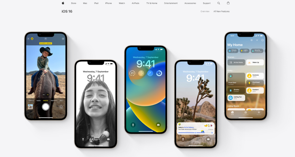
Apple is one of the best minimalist design examples. The clean and sleek layout showcases how they don’t add distractive elements to the minimal page design and directs all of your attention toward the key element, i.e., the phones.
Airbnb

Airbnb is another fine example of minimalist design. The website doesn’t need to explain itself. You can directly find what you are looking for with the simplistic yet elegant web design.
Nike
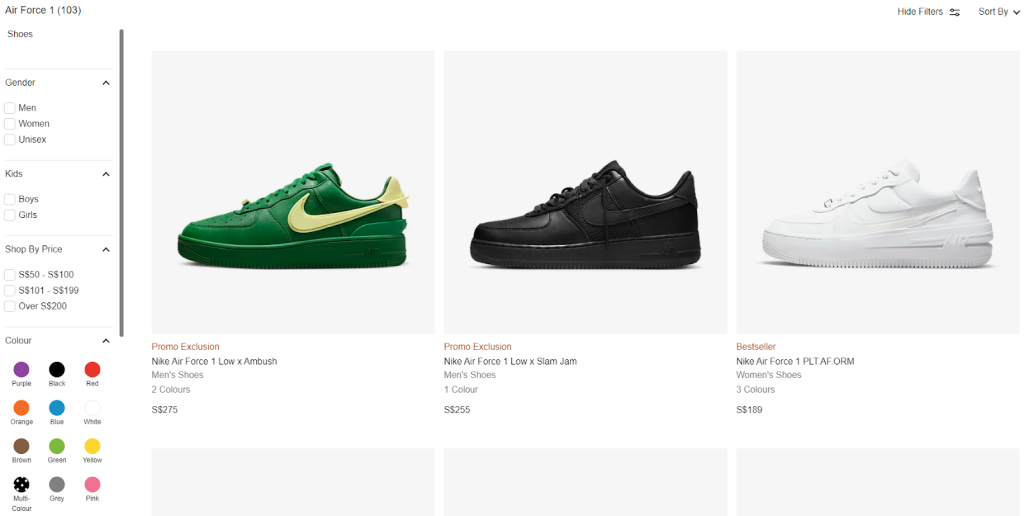
We are entirely in love with Nike’s official website. The minimal design is so evident and clearly depicts the wonderful shopping experience.
Code Theorem

Code Theorem’s website is built on the concept of minimalism. From the color palette and layouts to the interactions and the visual hierarchy; you can clearly find the design inspiration you are looking for in a content-rich web design that is minimal.
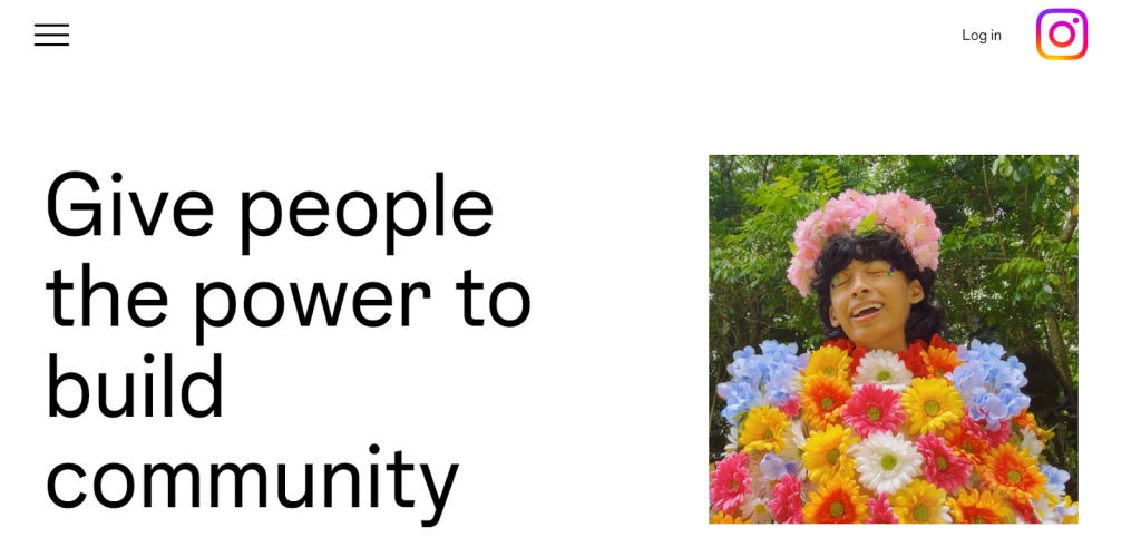
Instagram’s official website is proof that you don’t need something extraordinary to create a minimalistic web design. The power of words and media is enough.
Conclusion
From time to time, questions come up like isn’t minimal too bland or stands opposite of maximalist design? A minimalist web design solves a lot of UX design problems. Implementing a Minimalist UI design has been a great help in driving more traffic and lowering bounce rates.