
Today, dashboards are practically everywhere. Every business today needs to keep track of important information. And this is where dashboards come in. They are the best way to showcase essential information using unique data visualization techniques. This blog will walk you through everything there is to learn about dashboard UI design i.e. how to create one and the best practices with examples.
Article content
What is a Dashboard?
A dashboard is a visual representation of your data. It allows you to track, analyze, and display KPIs, metrics, and data points. Dashboards also enable the user to monitor the overall performance or health of your business, a department, or even a process.
With dashboards, there is no such thing as one-size-fits-all. Dashboard UI design varies according to the user’s needs and roles. For example, if you design it for a digital marketer, it must display marketing metrics. But, if you create it for a founder or executive, it must display SaaS metrics.
Dashboards collect data from various sources. They aren’t just about saving time. But, seeing all the data in one place. Above all, users don’t have to go to multiple services or spreadsheets to retrieve their data and form a report. Dashboards do all the heavy lifting for them!
Well-designed dashboards answer critical business questions and provide insights before a team even has to ask for them. Hence, investing time up-front to set up and design a dashboard is always beneficial. It will pay back that time investment 10x over.
What are the components of a good dashboard UI design?
Dashboard design serves a purpose, the priority for each component differs according to the dashboard. However, a certain set of components must be there in a dashboard UI design. The following are the components of a good dashboard design:
Data Visualization
Dashboards are a visual display for showcasing information. Data visualization is a key element for any dashboard. Use graphical representations, such as charts, tables, and more, to increase usability.
Navigation
Navigation is the one component that makes the dashboard intuitive, accessible, and usable. When using a dashboard, you look for the required set of data and if you are not able to access it with clarity then it is probably because of poor navigation.
Metrics & KPIs
Every dashboard has an objective and according to that, the suitable metrics or the KPIs are tracked. This component is entirely personalized & user-focused. The user preference determines which metrics are to be added to the dashboard to access the data.
Filters
One of the key goals of dashboard users is conditional data analysis. To drive meaningful insights, the users prefer to analyze data from a specific period of time or an area of operation. To enable that, you must avail of the filter option in the dashboard UX design.
Dashboard UI Design Process
Now that you’re familiar with what a dashboard is, let’s see how to design one. As easy as it may seem, dashboard design needs a lot of research, logic, and structure. Hence, you must follow a design process to create a dashboard.
1. What’s the purpose of the dashboard?
The first thing to note is the purpose of the dashboard. Understand what the user wants to achieve through it. If you get this wrong, all your efforts will go in vain. Hence, as a dashboard designer, you must ask the user:
- What do they expect?
- What is the nature of the data they want on the dashboard?
- How much data do they want to see immediately?
- Which metrics, numbers, and tables suit their needs the best?
- Are there any additional specifications to keep in mind?
- How often do they want the data to be updated?
After you’ve got all the answers, you can move to the prototype. Just remember not to deviate from the purpose. In short, keep the user requirements in mind throughout and create a dashboard UI design around it.
2. Select the charts
The next step is to select the type of charts you want to display on the dashboard. As it is said, “a picture is worth a thousand words.” Therefore, selecting the right picture (chart) is critical. Charts are important to visualize patterns, and trends and gain essential insights. This information is otherwise challenging to get just by looking at raw data.
Here’s a list of charts you can use according to the type of data:
- Changing Trends: Line chart, Area chart, Bar chart
- Comparison or Ranking: Bar chart
- Correlation: Bar-line combination chart, Scatter Plot
- Distribution: Histogram, Box-Plots
- Part to the whole: Stacked bar charts
- Geographical data: Maps aligned with other charts
3. Make the charts effective
Selecting the chart is just not enough. You must ensure it is effective. Ensure not to overload your charts with information. But create divisions to help understand the chart better. Moreover, here are a few things you can keep in mind while choosing charts:
- Use the right orientation
- Avoid using too many colors in a single chart.
- Organize a chart so that it answers crucial questions easily.
4. Create a prototype
Once you clearly understand the objectives and action items, make a prototype of the dashboard. Creating a prototype helps you know what elements you have at hand and what you might miss.
Lastly, a prototype doesn’t have to be a full-fledged working model. Rather it can simply be a hand-drawn sketch. As a dashboard designer, your aim here should be to define the following :
- The different sections of information that go on the dashboard.
- What is the importance of those elements?
- How to arrange them?
Note that you might not get the design right in one go. So, don’t rush it and try to bring new perspectives to your dashboard UX and dashboard UI design.
5. Ask for feedback
The last step is to get feedback and evaluate. Once the prototype is ready, ask for feedback. Reach out to someone who knows about the services, client, or product. Moreover, you could also ask a potential user and, later, the end-user themself. Based on the feedback, improve the design.
Dashboard UI design principles
1. Choosing the right type of dashboard
This is one essential step in dashboard design. You need to understand the target users and decide which type of dashboard is applicable. For example, when designing for executives and decision-makers, you need a KPI dashboard. For the supervisors who are monitoring employee actions, you need an operational dashboard that provides a real-time view of business operations.
2. The right kinda data visualization
Choosing the right type of data visualization depends on the purpose of the dashboard. To emphasize, data visualization should be pleasing to look at while being functional and serving its purpose. The necessary facts need to be conveyed in an effective way. You must choose formats that the users are familiar with. To avoid too much cluttering, stick to a minimal layout that helps maintain a consistent design.
| Data Visualization Type | Uses |
|---|---|
| Line Charts | Showcasing data patterns |
| Tables | Displaying large amounts of data |
| Bar Charts | Comparing various data patterns |
3. Simplistic and Intuitive design
The less is more. For dashboards, designers may feel the need to cram all of the details into one view. Theoretically, it sounds right. But practically, it would be visual clutter. And to avoid that, you need to add filters and hierarchies. The best way to have an intuitive dashboard is to break it down into 2 or 3 separate dashboards, either on one page or separately.
4. The 5-second rule
If the user can’t get a hold of all the key information they are looking for in 5 seconds then the dashboard design needs some serious meddling. Dashboards are full of metrics and you might argue how it’s possible in 5 seconds. It is not. But creating minimal and intuitive navigation that helps them locate the information needed within 5 seconds.
To make it happen, you need an inverted pyramid layout, where information is placed in a logical order. The layout starts with the high-priority data on top, the mid-section is occupied by trends, and the bottom of the layout is reserved for granular details.
Dashboard UI design best practices
To ensure that you design an impeccable dashboard, you can follow these best practices:
1. User-relevant data
It is essential to understand your users and audience. Once you know your audience, you can easily answer what your user expects from the dashboard. And accordingly, you can decide what and how to place it on the dashboard.
Remember, if you don’t provide relevant data to the user, then how you structure it won’t matter. Therefore, keep in mind the 5 key takeaways your user would want to see on the dashboard. Then, consider the F and Z reading pattern to structure the page.
As a dashboard designer, your goal should be to ensure that the dashboard does its job. But, while sticking to a single screen. It should provide a glance view. Therefore, here you can consider using the 5-second rule. According to this rule, the user must be able to take in the most critical information within just five seconds.
2. Responsive Design
It is always better to give your user more control over the dashboard. This way, they can customize it as per their current requirements. Hence, it is best to keep the dashboard design responsive. The key to a good, responsive design is a straightforward, easily understood dashboard UI design and dashboard UX. It allows the user to control exactly which data needs to be front and center in the dashboard.
This would be a smart move on the dashboard designer’s part, as data visualization can get tricky. Sometimes, visual elements can create more work for the user. In the end, you might have to spend more time narrowing down the data for dashboard design. Still, the user might feel things are missing. Hence, it’s best to let the user control it.
3. Big and Bold crucial data
Big, bold numbers always cut to the point and make the user feel confident about the data in front of them. You can keep a decent amount of white space to avoid clutter and show a clean design. Moreover, presenting data clearly with big, bold numbers will indicate what’s essential instantly and save the user time.
4. Information Architecture Principles
Consider the principles of information architecture while dashboard design. Follow hierarchy when deciding which cards to show in which positions. Just like we mentioned earlier, remember the F and Z pattern to scan a page. Apply that pattern to structure and order the elements of dashboard design.
5. Simple main view
To keep the main view of the dashboard simple, use other supporting views. Allow the user to filter the data according to different parameters. Such as date, time, ongoing tasks, progress, etc. Therefore, adding filters and supportive views is the best way to fit all the necessary info on one screen.
6. Use a consistent color scheme and design language
It is critical to use a consistent color scheme and design language throughout the dashboard. If you use consistent color and design, it will only make your data look light and airy. Plus, it will offer clear visibility and striking good looks.
But that doesn’t mean you aren’t allowed to experiment. Many B2B SaaS product dashboards have a dark-themed UI. Reason? They are used for several hours straight. Dark-themed UIs help reduce eye strain and offer visual clarity within the interface. You can try that too. But, taking this approach needs a careful evaluation. So, make sure you do your research before diving in.
Types of Dashboards
Data dashboards can perform different functions and serve different purposes. They are generally used for business intelligence but may have different purposes depending on their service or team. Given this, there are three basic types of dashboards:
1. Operational Dashboards
Operational dashboards show the current status and activities to the user. These showcase critical information that’s time-sensitive. The data on operational dashboards is frequently updated, even up to the minute. One of the classic operational dashboard design examples is the Google Analytics dashboard. It displays real-time data for the user, including
- An active number of users on the site.
- Page views and clicks per minute
- Number of visits
- Actions taken by website/app visitors
- Bounce rates
Most people prefer operational dashboards as it lets them quickly check their status. Therefore, you must structure the information carefully while designing an operational dashboard. Remember that the most relevant data must appear first. The user must be able to get a snapshot as soon as they open the dashboard. Hence, it’s best to include a few neat graphs but not detailed data views.
2. Analytical Dashboards
Ask the user if they want to analyze large chunks of data. If yes, analytical dashboards will be the best for their application. It doesn’t have to be dynamic like an operational one as they receive and process data for another purpose. Managers or executives commonly use analytic dashboards to determine and compare trends. Moreover, to track and analyze market predictions.
An analytical dashboard allows the user to
- Predict outcomes
- Investigate trends
- Discover valuable insights
- Set targets based on those insights
Earlier, analytical dashboards were designed by data analysts. But, in recent times, people have seen an insurgence of no-code or low-code analytics tools. This has equipped almost everyone with the tools and resources to build an analytical dashboard.
3. Strategic dashboards
Strategic dashboards are more relevant for internal business demands. Basically, they help evaluate efficiency, achieve goals, and monitor KPIs. They showcase information that internal teams use to develop corporate strategies that are significantly valuable for the business’s success. Strategic dashboards help analysts to draw conclusions and find ways to solve problems. Moreover, plan further development.
Characteristics of a Great Dashboard
- A Great dashboard instantly communicates with the user.
- It is clear to read, intuitive, and easily customizable per the user’s needs. Thus, it makes complex information accessible and easy to digest.
- An effective dashboard design is always guided by the project goals, the nature of the data, and the user’s needs.
- A great dashboard always displays only the most relevant information.
- The information/content structure is easy to scan and remember.
- Elements of a great dashboard (chart, table, form) are displayed in a minimal view. But, they allow you to bring up more details in a modal window or go to a page with more detail.
- A great dashboard allows the user to filter content using labels, KPIs, and categories.
Better Dashboard UI Design With User Research
User research helps present the users with relevant, clear, and concise data. This helps them think about the content and the data they’re looking for. It takes their worry about how to use and access it.
Some dashboards have to be effortlessly customizable for users of different roles. Therefore, user research is essential. For example, it helps to determine the user’s goals, environmental context, mental models, and pain points. These factors greatly influence your final dashboard design.
You must define the different user types and understand where their goals are the same. What information is most relevant to one user type vs. another? Consider if there needs to be a different layout. Or is there a solution for a more general use case?
Considering this, it’s a good idea to start with basic wireframes. Furthermore, you can move on to prototypes and test them with actual users. You can do this during a user research phase. Precious insight can come out of a short user research phase. Even with just five users, it will save you significant time down the line.
Best dashboard UI design examples
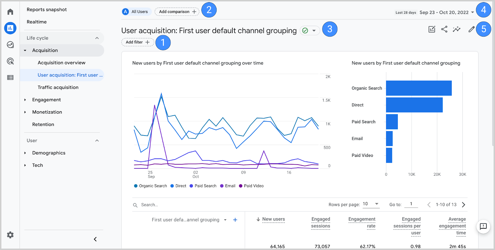
Google Analytics
The Google Analytics dashboard is a great example of dashboard design that enables users to go beyond the stand reporting. It allows you to create your custom dashboard or pick one from dashboards along with visual shortcuts to the important data.
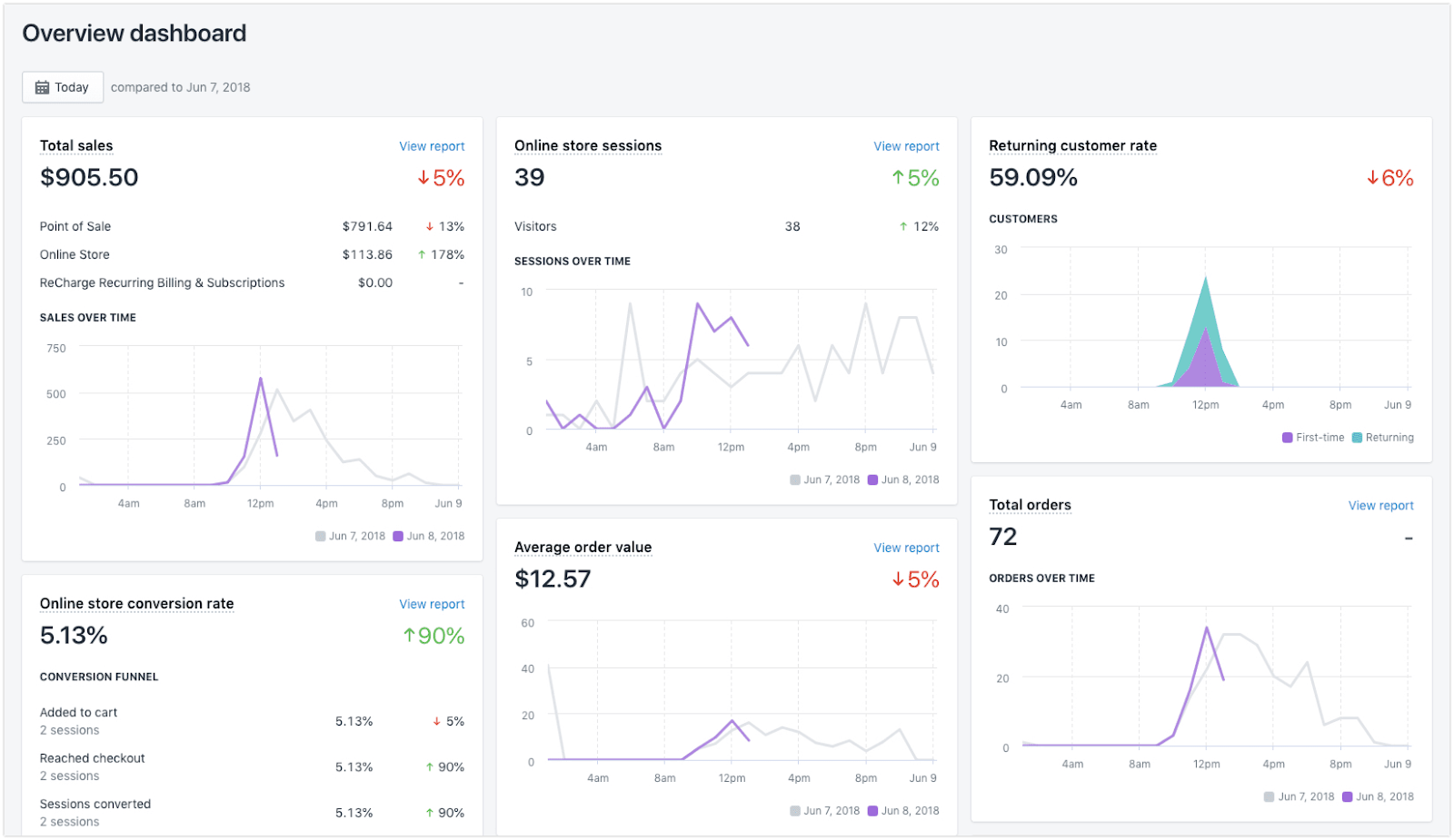
Shopify Dashboard
The Shopify dashboards display some of the key metrics for the users to understand and gather what is happening on their website. For example, the average order value, total orders, total sales, conversions, etc.
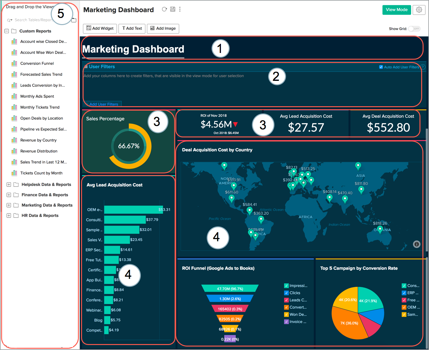
Zoho Dashboard
Zoho offers multi-device dashboards that are easy to use and customize with a drag-and-drop option. It helps visualize the KPIs, and analysis of business operations through interactive elements such as tables, charts, gauges & more.
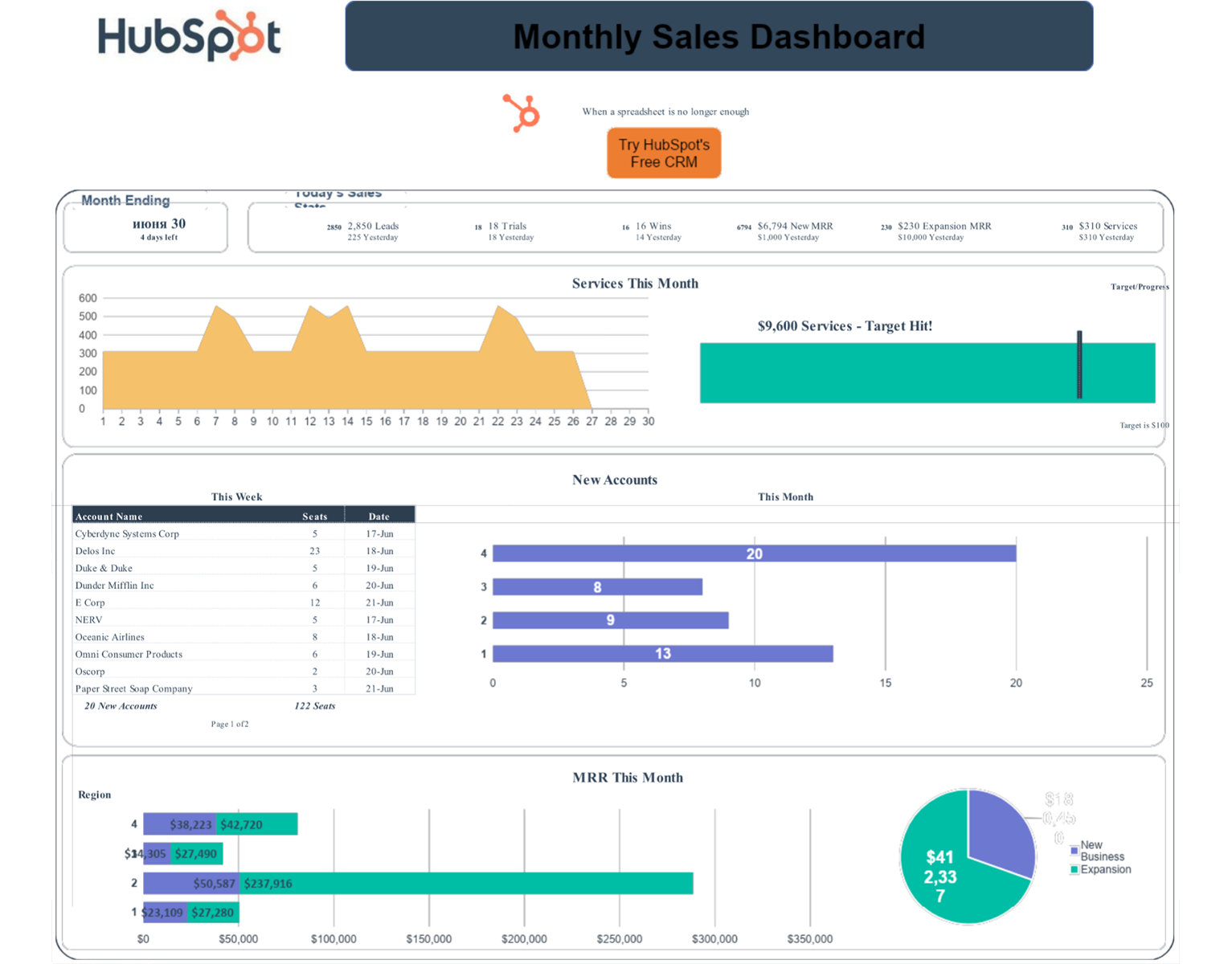
Hubspot Dashboard
The custom Hubspot dashboard provides a holistic view with a set of reports in a single view to analyze performances. The organized and visually appealing dashboard design helps the stakeholders to track the key stats for their next course of action.
Conclusion
Now that you’re familiar with a dashboard, its type, and best practices, you can easily create a dashboard design. All you need to do is keep the above-discussed points in mind throughout the dashboard design process. This will prevent you from deviating from the goal while brainstorming dashboard ideas and finally designing them. Also, it will help you create genuinely impeccable dashboard designs.
If you are looking to get a dashboard design created, you can contact Code Theorem; a UI UX design agency.
Contact Code Theorem to make a great dashboard design for your digital product.